-
We looked at prime dating age and when people usually marry. Now it’s time for the next step in the circle of life.
-
Members Only

Unfortunately, you can’t just conjure data out of thin air. Well, I guess you can, but it’d probably be sort of unreliable. Kind of. Maybe. So where do you find data? Here’s where I’m at in 2019.
-
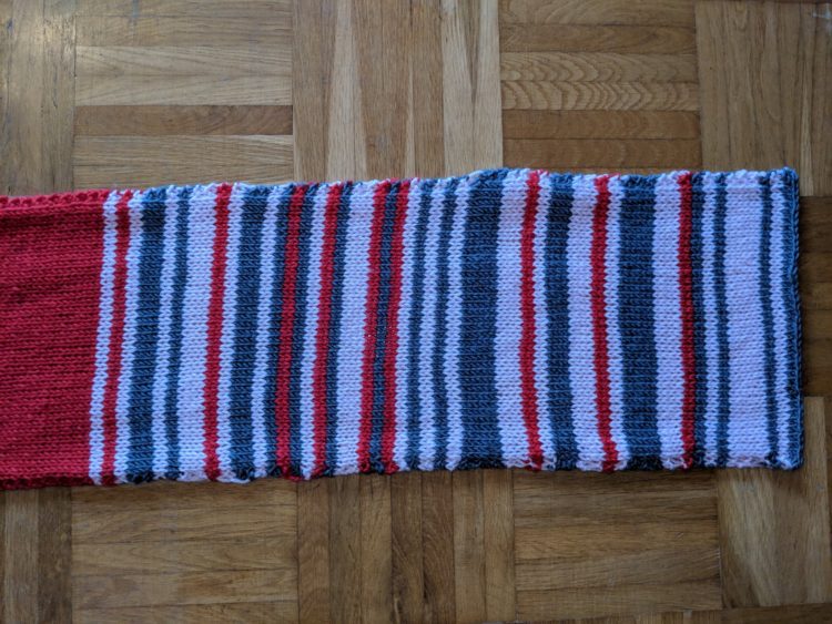
Sarah Weber posted a picture of a scarf that her mom knit to represent rail delays. Weber’s mom knitted two rows per day and used color to indicate the delay. Grey was under 5 minutes, pink was 5 to 30 minutes, and red was over 30 minutes.
After getting some attention on the Twitters, the mom opted to put it up on eBay to benefit charity Bahnofs Mission. It went for $7,550 euros. Nice.
-
I’m always up for some scaled perspective. From David Packer:
Anyone need a video demonstrating 1000s, 100s, 10s and 1s? You're in luck pic.twitter.com/sMGKlXKVy7
— Dave (@sheepfilms) January 21, 2019
-
DataKind, the organization known for helping others use data for social good, received a $20 million grant from The Rockefeller Foundation and the Mastercard Center for Inclusive Growth:
The grant will allow DataKind to transition from a project to a platform-based model, thereby, supporting more organizations on a set of high impact areas, such as community health and inclusive growth. We’re humbled and honored that these two groups are supporting our mission with $20M over five years to help us grow to support the needs of the sector.
Awesome.
-
Some words are harder to spell than others, and on the internet, sometimes people indicate the difficulty by following their uncertainty with “(sp?)”. Colin Morris collected all the words in reddit threads with this uncertainty. Download the data on GitHub.
-
Hurry up, light. We’re gonna be late:
By James O’Donoghue, the animation shows the speed of light in real-time. The distance between Earth, the moon, and Mars is to scale, but the locations are scaled up so that you can see them.
See also the animations for Earth to the moon and of light orbiting Earth.
-
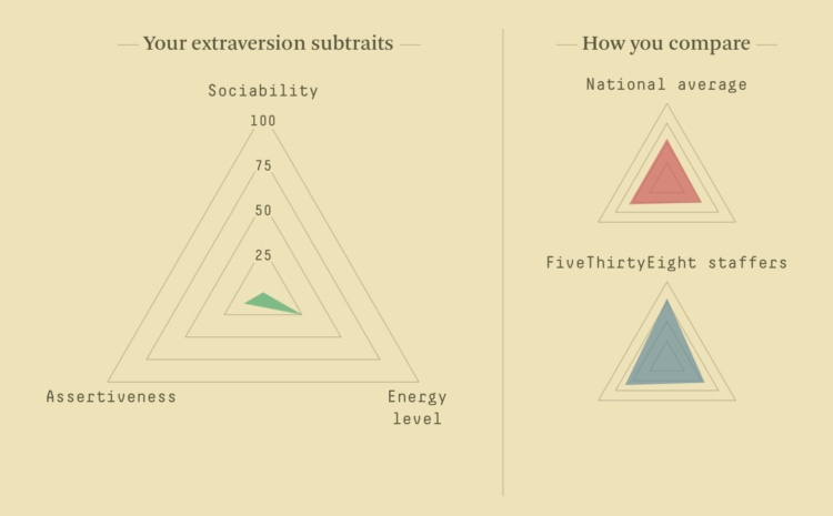
Ah, the online personality quiz, oh how I missed you. Oh wait, this one is slightly different. For FiveThirtyEight, Maggie Koerth-Baker and Julia Wolfe provide a quiz used by psychologists to gauge personality traits:
First, the Big Five doesn’t put people into neat personality “types,” because that’s not how personalities really work. Instead, the quiz gives you a score on five different traits: extraversion, agreeableness, conscientiousness, negative emotionality and openness to experience. For each of those traits, you’re graded on a scale from 0 to 100, depending on how strongly you associate with that trait. So, for example, this quiz won’t tell you whether you’re an extravert or an introvert — instead, it tells you your propensity toward extraversion. Every trait is graded on a spectrum, with a few people far out on the extremes and a lot of people in the middle.
Dang it. I really wanted to know what Harry Potter character I am.
-
Members Only
Datawrapper is an online tool that helps you make nice-looking charts for the web. No code is required. Instead, a focused interface lets you load data, pick your chart type, refine, and publish.
-
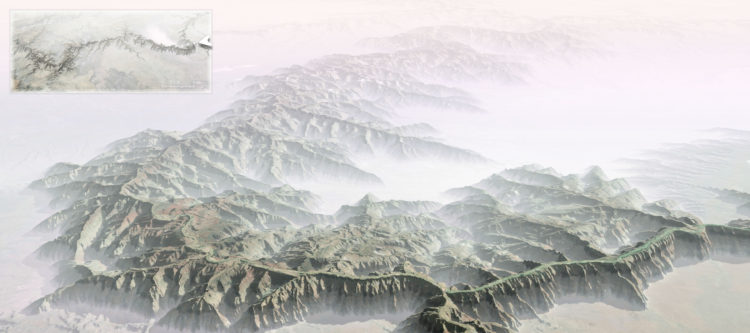
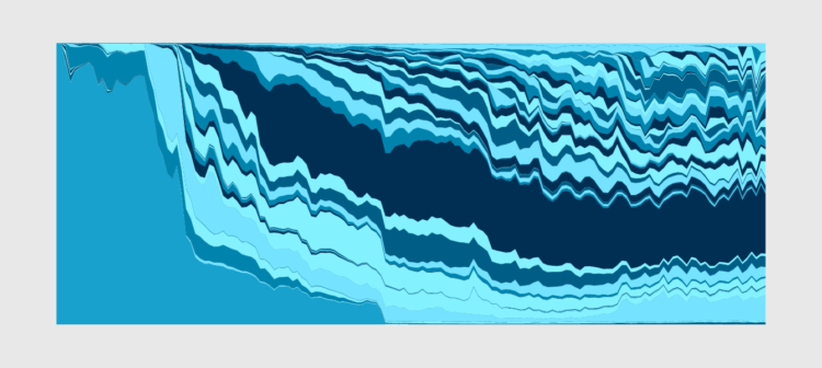
John Nelson turned the Grand Canyon inside out to understand the magnitude better:
Some of my earliest memories of the place had to do with the trippy feeling of my eyes and mind trying to make sense of the scale. I had seen many mountain ranges and vistas, including some on the way, but the vast negative space played havoc with my perception of magnitude. I’ve felt it a few times since, but never like that first Grand Canyon overlook.
Instructions included on how to do this in ArcGIS Pro.
-
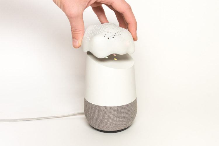
Digital assistants offer convenience, but they also offer continuous surveillance, and it’s not always clear when the tech is listening. Alias by Bjørn Karmann is a device you put on top of the assistant the block any unwanted listening:
Alias acts as a middle-man device that is designed to appropriate any voice activated device. Equipped with speakers and a microphone, Alias is able to communicate and manipulate the home assistant when placed on top of it. The speakers of Alias are used to interrupt the assistance with a constant low noise/sound that feeds directly into the microphone of the assistant. First when Alias recognises the user created wake-word, it stops the noise and quietly activates the assistant with a sound recording of the original wake-word. From here the assistant can be used as normally.
Armed with a Raspberry Pi and a 3-D printer, follow the build guide to make your own.
-
Amanda Cox is the new data editor for The New York Times:
As data editor, Amanda will continue to provide direction for The Upshot, and she’ll add the expertise from Computer-Assisted Reporting journalists in New York and software developers here and in the Washington bureau. She’ll serve as the top adviser to the executive editor and managing editor on statistical questions like polling methodologies and election forecasting, and she’ll participate in conversations with desks as they discuss data-oriented reporting that may aid our economics, technology and investigative coverage.
In her time here, Amanda has helped bring together some of our best explanatory and statistical reporting efforts with our smartest visualization experts, and now she’ll do that on a bigger stage.
Great news for both Amanda and NYT.
-
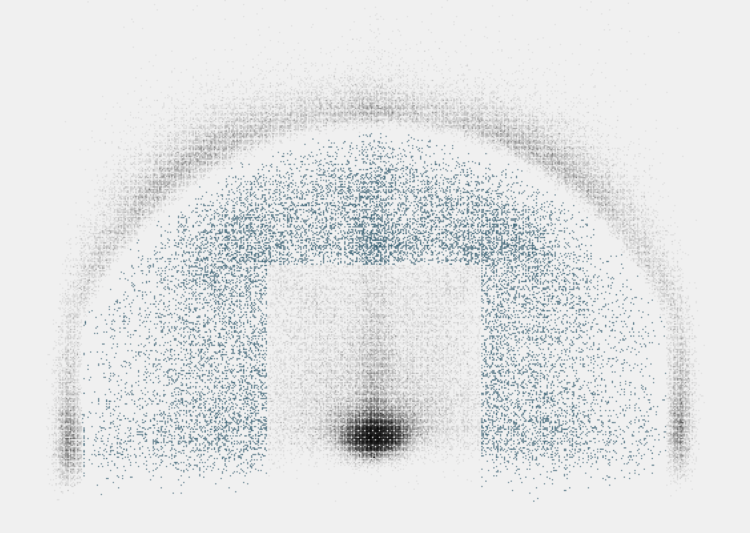
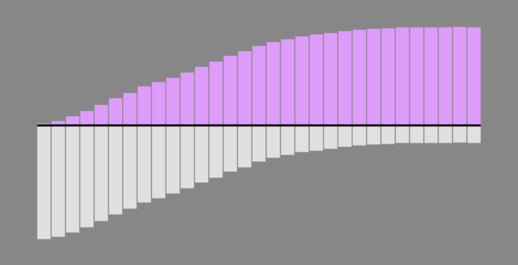
There’s a space on the basketball court called “mid-range.” It’s actually not off-limits. In fact, people used to shoot these so-called “mid-range” shots.
-
How to Make Animated (GIF) Heatmaps in R
Using color as the visual encoding, show changes over time in two dimensions.
-
People show up unannounced at John and his mother Ann’s home in South Africa, looking for stolen property, but John and Ann didn’t steal anything. For Gizmodo, Kashmir Hill investigates another case of IP address and geolocation mistaken for exactness:
John and Ann’s problems weren’t necessarily caused by one bad actor, but by the interaction of a bunch of careless decisions that cascaded through a series of databases. The NGA provides a free database with no regulations on its use. MaxMind takes some coordinates from that database and slaps IP addresses on them. Then IP mapping sites, as well as phone carriers offering “find my phone” services, display those coordinates on maps as distinct and exact locations, ignoring the “accuracy radius” that is supposed to accompany them.
The victims of theft, police officers, private investigators, the Hawks (South Africa’s FBI), and even foreign government investigators showed up mistakenly at John and Ann’s door, and none of them ever tried to figure out why.
Remember when we thought Kansas had unusually high porn views per capita?
-
Along the same lines as last week’s one-year wind time-lapse, Weather Decoded provides this one-year time-lapse of the weather over the United States:
Fun. [via kottke]
-
It feels like magic. I think there’s a magic trick percolating in there somewhere.
I’m not sure where this is from. It looks like it’s a recording from a camera pointed at a television screen, so if anyone knows where the original is, please let me know.
-
Members Only

Compelling visualization doesn’t just conjure itself out of nowhere. The ideas come from somewhere, and oftentimes they build off previous ones.
-
Using the same National Weather Service data that powers his live-ish wind map of Earth, Cameron Beccario put together a time-lapse for all of 2018. Watch it on full-screen in its 4k glory.
Recently for Members
Second Edition
 Visualize This: The FlowingData Guide to Design, Visualization, and Statistics (2nd Edition)
 Visualize This: The FlowingData Guide to Design, Visualization, and Statistics (2nd Edition)
New tools, refined process.
Browse by Chart Type See All →


