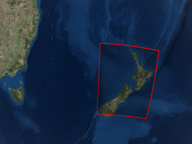
Downloading and viewing satellite imagery is a bit of a process. There are lot of images, and pictures aren’t taken in the exact same spot (because they’re taken from a satellite). The Landsat Viewer makes the viewing a bit easier. Just click and drag the area, select the source, and you’re off. There may or may not be wizardry involved.
-
For perspective, The New York Times compares the strength of Hurricane Irma to hurricanes from the past 50 years that reached Category 3. They transition through three views in the scroller, which would probably be too advanced on their own, but I think the short notes and focus on Irma gets the charts over the hump.
-
Buying a house is often confusing and complex, compounded by a dollar sign followed by too many commas and zeros. So John Nelson broke it down to something more simple. How many annual salaries would it take to buy a house? He applied it to his own family situation and then expanded it to the country on a county level.
Of course that’s not how mortgages actually work. It’s much worse than that. But this was the concrete visual of the trade required to land a house. I felt the Nelson family had no future there, if our plans in any way involved home ownership.
How many working years will it take you?
-
After their graphic for thirty years of floods, Axios follows up with thirty years of Atlantic hurricanes. Each area represents the wind speed and time of a hurricane, and color represents the category.
-
Kevin Quealy for The Upshot charted the estimated cost of Hurricane Harvey, along with the cost of storms past, going back to 1980. I like the animated bands for the Harvey estimates — kind of like a neon light.
If you’re interested in the data, you can grab it from NOAA.
-
This is a fun one that’s weirdly suspenseful. Everyday thresholds, like the slow flip of a light switch towards the on position and stacking blocks until they fall over, are displayed on one side. On the other side, a line chart shows progress towards a threshold.
[arve url=”https://vimeo.com/231498722″ /]
-
That xkcd is such a joker. Munroe should start a comic.
-
Xaquín G.V., in collaboration with the Google News Lab, investigated what people around the world searched for how to do. Starting with items in the household that need fixing, the visual essay looks at more general topics and the seasonality of things. If anything, check out those animated GIFs.
-
Based on data from the Dartmouth Flood Observatory, Lazaro Gamio for Axios mapped thirty years of a major flooding. The deeper the orange, the more extreme the flooding was.
-
This is great. Daniel Goddemeyer and Dominikus Baur made Data Futures, which collects multiple choice answers from audience members and then allows the speaker to interact and visualize the results on stage, as well as highlight audience members.
[arve url=”https://vimeo.com/226939721″ /]
I’m imagining this project restructured in a college statistics course with several hundred unwitting students. Seems like a great learning opportunity.
-
We might be in an age of big data, but people have been trying to convey large numbers for a long time. John F. Ptak takes a quick look through the archives for the size of big things compared to ships. “These units of measurement do seem a little odd, but they really have a capacity to humanize inescapably difficult numbers by putting them in context with a known entity, like Trinity Church.”
-
In case you didn’t hear, Houston is getting some rain due to Hurricane Harvey. The Washington Post provides a map that shows the cumulative rainfall since Friday morning through Sunday morning.
Also worth coming back to: the flooding piece from last year by ProPublica and The Texas Tribune.
-
Comics are a way to tell stories and for a while now, people have been interested in telling stories with data. So it’s only natural that the two would come together at some point. Data Comics is a collection that highlights the emerging genre.
I’ve had Understanding Comics sitting on my desk for a couple of months now. Maybe it’s time to dig in.
-
As the final episode of Game of Thrones nears, Kavya Sukumar for Vox looked at the colors used in each episode. More relevant if you’ve seen the show, the wideout view makes it easy to pick out themes and events so that you can reminisce about all the characters who died.
-
Here’s a neat one by John Muyskens for The Washington Post. Using data from flightradar24, he made an animated map that shows flights that went towards the totality of the eclipse as it was happening.
Hundreds of aircraft flocked to the moon's shadow during Monday's eclipse.
Animation by @JohnMuyskens
Data courtesy of @flightradar24 pic.twitter.com/vtOiSxb5Lm— Post Graphics (@PostGraphics) August 24, 2017
The caption suggests the flights were headed to the path for that specific reason, but I suspect a good number of the flights just happen to be flying at the time. Still fun to see though.
-
I did a quick Q&A with This is Statistics recently. It’s an ongoing effort by the American Statistical Association to tell people what the field is about, which I’m all for.
-
-
In screenplays, there are directions that tell actors and actresses what to do or what’s happening other than dialogue. Julia Silge and The Pudding studied which direction is written more often for women and more often for men. More specifically, they looked for the actions that followed “he” and “she” and then tabulated which were more likely for each gender, so you end up with things like snuggle, giggle, and squeal for women and strap, gallop, and shoot for men.