Most Female and Male Occupations Since 1950
Decades ago, men went to work and women stayed at home to take care of the home and children. This of course changed a lot. In 1950, a bit over 30 percent of women aged 16 to 64 worked, and just over 80 percent of men in the same age group did. In 2015, it’s closer to 70 percent for women and high 70s for men.
Naturally, men and women now work many of the same jobs, but many jobs are mostly men or mostly women. Here’s what it looked like in 2015, based on data from the American Community Survey.
The most female job was preschool and kindergarten teachers, and the most male was carpenters. The male-female ratios for these jobs changed little. But there are a lot of jobs in the middle of the chart that shifted plenty.
Looking more broadly, here’s how employment in different job categories changed since 1950.
At this point, the most interesting is the sum of the parts. The percentage of women not in the labor force decreased at lot between 1950 to 1990 and then kind of leveled off after that. The percentage of men not in the labor force increased some.
With this in mind, I looked for occupations that showed the biggest shifts, which as you’d expect went from mostly male to female. Some shifts were gradual like bakers and compliance officers, whereas others were quicker such as mail clerks and human resources.
Between 1950 and 2015, there were 82 occupations out of 459 that flipped from male to female and/or female to male. Out of the 82, 72 shifted from male to female majority. There were 28 occupations that shifted from majority female to male. (Keep in mind that an occupation can fluctuate more than once over the years.)
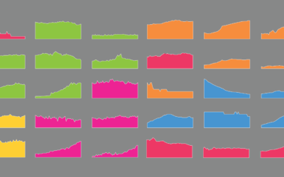
Below are the six jobs that showed the most fluctuation from majority female to male. Personal care and service workers stand out.
Want to see how other occupations have changed? Check it out below.
 Searchable Time Series Chart
Here’s how I made the interactive chart above.
Notes
- The data comes the decennial census from the Census Bureau for the years 1950 through 2000. The data for 2010 and 2015 comes from the American Community Survey. I downloaded all the data using the IPUMS USA extraction tool, which is maintained by the University of Minnesota.
- Occupation classifications from the Census Bureau change regularly. IPUMS offers a few unified classifications to make it possible to compare data over time. I used the 2010 basis for patterns over time. For the first chart though, I used the ACS 2015 classification.
- Percentages are based on the 16- to 64-year-old populations each year.
- I analyzed and processed the data in R. I visualized the data with d3.js. I also used the d3-annotation library and JavaScript-autoComplete.
Chart Types Used


Become a member. Support an independent site. Get extra visualization goodness.
See What You Get