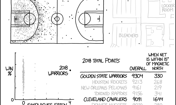
xkcd. Sometimes sports statistics are far-fetched.
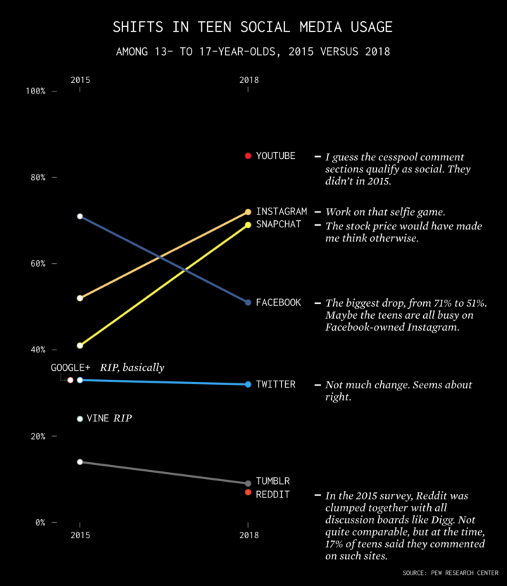
Facebook took the biggest hit in the past three years. Snapchat and Instagram got more likes.

How the schedules between remote and non-remote workers differ during workdays.
xkcd. Sometimes sports statistics are far-fetched.
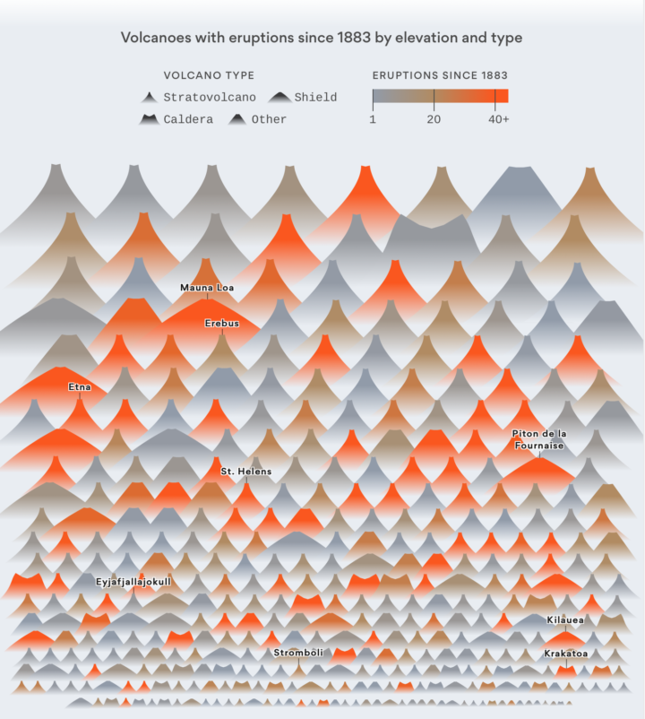
Slowly becoming the person who charts the past century of natural disaster events, Lazaro Gamio for Axios uses a pictogram to depict all known volcano eruptions since 1883. The vertical position represents elevation, color represents number of eruptions since 1883, and the shape represents volcano type.
I wonder if you get anything out of looking at eruptions over time. This view is more compendium than pattern revealer. You can grab the data from the Global Volcanism Program to check it out yourself.

The ink-drawn map of Hundred Acre Wood by Winnie-the-Pooh illustrator E. H. Shepard dates back to 1929. I’m headed straight for Eeyore’s gloomy place, which is rather boggy and sad. The drawing is up for auction, in case you’re interested in dropping a couple hundred thousand dollars. [via BBC]

Artist Marcus Lyon imagines worlds where there are so many people that the only thing left to do is to make gigantic places to fit everyone. The patterns repeat themselves over and over, and it’s no longer about the individual exploring an entire place. [via kottke]
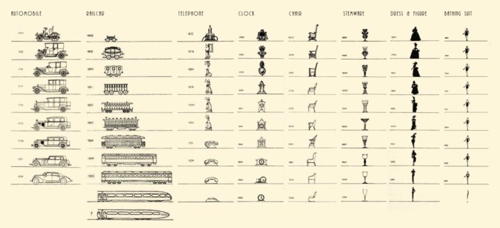
By Raymond Loewy, this chart from 1934 shows the shifts in design of the car, telephone, and clock, among other things. I assume someone is already working on updating this one to the present. [via @michaelbierut]
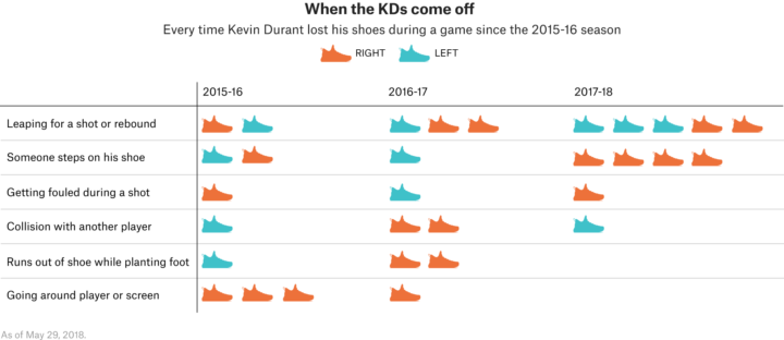
This is what happens when there is a lull during the basketball playoff season. Chris Herring, for FiveThirtyEight, goes into full detail of the relatively high number of times Kevin Durant’s shoe falls off during games:
All told, an extensive video analysis of Durant’s games from the past three regular seasons and postseasons reveals that the four-time scoring champ has come out of his shoe at least 31 times since the beginning of the 2015-16 campaign. That number, compiled against 20 different NBA teams, equates to losing a sneaker roughly every eight games or so — a mind-bogglingly high figure considering that Durant has had his own signature Nike shoe, designed to fit the unique contours of his feet, dating back to 2008.
“His shoe comes off more than anyone I’ve ever seen,” says teammate Draymond Green.
The question, of course, is why.
I’m so here for this.
Emily Robinson gives advice on applying for a data science job (that you can likely generalize for most tech jobs). For example:
If you have a GitHub, pin the repos you want people to see and add READMEs that explain what the project is. I also strongly recommend creating a blog to write about data science, whether it’s projects you’ve worked on, an explanation of a machine learning method, or a summary of a conference you attended.
This is especially true for visualization-heavy jobs. It doesn’t have to be GitHub. You just need a place where others can see your collection of work, so that they can see if it aligns with what they’re looking for. Plus it lets you show off your best stuff.
And this:
Rather than applying to every type of data science job you find, think about where you want to specialize. A distinction I’ve found helpful when thinking of my own career and looking at jobs is the Type A vs. Type B data scientist. “A” stands for analysis: type A data scientists have strong statistics skill and the ability to work with messy data and communicate results. “B” stands for build: type B data scientists have very strong coding skills, maybe have a background in software engineering, and focus on putting machine learning models, such as recommendation systems, into production.
I’ve never formally interviewed for a data science job, and the last job I interviewed for was back in college I think. So I’m one of the worst people to ask about this stuff, but this seems like good advice.

Popular songs on the Billboard charts always tended to sound similar, but these days they’re sounding even more similar. Andrew Thompson and Matt Daniels for The Pudding make the case:
From 2010-2014, the top ten producers (by number of hits) wrote about 40% of songs that achieved #1 – #5 ranking on the Billboard Hot 100. In the late-80s, the top ten producers were credited with half as many hits, about 19%.
In other words, more songs have been produced by fewer and fewer topline songwriters, who oversee the combinations of all the separately created sounds. Take a less personal production process and execute that process by a shrinking number of people and everything starts to sound more or less the same.
Visualization is often described in the context of speed and efficiency. Get the most insight for the least amount of ink or pixels. Elijah Meeks argues that visualization goes far beyond this point of view:
This breakneck pace is a real data visualization constraint. It’s not a myth that charts are often deployed in rooms full of people who only have a short time to comprehend them (or not) and make a decision. Automatic views into datasources are a critical aspect of exploratory data analysis and health checks. The fast mode of data visualization is real and important, but when we let it become our only view into what data visualization is, we limit ourselves in planning for how to build, support and design data visualization. We limit not only data visualization creators but also data visualization readers.
In the three-parter, Meeks tries to make the fuzzy aspects of visualization — meaning, insight, impact, etc. — more concrete.
See also:
Note the dates on all of them. We’ll figure out this visualization thing one of these days.
Many surveillance apps cater to parents who want to keep tabs on their children who have mobile phones. Many of these apps are used for less parental purposes. Jennifer Valentino-DeVries for The New York Times reports:
More than 200 apps and services offer would-be stalkers a variety of capabilities, from basic location tracking to harvesting texts and even secretly recording video, according to a new academic study. More than two dozen services were promoted as surveillance tools for spying on romantic partners, according to the researchers and reporting by The New York Times. Most of the spying services required access to victims’ phones or knowledge of their passwords — both common in domestic relationships.
Amazon’s Rekognition is a video analysis system that promises to identify individuals in real-time. Amazon wants to sell the systems to governments for surveillance.
Amazon is marketing Rekognition for government surveillance. According to its marketing materials, it views deployment by law enforcement agencies as a “common use case” for this technology. Among other features, the company’s materials describe “person tracking” as an “easy and accurate” way to investigate and monitor people. Amazon says Rekognition can be used to identify “people of interest,” raising the possibility that those labeled suspicious by governments — such as undocumented immigrants or Black activists — will be seen as fair game for Rekognition surveillance. It also says Rekognition can monitor “all faces in group photos, crowded events, and public places such as airports,” at a time when Americans are joining public protests at unprecedented levels.
Given the millions of Alexa-enabled devices in people’s homes and customer purchase histories available on-demand, this feels like a bad idea. Also, creepy. Probably because of the ‘k’ in Rekognition.
Wow your friends during the game with random win percentages, based on various player stats.
Ken Auletta for The New Yorker looks at “math men” replacing the Mad Men:
Engineers and data scientists vacuum data. They see data as virtuous, yielding clues to the mysteries of human behavior, suggesting efficiencies (including eliminating costly middlemen, like agency Mad Men), offering answers that they believe will better serve consumers, because the marketing message is individualized. The more cool things offered, the more clicks, the more page views, the more user engagement. Data yield facts and advance a quest to be more scientific—free of guesses. As Eric Schmidt, then the executive chairman of Google’s parent company, Alphabet, said at the company’s 2017 shareholder meeting, “We start from the principles of science at Google and Alphabet.”
I know the big tech companies is where the money is at, but I hope you young statisticians out there consider the other possibilities. Your skills are valued in many places.

Nigel Holmes, the graphic designer known for his playful illustrated graphics, has a new book: Crazy Competitions. It’s exactly what it sounds like.
Whether it’s flinging frozen rats or parading in holly evergreens, racing snails or carrying wives, human beings have long displayed their creativity in wild, odd, and sometimes just wonderful rituals and competitions. To show what lengths we’ll go to uphold our eccentric customs, British American graphic designer Nigel Holmes channels his belief in the power of hilarity to bring together a bewilderingly funny tour around the globe in search of incredible events, all dryly explained with brilliant infographics in Crazy Competitions.
Ordered.

Food trucks are the real deal these days. The best ones serve a specialized menu really well, in a small, focused space. The Washington Post delves into the insides of several of these trucks and how they make the food with very specific equipment.

Educate Your Child by Gabrielle LaMarr LeMee uses census data and the school selection process to simulate the steps you might take in choosing your kid’s first school in Chicago.
The Chicago public school system has a high level of school segregation as a result of parent’ residential and school choices as well as policy decisions that do not encourage integrated neighborhoods and schools.
In this game, you are a parent of a 5-year-old child and now you have to make some decisions. Explore how your choices can have an impact on your child’s education and on the overall education of the city’s children.
There should be more games like this based on census data. It seems to be a good way for an individual to latch on to data points while still getting a view of the grand scheme of things.
See also more on LeMee’s design for details on modeling school choice.
Imagine that those with immigrants in their family tree left the country. Almost everyone, basically.
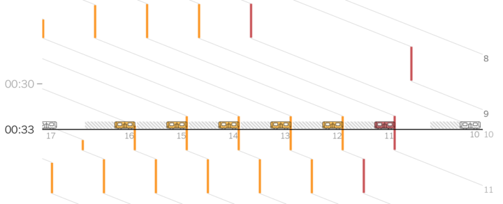
Adam Pearce for The New York Times describes the sad state of affairs that is the delayed subway trains in New York. One delay causes a ripple effect down the line, leaving little chance to get back on track. The more straightforward figures gear you up for the overall view at the end.
This was for New York specifically but is applicable to other transits and forms of transportation. See also the traffic gridlock simulation from a few years ago. It doesn’t take much for gridlock.
 Visualize This: The FlowingData Guide to Design, Visualization, and Statistics (2nd Edition)
New tools, refined process.


