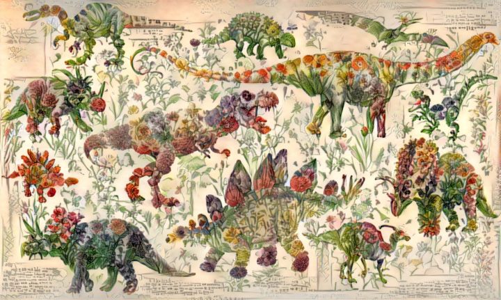
Neural networks have shown usefulness with a number of things, but here is an especially practical use case. Chris Rodley used neural networks to create a hybrid of a dinosaur book and a flower book. The world may never be the same again.
Neural networks have shown usefulness with a number of things, but here is an especially practical use case. Chris Rodley used neural networks to create a hybrid of a dinosaur book and a flower book. The world may never be the same again.
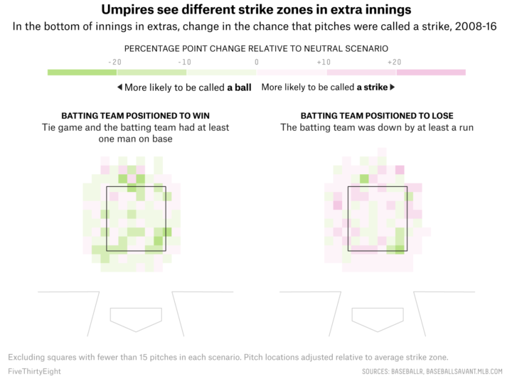
When watching baseball on television, we get the benefit of seeing whether a pitch entered the strike zone or not. Umpires go by eye, and intentional or not, they tend towards finishing a game over extra innings. Michael Lopez, Brian Mills, and Gus Wezerek for FiveThirtyEight:
The left panel shows the comparative rate of strike calls when, in the bottom of an inning in extras, the batting team is positioned to win — defined as having a runner on base in a tie game — relative to those rates in situations when there’s no runner on base in a tie game. When the home team has a baserunner, umps call more balls, thus setting up more favorable counts for home-team hitters, creating more trouble for the pitcher, and giving the home team more chances to end the game.
I doubt the shift is on purpose, but it’s interesting to see the calls go that way regardless. Also, from a non baseball-viewer, why isn’t there any replay in baseball yet?
Abstract: The Art of Design kept popping up on my Netflix recommendations list for the past several months. I ignored it though, because I’m tired of the heavy-handed design shows talking about how design is life and life is design, etc. Also, I probably spend more time flipping through what I can watch than actually watching anything.
In any case, for some reason I hit play and was happy to see the first episode with Christoph Niemann. Niemann is known for his whimsical, visual storytelling, and his process was fun to watch. Recommended.
And if Netflix isn’t your jam, this talk by Niemann is also good:
Focus on finding or displaying contrasting points, and some visual methods are more helpful than others. A guide.
Look from the above at the shapes and geometry we use for cities, blocks, roads, fields, and the like, and you start to get the repeating patterns. Páraic McGloughlin and Pearse McGloughlin highlight these patterns and their connectedness in Arena by stringing together Google Earth images.
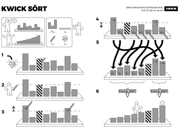
Learning algorithm steps can be a challenge when viewed only through code or words. So Sándor P. Fekete, Sebastian Morr, and Sebastian Stiller put together IDEA. The collection of illustrations describes common programming algorithms, such as Quicksort, in the style of IKEA furniture assembly instructions. Allen wrench not required. [via kottke]
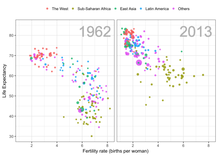
 Hans Rosling was able to build excitement around data like no other. Truth and progress was his rally cry. Before he died, he was working on a book with his Gapminder co-founders Anna Rosling Rönnlund and Ola Rosling. The book, Factfulness: Ten Reasons We’re Wrong About the World—and Why Things Are Better Than You Think, is out now. Ordered and looking forward to it.
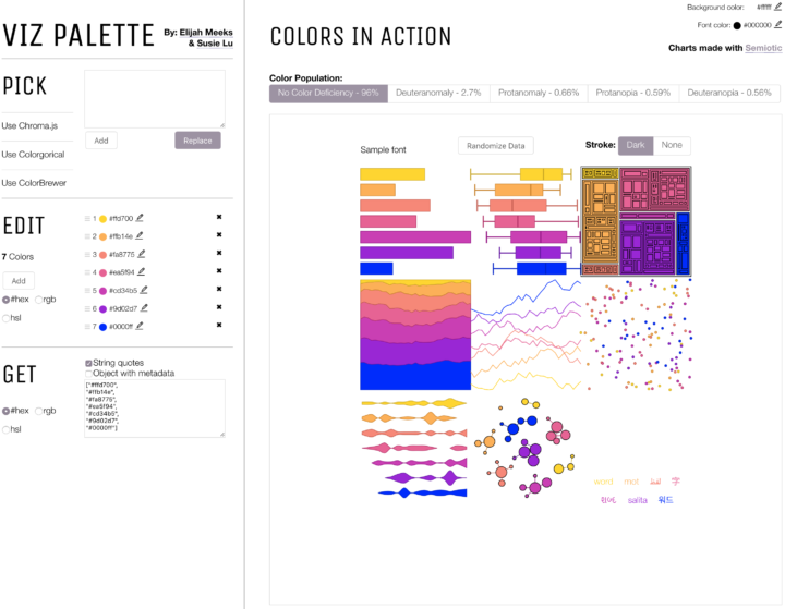
The colors you choose to visualize data can completely shift what you convey to a reader. With an ominous color palette, a graphic meant to be light and fun comes off the wrong way. Or the other way around. You wouldn’t use Comic Sans for your résumé (right…?), so choose colors that fit the topic. Viz Palette, made by Elijah Meeks and Susie Lu, aims to make the choosing part easier.
It’s still up to you to figure out the right overall scheme, but Viz Palette takes care of the stuff in between, such as designing for color blindness and perceptually evenly-spaced shades. It also includes a “color report” that points out shades that might look the same in various situations.
While there are many color-picking tools (I typically stick to four.), they are often too simple, overly-complicated, or research-centric. This one seems to strike a good balance for practicality.
This comic from Saturday Morning Breakfast Cereal speaks to me.
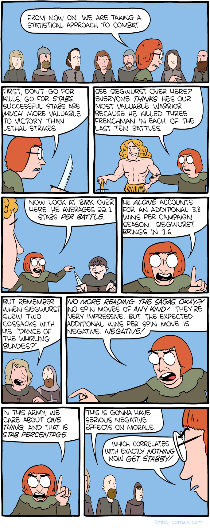
You can quantify all the things to look at said things more objectively. However, there are always other things that cannot be quantified and in real life, they are often intertwined with the numeric portion of the data. Split apart the quantitative and qualitative, and you end up making all decisions based on stab percentage.
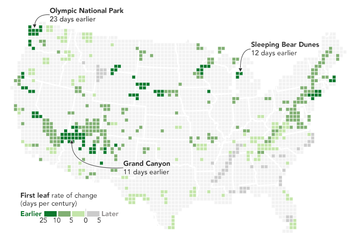
From Joshua Stevens at the NASA Earth Observatory:
But over the longer term, climate change is causing spring to begin earlier and earlier across the United States. These maps reveal just how much earlier spring is arriving in National Parks across the country. The data were published in 2016 by ecologists from the National Park Service, working in collaboration with colleagues at other agencies and institutions.
Griddy.
Limited to only national parks, the view still provides a good idea. For a model-based view at higher granularity, check out the USA National Phenology Network.
Based on data gathered by the Lunar Reconnaissance Orbiter, NASA pieced together this high-resolution tour of the moon. At the two-minute mark they zoom in on a boulder in the middle of a 100-million-year-old crater, and it blew my mind.
Rafael Irizarry introduces the dslabs package for real-life datasets to teach data science:
[I] try to avoid using widely used toy examples, such as the mtcars dataset, when I teach data science. However, my experience has been that finding examples that are both realistic, interesting, and appropriate for beginners is not easy. After a few years of teaching I have collected a few datasets that I think fit this criteria. To facilitate their use in introductory classes, I include them in the dslabs package.
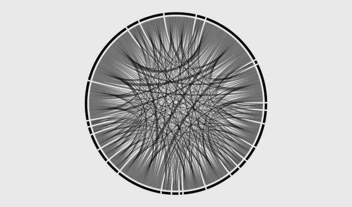
Show connections in the circular layout for a more compact presentation.
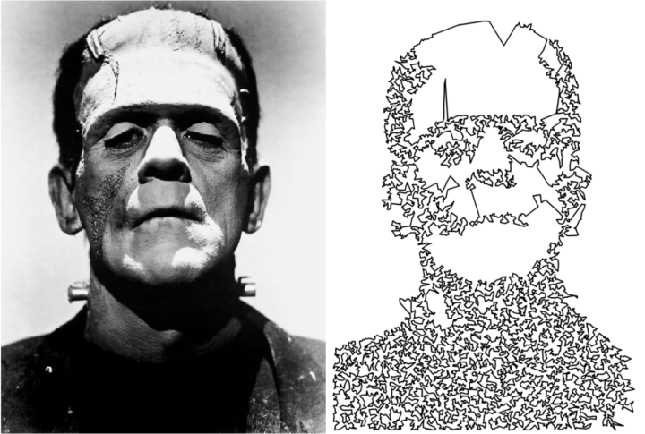
This is a fun drawing experiment in R by Antonio Sánchez Chinchón. A simple process: convert an image to black and white, sample the black points, and then solve the Traveling Salesman Problem for those points. Draw the resulting path for something like the above.
Grab the R code to try it with your own images and settings.
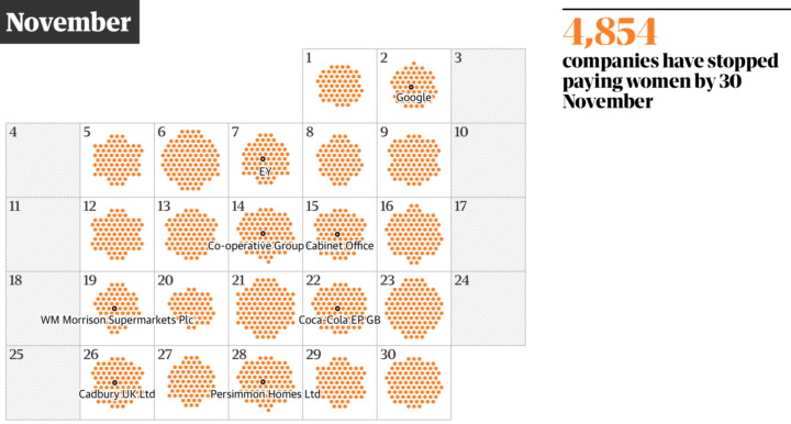
One way to think about gender pay gap is to imagine women receive the same pay as men each working day until they reach their salary. At some point during the year, women effectively work for free. With a new law that requires companies in Great Britain with 250 or more employees to report pay gap, The Guardian provides a calendar view into the newly reported data that shows the day of the year the free work starts.
The scroller shows companies as you move down the calendar. The information feels less overwhelming than seeing it all at once, and a running counter keeps track of what you already saw.
See also The Guardian’s breakdown by sector.
There are many ways to estimate how similar two cities are — weather, demographics, taxes, etc. Jed Kolko from job site Indeed and Josh Katz for The Upshot used the distribution of job offerings. Just enter your city or a nearby metro, and you get something like this:
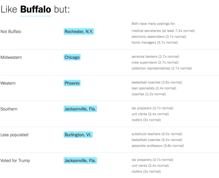
I punched in cities I’ve lived in or visited, and the results looked pretty good.
The analysis is based on job postings on Indeed, but I wonder if this would work with Census data. And can we apply this similarity index or some form of it to, say, individuals? Just think of the possibilities, Match.com.
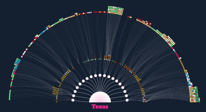
In 1939, John and Ruby Lomax traveled through ten southern states in three months. They recorded music by individuals with the belief that the subtleties of music culture is best captured when a person plays for another face-to-face.
The Texas Folklore Society’s founding members shared with Lomax a sense that their state’s rich folklore needed to be documented and preserved for the analysis of later scholars. Nascent technology such as the radio and the gramophone, it was feared, would end the age-old tradition of transmitting music and lore directly from one person to the next. With professional musicians’ works being piped into homes across the country, the purity of traditional music, its particularities of region, religion and ethnicity, could be lost forever.
Aditya Jain tells the story of the Lomax’s journey, visualizing the bits they collected and archived along the way. [via @blprnt]
Elizabeth Barber was in a long-distance relationship, and Strava was a way for her to connect with him. It became a point of anxiety when her boyfriend cycled with someone else more and more often.
I was curious, and Strava is a joyless data bank for the insecure. When The Washington Post reported in January that US military bases are visible in the GPS shadows of uniformed Stravites, I was not shocked. I had performed equally fastidious forensics on the cyclist’s Strava maps. Tracing her routes on that anxious morning and days to come, I could see where she lived, where she drank beer and got coffee. I knew how many calories she burned working out, and how often. I knew when and where and with whom she spent time (increasingly, my boyfriend).
Data without much context: enough to drive anyone a little nutty.
Alec Barrett for TWO-N describes the benefits and some of the intricacies of animated transitions in data visualization.
This visual essay is inspired by the question: What is happening conceptually between the start and end of a transition? I look at reasons for using animated transitions (besides “it looks cool”) and at the kinds of variables that can be transitioned. I conclude that we can think of animated transitions in two categories: those where the space between the start and end states consists of real/realistic data and grammatically valid states for that visualization, and those where it does not.
The essay by the way was published on Observable, a new-ish way to publish “interactive notebooks for data analysis, visualization, and exploration.” Worth a look if you’re into publishing and sharing code.
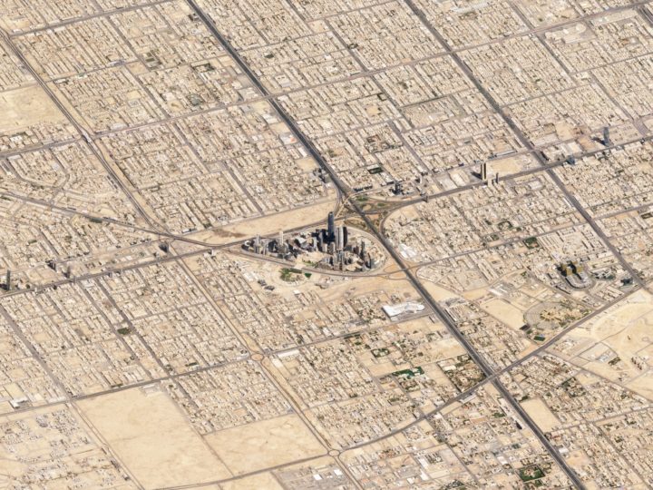
Maps typically show a view from straight above, which is good for navigation and to see regional patterns over large areas. However, missing out on the extra dimension of height can mean missing out on context. Robert Simmon for Planet Labs shows off some work in getting the less abstract perspective at a large scale.
 Visualize This: The FlowingData Guide to Design, Visualization, and Statistics (2nd Edition)
New tools, refined process.


