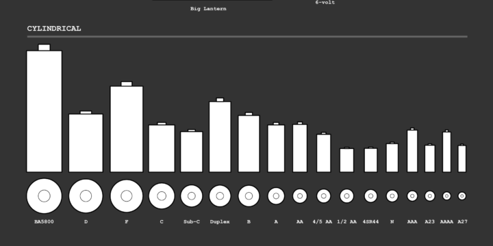
Sorting algorithms. Apparently there are an endless number of ways to visualize them in various contexts, and somehow it never gets old. Here sorting in the context of books on a shelf.
Irene Ros, the Director of Data Visualization at Bocoup, talks about her path through the field of visualization, which kind of doubles as a quick history of the past decade.
These days, I’ve relaxed the demands I put on myself around the visual wow-ness of my work. Sure, it’s really wonderful to have recognition from my peers in the industry, but it’s actually even more wonderful to build a really simple tool for small clinic practitioners to track their patient experience data in a digital way for the first time; to show and explain to them a box plot and suddenly see them make use of it. A box plot is never going to win awards, but a well crafted tool that is simple to use is going to make someone’s life better, or at least a little easier.
Man wears virtual reality headset. Another man throws a ball to headset-wearing man. Headset-wearing man catches actual ball displayed in virtual reality. There’s something magical about the quick data processing going on here.
Wendover Productions explains basic economics of airline classes. The passengers in first class and business, assuming seats are occupied, make much more for airlines than the economy class. Sounds familiar.
Based on estimates from the Yale Program on Climate Change Communication, The New York Times mapped the percentage of people who think global warming will harm the country against the percentage of people who think it will harm them personally. It’s a big contrast. A delayed trend essentially, which is a big source of why action is so slow-moving.
Check out the Yale interactive too to see more contrasting opinions.
You have a mouth with a bunch of tissue in it and manipulate your tongue, lips, throat, and other pieces so that somehow words come out. A lot of variables figure in, which can make the whole process of talking a complex process. Neil Thapen makes it more understandable with a fun simulator he calls Pink Trombone. Turn your sound on, and click and drag any of the words to see how voice changes when you modulate parts of the mouth.
The Washington Post looks at the shifting national budget over the past 40 years. Be sure to keep scrolling past the first overall to see the funding for departments separately. The consistent vertical scale works well.
Everyone has his or her own timeline, but here it is in general for Americans.
Cartographer Daniel Huffman tried out Penrose tiling for binning in maps:
A Penrose tiling is a form of tessellation. It’s fun and unique in that it fills the entire plane, but has no repeats. Wikipedia has more detail about how these things are cool. Mostly, I thought of them because they look interesting and are sort of regular, without being too regular.
He recently came back to the method to look at elevation for the pretty result above.
In a recent talk, New York Times graphics editor Gregor Aisch noted that only 10 to 15 percent of readers who visit an interactive visualization on their site actually click on anything. That’s a lot of people who don’t get everything that New York Times interactives have to offer, which begs the question: Is it worth the time and effort to make these things?
As with most design-related things, it depends on the goals and the audience of your visualization. Dominikus Baur explains in detail, drawing experiences from his own work.
When you don’t know where to start with a dataset, try to come up with a question. It’ll point you in the direction you want to go, as this guide by Frédérik Ruys shows you. [via @maartenzam]
Here’s a fun piece by Karl Sluis. He looked at eight demographic metrics, such as population, age, and income (based on estimates from the American Community Survey) and found the “most typical” city in America that sat around the median of all the measurements.
According to the averages across these eight measures, the Lynchburg, Virginia Statistical Area is the most typical statistical area in the country. Made of four counties and eleven communities, Lynchburg’s statistics are less than half of a standard deviation from average across every measure. In fact, the median income of Lynchburg’s residents ($46,913) lies closer to the average ($46,871) than any other city.
Congratulations, Lynchburg. You get the award for most average.
A lot of people around the world including myself don’t quite understand the scale of what’s going on in Syria. We just know it’s bad. Hans Hack overlaid Aleppo on top of London and Berlin to give you a better idea.
As a geographical reference point, the historical center of Aleppo (The Citadel of Aleppo) has been superimposed on that of Berlin (Museum Island) and London (The Tower of London). The reprojected destruction is indicated by randomly selected buildings marked in red. To make it more representative, the distribution of the reprojected destruction has also been mapped with respect to Aleppo’s administrative borders provided by OCHA.
Spring is in the air in a lot of places, and that means it’s time to dig up the bicycle from winter hibernation and have a ride. Not much beats the satisfaction of a casual ride in perfect weather. A gentle breeze kisses your face. The sun shines on you but it’s not too hot.
But then you realize you’re on a road without a bike lane and there’s heavy traffic. A semi truck rushes past you and you feel the weight of air almost blow you off your bike. Shoot. If only there was a map that you looked at beforehand that showed you the safe places to ride.
Oh wait, there’s this bike riding map from Mapzen that colors roads by three tiers of safety. Score.
In most states, there is minimum wage and there is tipping minimum wage. For those who earn the latter, most of their income comes from tips. This is fine in nicer restaurants where tips can be substantial, but in places that depend on high turnover and low prices, restaurant servers need to work more tables per hour to earn the equivalent of minimum wage.
Kathryn Casteel and Charlie Smart for FiveThirtyEight have an interactive chart that shows how many tables servers have to work to make up the difference in different states.
Tables per hour makes the x-axis and hourly wage makes the y-axis, which means steeper slopes represents fewer tables to make up the difference. I’m not sure everyone will get that, but I like it.
That said, I hope people don’t interpret these numbers as servers at some restaurants have to work harder than others do. Service at Denny’s isn’t quite the same as service at a four-star. Rather, the main takeaway is that you should tip your servers. That’s where they make most of their income.
There were some ripples in the space time continuum recently about a pizza and a pie chart. It looked like a pie chart but was actually just a pizza with numbers around it. Those numbers didn’t sum to 100 percent, so there were pitch forks and burning and like I said, ripples in the space time continuum.
Read More
Based on estimates from the Kaiser Family Foundation, Kevin Quealy and Margot Sanger-Katz for The Upshot compare the tax credits for individuals under the Republicans’ proposed health care plan against Obamacare.
The biggest losers under the change would be older Americans with low incomes who live in high-cost areas. Those are the people who benefited most from Obamacare.
For some people, the new tax credit system will be more generous. The winners are likely to be younger, earn higher incomes and live in areas where the cost of health insurance is low.
Hm.
There was a time when charts and infographics were drawn by hand, because computers weren’t affordable or commonplace. John Grimwade provides a run down of the tools he used back in the day. The thing above was used to draw different sized circles. On paper. With a pen.
The tools remind me a lot of my dad’s that he used to have laying around. He’s a civil engineer and used to pull out all these blueprints with measurements and codes. Now they just have giant, high-resolution computer screens.
I wonder what my kids will think of the tools I use when they’re older. “You mean you have to use your hands to visualize your data? That’s like a baby’s toy.”
As you probably know, different countries have different legal age limits for drinking alcoholic beverages. In the United States, the age is 21. In some places in the world, there is no set age. In most places, the legal age is 18 to drink a non-spirit beverage such as beer in a public place without a guardian.
The map above, based on data from Wikipedia, shows where in the world you’re legally allowed to drink a beer in a public place. It’s slightly generalized and doesn’t take into account that in some places you have to be older to purchase the beverage, but it gives you a good idea of the age limits globally.
This by the way is part of new category I’m calling my sketchbook. I need a place where I can mess around with different formats without worrying about what is the “right” way to do it.
Relevant tutorials: Choropleth Maps and Shapefiles in R / How to Make an Animated Growth Map in R
The nice thing about animated GIFs for visualization is that they can get a message across pretty quickly, which lends itself to potential shares. You’d think there would be a Twitter bot by now tweeting GIFs non-stop. In any case, Lena Groeger put together a nice collection of them.