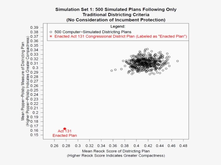
The change that’s already come to Pennsylvania may not have been possible without the research Kennedy and three other expert witnesses brought to light. They took the stand with a range of analyses, some based in complex quantitative theory, others, like Kennedy’s, based in pure cartography. But they all reached the same conclusion: Pennsylvania’s map had been so aggressively gerrymandered for partisan purposes that it silenced the voices of Democratic voters in the state. Here’s how each came to that conclusion—and managed to convince the court.
This is a great story of visualization and data put to use for a greater good. The analyses solidify the points, and the charts drive them home.
 Visualize This: The FlowingData Guide to Design, Visualization, and Statistics (2nd Edition)