False.
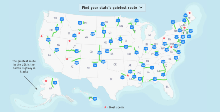
Geotab made a rough estimate of the quietest route in each state, based on average traffic. The methodology:
To find the quietest road in each US state, we gathered the latest available (2015) traffic count data from the Highway Performance Monitoring System. Quietness was calculated as the annual average daily traffic (AADT, measured in # of vehicles), and routes with the lowest AADT in each state were deemed the quietest. Lengths of routes were gathered from local transport authorities in each state. The data covers Interstates, US Routes, and State Routes over 10 miles long.
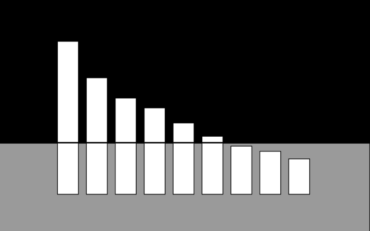
I feel like they should’ve normalized by length of route, especially since they had it already. But hey, I’m always down for some peace and quiet.
Summarizing a talk by Xaquín G.V., Natalie Gerhardstein for Delano:
Among González’ takeaways were that, in order to avoid misunderstandings or bias in data visualisation, it helps to be aware of the pitfalls across the lifecycle–from collection through analysis, to the visualisation itself–and, of course, the final story the data is helping to tell. Question, for example, whether correlations being made are legitimate, be transparent and be aware of the visuals aligning with words in the story, he argues.
There are always compromises and possible mistakes upstream before the data comes out as a nicely formatted delimited text file. The more you understand about what happens upstream, the more you can do downstream.
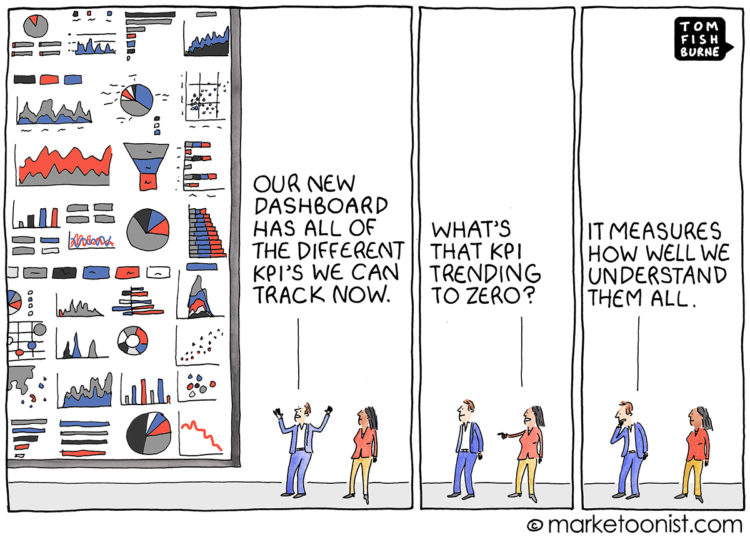
From Tom Fishburne, the Marketoonist. Maybe a dashboard isn’t the answer you’re looking for.
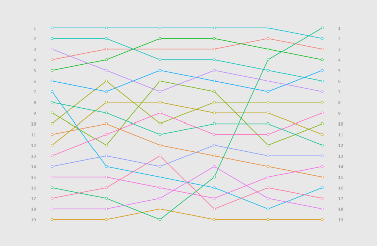
Visualize rankings over time instead of absolute values to focus on order instead of the magnitude of change.
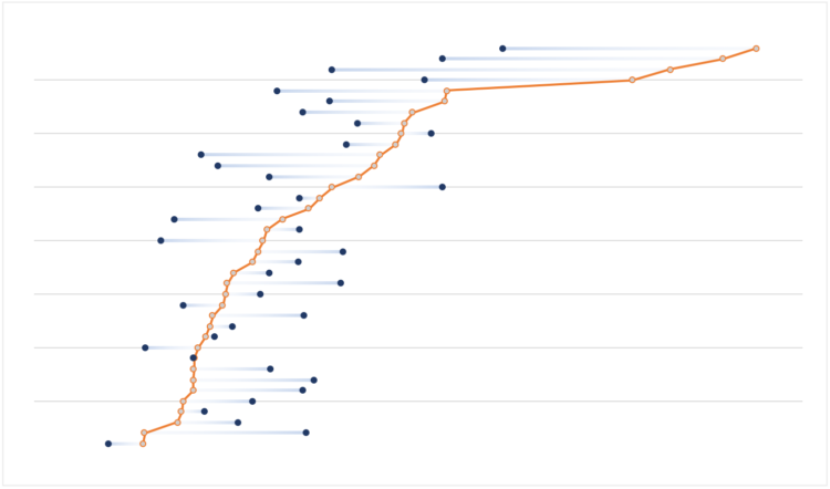
Easily compare multiple categories and spot differences between two or more series.
Salaries vary across occupations. Here are some charts that show by how much for 800 of them.
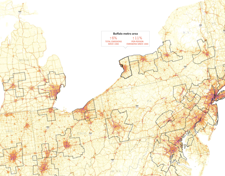
Using estimates from the Database of Road Transportation Emissions, Nadja Popovich and Denise Lu for The New York Times mapped auto emissions at high granularity. Popovich described their process on Storybench:
I want to make graphics that really resonate with people. If that is your goal as a visual journalist, something to think through is just how you can tie data back to a more human experience. To kind of go past the dataset as a dataset and reveal the humanity of it. I think one way that you can do that is by zooming into it in this way. You suddenly don’t just see, “Oh, this line of emissions has gone up.” We set out for a more personal view that says, “You know, you can actually see the roads that you might be driving on every day. That’s where the emissions are coming from.” It ties it back to a much more human experience and makes the data less abstract. Thinking a lot more through how to tie (the data) back to human-lived experiences is something that is really important and really we found resonates with readership.
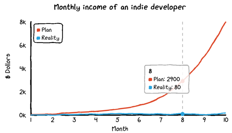
This week I reminisce back to when I didn’t know anything about visualization, and all I wanted to do was solve analysis problems. Also, some fun updates on the way, exclusively for members.
For Knowable Magazine, Betsy Mason looks at the state of (not so good) data visualization in science and offers some direction for how it can improve:
[S]cience is littered with poor data visualizations that confound readers and can even mislead the scientists who make them. Deficient data visuals can reduce the quality and impede the progress of scientific research. And with more and more scientific images making their way into the news and onto social media — illustrating everything from climate change to disease outbreaks — the potential is high for bad visuals to impair public understanding of science.
It’s time to kick the tires on some new tools.
Read More
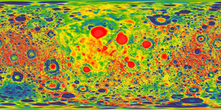
You’ve probably seen the composite map of lights at night from NASA. It looks a lot like population density. Tim Wallace adjusted the map for population, so that you can see (roughly) the areas that produce more light per person.
Adjusting NOAA nighttime lights for population reveals areas that create an outsized amount of light per person living there. pic.twitter.com/k91cGyWvLd
— Tim Wallace (@wallacetim) November 10, 2019
There are a lot of variables to consider, but for people of middle income, here’s a suggestion, based on when you start saving and when you want to retire.
For xkcd fans, here’s a JavaScript library by Tim Qian that lets you style your charts like xkcd.
There’s something about sketchy, comic-style charts that makes the data feel more approachable. Maybe just because it’s different or looks more casual? I mean, I would use the style sparingly and maybe not in your next business meeting, but it’s kind of fun to mess with. You can also do this in R and Python of course.
People tend to have more money saved up over time, but range and variation also grow, and often it’s not enough.
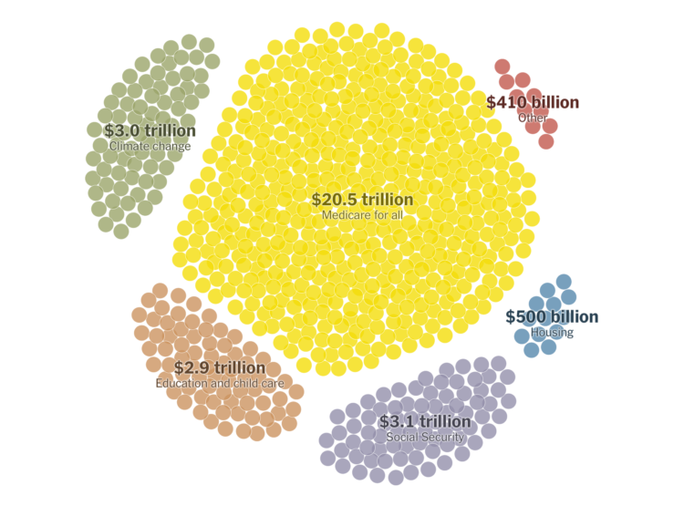
Elizabeth Warren has big plans, and they would cost a lot with a big shift in government spending. The New York Times breaks it down.
I realize the topic here is important, but NYT’s bubble game is on point in this piece. Check out those transitions as the bubbles funnel into the screen from the top and how the pie-like segments rotate as each segment is highlighted.
Force-directed graphs, for the win, amirite.

There are many tools to clean up your data, and they can be helpful with the right dataset and situation. I tend to stick to a small handful. Here’s what works for me.
Randall Munroe of xkcd was on the Data Stories podcast. He talks about his work, his process, and communicating complex ideas to a wide audience. It’s amazing how much of his process overlaps with visualizing data.
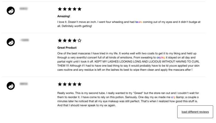
Interested in reviews on the Sephora website for waterproof makeup, Connie Ye figured she might as well scrape all of the reviews and filter for the ones that mention crying:
I ended up scraping about ~5k reviews, and 105 of them mentioned crying, sobbing or tears, giving a ratio of about 1/50. This is of course a biased number because the products the reviews are for are meant to withstand water, but I was still surprised to find so many. I was also surprised by how confessional and emotional people were willing to be in their reviews; I saw stories about breakups, death of loved ones, weddings, fights and more. However, despite the tragedy underlying many of the stories, the tone was often strangely positive, providing exuberant praise for the product that allowed them to maintain their makeup throughout the tragedy.
I have no idea what I would do with this dataset, but I feel like someone can figure out a worthwhile use.
You can also browse through the reviews using Ye’s straightforward viewer.
Stephen M. Stigler argues that data have a limited shelf life. The abstract:
Data, unlike some wines, do not improve with age. The contrary view, that data are immortal, a view that may underlie the often-observed tendency to recycle old examples in texts and presentations, is illustrated with three classical examples and rebutted by further examination. Some general lessons for data science are noted, as well as some history of statistical worries about the effect of data selection on induction and related themes in recent histories of science.
In a nutshell, while data itself doesn’t change, everything around it — the people who collected the data, the things that the data is about, and where the data came from — changes over time.
 Visualize This: The FlowingData Guide to Design, Visualization, and Statistics (2nd Edition)
New tools, refined process.


