This issue of The Process is public.
Hi,
I don’t know about you, but I’ve been finding it hard to concentrate the past week or so. I keep getting guidelines on washing hands and reassurances from the kids’ school that everything is sanitized multiple times per day. There are empty shelves at the stores with toilet paper and hand sanitizer. It all just feels very uneasy.
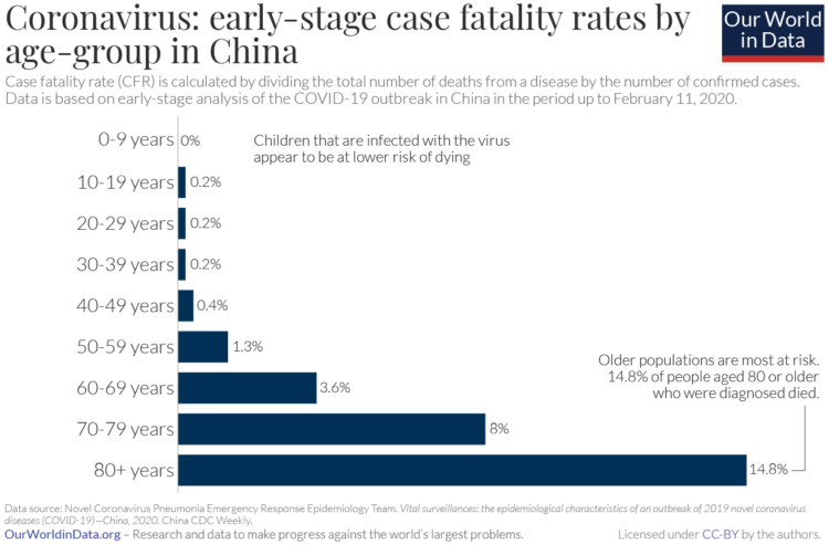
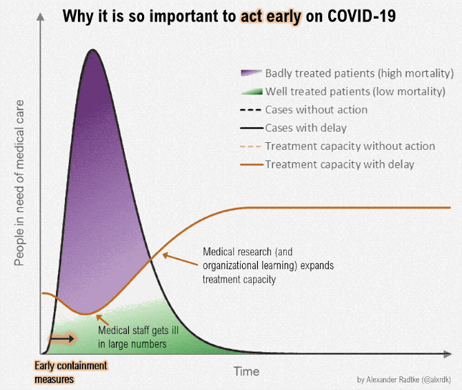
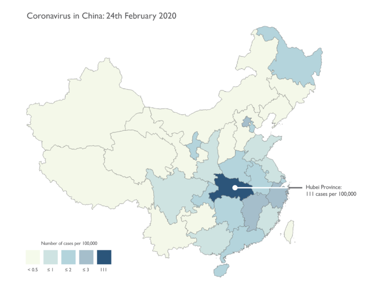
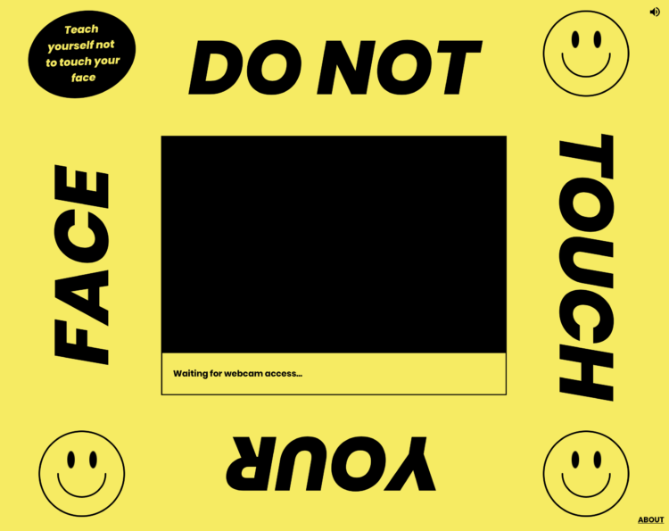
And, as I’m sure you heard, the World Health Organization classified Covid-19 as a pandemic. Naturally, I continued voraciously consuming information about the coronavirus. Here’s a rundown of the useful visuals that have crossed my way. They didn’t help with the uneasiness, but they at least provide a window into what’s happening.


 Visualize This: The FlowingData Guide to Design, Visualization, and Statistics (2nd Edition)


