• Membership
  • Newsletter
  • Projects
  • Learning
  • About
  • Member Login
  • xkcd-style charts in JavaScript

    November 11, 2019

    Topic

    Coding  /  JavaScript, xkcd

    For xkcd fans, here’s a JavaScript library by Tim Qian that lets you style your charts like xkcd.

    There’s something about sketchy, comic-style charts that makes the data feel more approachable. Maybe just because it’s different or looks more casual? I mean, I would use the style sparingly and maybe not in your next business meeting, but it’s kind of fun to mess with. You can also do this in R and Python of course.

  • Data Underload  /  money, retirement, savings

    Saving for Retirement and Age

    People tend to have more money saved up over time, but range and variation also grow, and often it’s not enough.

    Read More
  • Paying for Elizabeth Warren’s proposed policies

    November 8, 2019

    Topic

    Infographics  /  Elizabeth Warren, New York Times, spending

    Elizabeth Warren has big plans, and they would cost a lot with a big shift in government spending. The New York Times breaks it down.

    I realize the topic here is important, but NYT’s bubble game is on point in this piece. Check out those transitions as the bubbles funnel into the screen from the top and how the pie-like segments rotate as each segment is highlighted.

    Force-directed graphs, for the win, amirite.

  • Members Only

    Cleaning and Formatting Data, What I Use (The Process #64)

    November 7, 2019

    Topic

    The Process  /  cleaning, formatting

    There are many tools to clean up your data, and they can be helpful with the right dataset and situation. I tend to stick to a small handful. Here’s what works for me.

  • Randall Munroe of xkcd on Data Stories

    November 7, 2019

    Topic

    Design  /  Data Stories, Randall Munroe, xkcd

    Randall Munroe of xkcd was on the Data Stories podcast. He talks about his work, his process, and communicating complex ideas to a wide audience. It’s amazing how much of his process overlaps with visualizing data.

    Worth the full listen.

  • Sephora dataset is a collection of makeup reviews that mention crying

    November 7, 2019

    Topic

    Data Sources  /  crying, makeup, Sephora

    Interested in reviews on the Sephora website for waterproof makeup, Connie Ye figured she might as well scrape all of the reviews and filter for the ones that mention crying:

    I ended up scraping about ~5k reviews, and 105 of them mentioned crying, sobbing or tears, giving a ratio of about 1/50. This is of course a biased number because the products the reviews are for are meant to withstand water, but I was still surprised to find so many. I was also surprised by how confessional and emotional people were willing to be in their reviews; I saw stories about breakups, death of loved ones, weddings, fights and more. However, despite the tragedy underlying many of the stories, the tone was often strangely positive, providing exuberant praise for the product that allowed them to maintain their makeup throughout the tragedy.

    I have no idea what I would do with this dataset, but I feel like someone can figure out a worthwhile use.

    You can also browse through the reviews using Ye’s straightforward viewer.

  • Data shelf life

    November 6, 2019

    Topic

    Statistics  /  history, old data

    Stephen M. Stigler argues that data have a limited shelf life. The abstract:

    Data, unlike some wines, do not improve with age. The contrary view, that data are immortal, a view that may underlie the often-observed tendency to recycle old examples in texts and presentations, is illustrated with three classical examples and rebutted by further examination. Some general lessons for data science are noted, as well as some history of statistical worries about the effect of data selection on induction and related themes in recent histories of science.

    In a nutshell, while data itself doesn’t change, everything around it — the people who collected the data, the things that the data is about, and where the data came from — changes over time.

  • Daylight Saving Time gripe assistant tool

    November 5, 2019

    Topic

    Maps  /  Andy Woodruff, daylight saving

    In a follow-up to a map from a few years back, Andy Woodruff provides a gripe assistant tool for Daylight Saving Time. Plug in your preferences for an ideal day, and you can see if you’re in the right or in the wrong for complaining.

    Obviously if you have kids, the whole map is automatically yellow.

  • Scale of space browser

    November 4, 2019

    Topic

    Infographics  /  Neal Agarwal, perspective, scale, space

    I always enjoy me some scale of space graphics. Neal Agarwal made an interactive browser that starts at astronaut scale and quickly zooms you out to larger objects with a fisheye view.

    See also: if the moon were a pixel, planets from various perspectives, a scaled physical model of the solar system, and the really slow speed of light.

  • How people laugh online

    November 1, 2019

    Topic

    Statistical Visualization  /  laughing, Pudding

    Laughter online is full of nuances. A capitalization of some letters or a single space can change the meaning completely. Good thing The Pudding is examining the subject.

  • Members Only

    Visualization Tools, Datasets, and Resources, October 2019 Roundup (The Process #63)

    October 31, 2019

    Topic

    The Process  /  roundup

    Every month, I collect new visualization tools, code, and datasets, along with helpful resources. Here’s the good stuff for October.

  • Mapping chemical plants, the pollution around them, and more chemical plants

    October 31, 2019

    Topic

    Maps  /  chemical, pollution, ProPublica

    ProPublica, with The Advocate and The Times-Picayune, estimated chemical concentrations in a highly polluted area along the Mississippi River that will probably get worse soon:

    The industrial stretch of the Mississippi River between Baton Rouge and New Orleans, a region known as “Cancer Alley,” is one of the most highly polluted areas in the country. A ProPublica analysis using a scientific model developed by the Environmental Protection Agency shows that some of the neighborhoods where new plants are being built already have very high concentrations of toxic chemicals. But Louisiana continues to approve the building of these new plants and the expansion of existing ones.

    Yikes.

  • Data Underload  /  debt, millennial, money, net worth

    When Americans Reach $100k in Savings

    It was reported that 1 in 6 millennials have at least $100,000 saved. Is this right? It seems high. I looked at the data to find out and then at all of the age groups.

    Read More
  • Worst performing circuits mapped with fire risk

    October 29, 2019

    Topic

    Maps  /  PG&E, Wall Street Journal, wildfire

    This month PG&E has been shutting down power to thousands of households in northern California because of high winds and wildfire risk. A lot of electrical equipment in the area is dated and in need of a repair. The Wall Street Journal mapped fire risk and bad circuits together.

  • High-resolution satellite image of Kincade fire, up close from far away

    October 29, 2019

    Topic

    Maps  /  Planet, satellite imagery, wildfire

    I feel like satellite imagery has upped its skillset in recent years. According to Rob Simmon, the image below from Planet of the Kincade fire in Sonoma, California was taken from 600 miles away in Utah.

    Planet SkySat imagery of the #KincadeFire captured at an extreme angle yesterday, October 27th. pic.twitter.com/WQd7RKsM81

    — Planet (@planetlabs) October 28, 2019

  • Kincade fire in Sonoma County via satellite imagery

    October 28, 2019

    Topic

    Maps  /  satellite imagery, wildfire

    You can see the time-lapsed imagery with this browser. [via @weatherdak]

  • The Myth of ‘Dumbing Down’

    October 28, 2019

    Topic

    Statistics  /  audience, communication

    For The Atlantic, Ian Bogost on communicating complex ideas to an audience:

    One thing you learn when writing for an audience outside your expertise is that, contrary to the assumption that people might prefer the easiest answers, they are all thoughtful and curious about topics of every kind. After all, people have areas in their own lives in which they are the experts. Everyone is capable of deep understanding.

    Up to a point, though: People are also busy, and they need you to help them understand why they should care. Doing that work—showing someone why a topic you know a lot about is interesting and important—is not “dumb”; it’s smart. Especially if, in the next breath, you’re also intoning about how important that knowledge is, as academics sometimes do. If information is vital to human flourishing but withheld by experts, then those experts are either overestimating its importance or hoarding it.

    I struggled with this during my first year of graduate school, because it took a while to get out of my own head and imagine myself as a reader. Or, in the case of that first-year regression analysis course, I was supposed to imagine a policymaker on a tight schedule.

    I would crunch numbers or whatever and write reports. My professor told me I had to do a better job explaining the meaning behind the numbers. How should a non-statistician interpret these results? It was my job as the statistician to explain.

  • How Charts Lie

    October 25, 2019

    Topic

    Visualization  /  Alberto Cairo, misleading

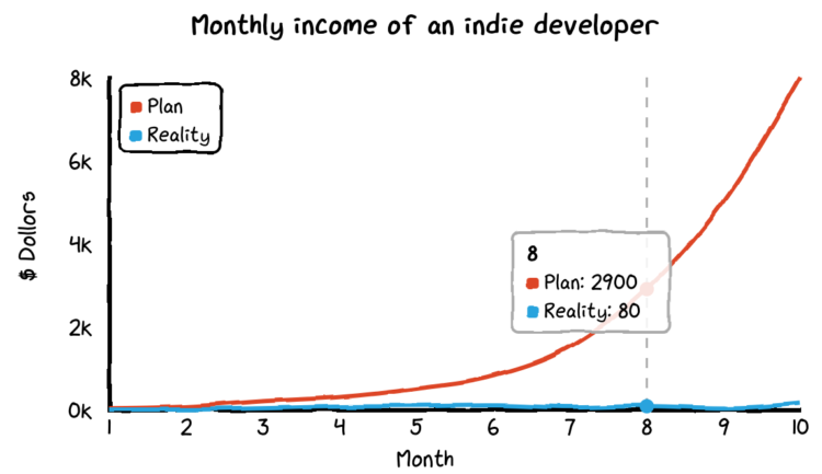
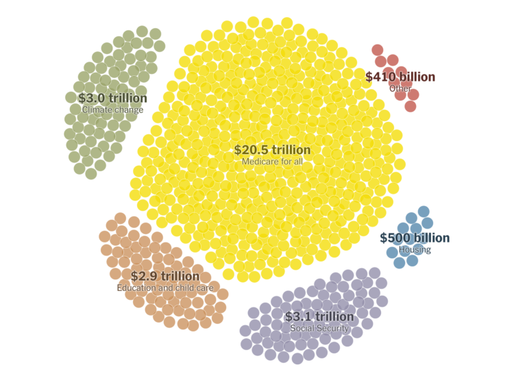
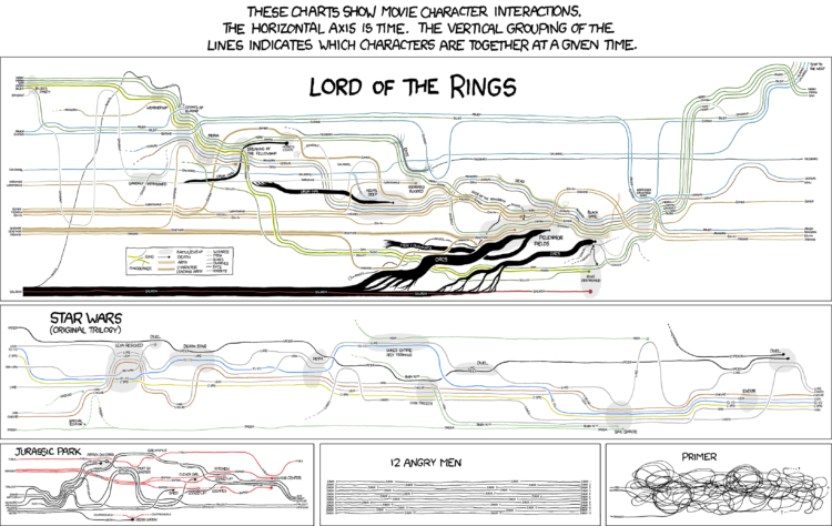
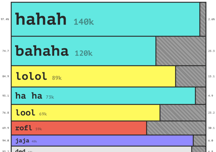
    Charts can reveal truths that we never would see otherwise, but they can also be misused to show us something in the data that doesn’t reflect reality. Alberto Cairo’s new book How Charts Lie is a guide on how to better spot the latter. It’s about reading charts more critically and understanding data better, which are necessary skills for everyone these days.

    I’m putting this at the top of my queue.

  • Visualizing the Friends sitcom

    October 25, 2019

    Topic

    Infographics  /  Friends, television

    Marion Rouayroux, a graphic designer and a big fan of the show Friends, collated a bunch of data about the sitcom. Then she visualized the data with a series of information graphics.

  • How to Use IPUMS Extraction Tools to Download Survey Data

    Almost all of my visualization projects that use data from the Census Bureau comes via IPUMS. In this guide, I provide five steps to getting the data you need using their tools.

  • Page 116 of 392
  • <
  • 1
  • ...
  • 113
  • 114
  • 115
  • 116
  • 117
  • 118
  • ...
  • 392
  • >

Analyze, visualize, and communicate data usefully, beyond the defaults.

Become a member →

Recently for Members

May 15, 2025
Step Chart, Enhanced

May 8, 2025
When the data is not what it seems

May 1, 2025
Finding the Right Charts

April 24, 2025
Visualization Tools, Datasets, and Resources – April 2025 Roundup

April 17, 2025
Breaking Out of Chart Software Defaults

Browse by Chart Type See All →

Line Map Dot Density Map Bar Chart Treemap Heatmap Bubble Chart Density Plot Moving Bubbles Bar Chart Race Scatter Plot

Browse By Topic

  • Visualization

    Seeing data

  • Maps

    Seeing geographic data

  • Infographics

    Explaining data

  • Networks

    Connecting data

  • Statistics

    Analyzing data

  • Software

    Working with data

  • Sources

    Getting data

  • Design

    Making data readable

Get the Book

Visualize This: The FlowingData Guide to Design, Visualization, and Statistics

Available now.

Order: Amazon / Bookshop

Made by FlowingData

  • The Process

  • Data Underload

  • Chart Everything

  • Guides

  • Books

  • Shop

  • About
  • Contact
  • Newsletter
  • LinkedIn
  • Instagram
  • Bluesky
  • RSS
Copyright © 2007-Present FlowingData. All rights reserved.