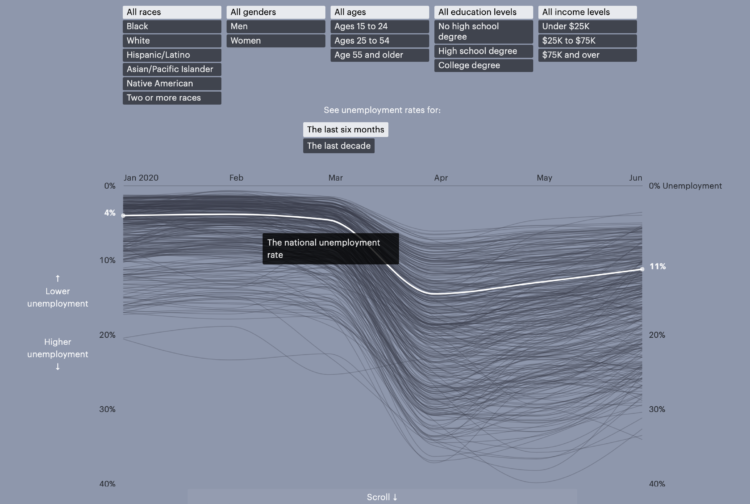
• Membership
  • Newsletter
  • Projects
  • Learning
  • About
  • Member Login
  • Wheel of emotional words, in case you’re having trouble finding the words these days

    March 20, 2020

    Topic

    Infographics  /  emotion, Geoffrey Roberts, words

    You’re probably feeling a range of emotions these days. It helps if you can express them. This emotional word wheel by Geoffrey Roberts might help:

    I work with people who have limited emotional vocabulary and as a result the intensity of their negative emotions and experiences is heightened because they can’t describe their feelings (especially their negative feelings). That’s why this list is heavily focused on negative emotions/ experiences. Being able to clearly identify how we are feeling has been shown to reduce this intensity of experience because it re-engages our rational mind.

  • Deer crossing across highway corridors

    March 20, 2020

    Topic

    Maps  /  animals, climate change, migration, Washington Post

    With the climate changing, animals will need to migrate to different areas to live, but that can be a challenge when there is a giant highway blocking the way. The Washington Post looks at how scientists in Wyoming are hoping to clear the path:

    “We can’t predict exactly what the impacts of climate change are going to be, or what species are going to be impacted,” said Hall Sawyer, a research biologist at Western Ecosystems Technology. “We do know one fundamental truth: That if we can keep this landscape connected, improve that permeability, they’ll be better off.”

  • Coronavirus Explained and What You Should Do

    March 20, 2020

    Topic

    Infographics  /  coronavirus, Kurzgesagt

    Kurzgesagt, which make videos to explain complex and abstract concepts in an understandable way, explain the coronavirus and what you should do. Spoiler alert: wash your hands and keep your distance.

    The entire state of California just went full on stay-at-home. I hope it works.

  • How washing your hands for 20 seconds does the trick

    March 19, 2020

    Topic

    Infographics  /  coronavirus, handwash, Vox

    Vox used a lotion that mimics viruses to demonstrate the power of washing your hands for twenty seconds:

    [arve url=”https://www.youtube.com/watch?v=-LKVUarhtvE” loop=”no” muted=”no” /]

  • Restaurant struggles

    March 19, 2020

    Topic

    Data Sources  /  coronavirus, OpenTable, restaurant

    The restaurant industry is taking a big hit right now, as most people are staying put at home. OpenTable provides a downloadable dataset to show how much restaurant dining is down:

    This data shows year-over-year seated diners at restaurants on the OpenTable network across all channels: online reservations, phone reservations, and walk-ins. For year-over-year comparisons by day, we compare to the same day of the week from the same week in the previous year. For example, we’d compare Tuesday of week 11 in 2020 to Tuesday of week 11 in 2019. Only states or cities with 50+ restaurants in the sample are included. All restaurants on the OpenTable network in either period are included.

    It’s red all the way down. Support your local businesses the best you can.

  • Members Only

    Simulating the Unknown; Working From Home – The Process 081

    March 19, 2020

    Topic

    The Process  /  coronavirus, simulation

    We don’t know what’s going to happen in the future, but we can look at what we do know and make our best guess.

  • Hospital bed occupancy

    March 19, 2020

    Topic

    Maps  /  bed, coronavirus, hospital, Upshot

    Using estimates from the Harvard Global Health Institute, The Upshot mapped what hospital bed occupancy might look like across the country if we don’t make changes now:

    “If we don’t make substantial changes, both in spreading the disease over time and expanding capacity, we’re going to run out of hospital beds,” said Dr. Ashish Jha, the director of the Harvard Global Health Institute, which produced the estimates. “And in that instance, we will not be able to take care of critically ill people, and people will die.”

  • Understanding data and statistics in the medical literature

    March 18, 2020

    Topic

    Statistics  /  academic, book

    Jeffrey Leek, Lucy D’Agostino McGowan, and Elizabeth Matsui have a free/ pay-what-you-want book on understanding data and statistics in the medical literature:

    Whether you are a medical student reading their first journal article or a healthcare professional trying to use the latest research to improve patient care, understanding data and statistics has never been more fundamental for extracting accurate information from the medical literature. This is a high-level, introduction to the concepts you need to know. It is targeted at busy students and professionals, and therefore efficient, with short lessons that can be completed in 5 to 10 minutes, with the whole course-time totaling around 4 hours. We leave out the mathematical detail and focus on the conceptual ideas. Anyone can pick this course up and gain a better understanding of the medical literature.

    We’re probably going to see a lot of research come out over the next weeks and months, and it’s more important than ever to understand the results and distill what it actually means. If anything, it might help you explain the current situation to others.

  • How to Flatten the Curve, a Social Distancing Simulation and Tutorial

    Using R, we look at how your decreased interaction with others can help slow the spread of infectious diseases.

  • Lagging coronavirus testing in the US

    March 17, 2020

    Topic

    Infographics  /  coronavirus, New York Times, testing

    Coronavirus testing in the United States has been a slow process to say the least. The New York Times shows how test counts contrast against other countries. There’s some catching up to do.

  • Possible coronavirus deaths compared against other causes

    March 16, 2020

    Topic

    Statistics  /  coronavirus, mortality, uncertainty, Upshot

    Based on estimates from public health researcher James Lawler, The Upshot shows the range of coronavirus deaths, given variable infection and fatality rate. Adjust with the sliders and see how the death count (over a year) compares against other major causes of death:

    Dr. Lawler’s estimate, 480,000 deaths, is higher than the number who die in a year from dementia, emphysema, stroke or diabetes. There are only two causes of death that kill more Americans: cancer, which kills just under 600,000 in a year, and heart disease, which kills around 650,000.

    A coronavirus death toll near the top of the C.D.C. range (1.7 million) would mean more deaths from the disease than the number of Americans typically killed by cancer and heart disease put together.

    Can we all agree now that brushing off coronavirus by floating annual flu numbers is a bad comparison? The most worrisome part of the data we have is the uncertainty and then the range of possibilities that come out of that uncertainty.

  • Simulations for virus spread with social distancing

    March 15, 2020

    Topic

    Infographics  /  coronavirus, Harry Stevens, simulation, social distancing, Washington Post

    Social distancing is the game plan these days. Try to stay at home and avoid contact with others as much as you can. But why? For The Washington Post, Harry Stevens used simplified simulations of an imaginary virus to show how social distancing can flatten the curve.

  • Change in foot traffic in outbreak cities

    March 13, 2020

    Topic

    Infographics  /  coronavirus, Economist, Google, traffic

    From The Economist, this chart shows the (mostly) decrease in foot traffic in major cities with coronavirus outbreaks. It’s based on data scraped from that section in Google Maps that shows how busy a location is, which I’m kind of surprised the Google limits allowed for. See James Fransham’s thread for more details on their process.

  • Coronavirus, a Visual Rundown – The Process 080

    March 12, 2020

    Topic

    The Process  /  coronavirus

    This issue of The Process is public.

    Hi,

    I don’t know about you, but I’ve been finding it hard to concentrate the past week or so. I keep getting guidelines on washing hands and reassurances from the kids’ school that everything is sanitized multiple times per day. There are empty shelves at the stores with toilet paper and hand sanitizer. It all just feels very uneasy.

    And, as I’m sure you heard, the World Health Organization classified Covid-19 as a pandemic. Naturally, I continued voraciously consuming information about the coronavirus. Here’s a rundown of the useful visuals that have crossed my way. They didn’t help with the uneasiness, but they at least provide a window into what’s happening.

    Read More

  • A view of the coronavirus outbreak through data

    March 12, 2020

    Topic

    Statistical Visualization  /  coronavirus, Our World in Data

    There’s a lot of figures and numbers floating around about the coronavirus disease. Some conflict with each other and some are from less trustworthy sources. It’s getting tough to filter through. So Our World in Data, which typically offers a view of global progress, has been compiling research and data with links to its sources:

    Most of our work focuses on established problems, for which we can refer to well-established research and data.

    COVID-19 is different. All data and research on the virus is preliminary; researchers are rapidly learning more about a new and evolving problem. It is certain that the research we present here will be revised in the future. But based on our mission we feel it is our role to present clearly what the current research and data tells us about this emerging problem and especially provide an understanding of what can and cannot be said based on this available knowledge.

  • How gears work

    March 12, 2020

    Topic

    Infographics  /  Bartosz Ciechanowski, gears, physics

    Bartosz Ciechanowski took a deep dive into how gears work and the physics behind the movement with a series of graphics and interactives:

    I’ve always been fascinated by mechanical gears. There is something captivating about the way their teeth come together to create a fluid, unified motion.

    In this blog post I’d like to look at these simple machines up close. I’ll explain how gears affect the properties of rotational motion and how the shape of their teeth is way more sophisticated than it may initially seem.

    [Thanks, @mtoconnor3]

  • Coronavirus life cycle

    March 11, 2020

    Topic

    Infographics  /  Carl Zimmer, coronavirus, Jonathan Corum, life cycle, New York Times

    For The New York Times, Jonathan Corum and Carl Zimmer describe how the SARS-CoV-2 Coronavirus hijacks your cells, makes copies of itself, spreads through the body, and infects others.

    The vertical scrolling provides a clear path from beginning to end of a life cycle, and the color transitions separate various stages. Informative.

    Really wishing we could just skip to the end.

  • Map of all the trees and forests

    March 11, 2020

    Topic

    Maps  /  trees

    EarthArtAustralia mapped all of the trees and forests in the United States, based on data from researchers Hansen et al. at the University of Maryland.
    Read More

  • Visual explanation of exponential growth and epidemics

    March 10, 2020

    Topic

    Infographics  /  3Blue1Brown, math, video

    3Blue1Brown explains exponential growth and epidemics and answers the question of when the curve levels off:

  • Flatten the coronavirus curve

    March 9, 2020

    Topic

    Statistical Visualization  /  Alexander Radtke, coronavirus, curves, health care, Rosamund Pearce

    The coronavirus can possibly infect a lot more people than there are those who can provide medical care. But if we slow the spread, and there are fewer people in need of care at the same time, the difference might be less overbearing. This version of the “flatten the curve” graphic by Alexander Radtke, first made by Rosamund Pearce for The Economist, illustrates the difference in animated form.

  • Page 108 of 391
  • <
  • 1
  • ...
  • 105
  • 106
  • 107
  • 108
  • 109
  • 110
  • ...
  • 391
  • >

Analyze, visualize, and communicate data usefully, beyond the defaults.

Become a member →

Recently for Members

May 8, 2025
When the data is not what it seems

May 1, 2025
Finding the Right Charts

April 24, 2025
Visualization Tools, Datasets, and Resources – April 2025 Roundup

April 17, 2025
Breaking Out of Chart Software Defaults

April 15, 2025
Line Chart with Decorative Neon Accents

Browse by Chart Type See All →

Parallel Coordinates Pie Chart Heatmap Table Bar Chart Race Step Chart Voronoi Diagram Packed Bubble Chart Radar Chart Organogram

Browse By Topic

  • Visualization

    Seeing data

  • Maps

    Seeing geographic data

  • Infographics

    Explaining data

  • Networks

    Connecting data

  • Statistics

    Analyzing data

  • Software

    Working with data

  • Sources

    Getting data

  • Design

    Making data readable

Get the Book

Visualize This: The FlowingData Guide to Design, Visualization, and Statistics

Available now.

Order: Amazon / Bookshop

Made by FlowingData

  • The Process

  • Data Underload

  • Chart Everything

  • Guides

  • Books

  • Shop

  • About
  • Contact
  • Newsletter
  • LinkedIn
  • Instagram
  • Bluesky
  • RSS
Copyright © 2007-Present FlowingData. All rights reserved.