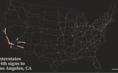
This is a fun map by Matt Dzugan. Search for a city, and…
Maps
Intuitive to look at spatial patterns and great for distributing geographic data.
-
Map of highway signs
-
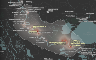
Where cancer risk is greater due to air pollution
Based on five years of data from EPA models, ProPublica mapped areas in…
-
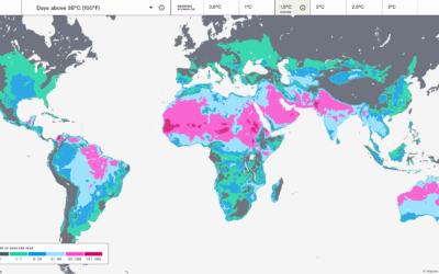
Mapping the probable heat around the world
Earth is getting warmer, and the previously abstract concept seems to grow more…
-
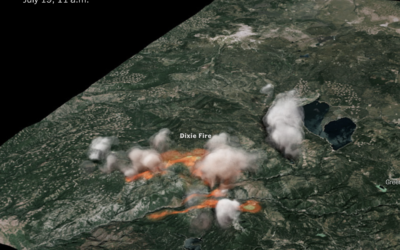
3-D rendering of Dixie fire smoke clouds
The New York Times used radar data to create a 3-D model of…
-
Search every USPS mail route
I’m not sure how long this has been around, but the USPS has…
-
Reducing methane to slow climate change
We often hear about increased CO2 in the context of global warming. Hayley…
-
Mapping climate change in the Arctic
UnstableGround is a project from the Woodwell Climate Research Center that focuses on…
-
Black neighborhoods split by highways
Rachael Dottle, Laura Bliss and Pablo Robles for Bloomberg on how urban highways…
-
Atlas of the Invisible
James Cheshire and Oliver Uberti teamed up for another book of maps, Atlas…
-
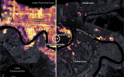
New Orleans power outage seen via satellite imagery
After Hurricane Ida, New Orleans experienced power outages. The NASA Earth Observatory show…
-
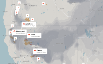
Tracking wildfires in the west
Wildfires continue to burn in the western United States. The New York Times…
-
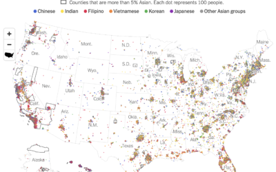
Diversity within the Asian population
Robert Gebeloff, Denise Lu and Miriam Jordan for The New York Times looked…
-
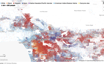
Race and ethnicity map of dots
CNN goes with the dot density map for their first pass on the…
-
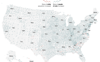
Shift in white population vs. people of color
The New York Times go with the angled arrows to show the shifts…
-
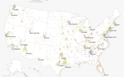
Maps of racial population change
Using their peaks and valleys metaphor, The Washington Post shows the shift in…
-
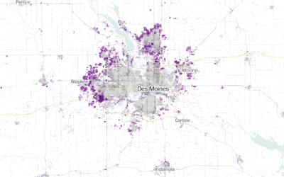
Where America is expanding in developed areas
Zach Levitt and Jess Eng for The Washington Post mapped newly developed areas…
-
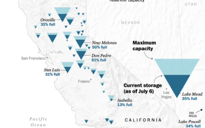
Map of drying reservoirs in the west
To show water levels in California’s drying reservoirs, The Washington Post used upside…
-
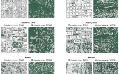
Tree canopy and income
Ian Leahy and Yaryna Serkez for NYT Opinion look at income and tree…


 Visualize This: The FlowingData Guide to Design, Visualization, and Statistics (2nd Edition)


