The Information Graphic Visionaries book series just launched on Kickstarter. Emma Willard, Florence…
Infographics
Telling stories with data and graphics.
-
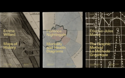
Information Graphic Visionaries, a book series
-

All the art in the Oval Office
The President of the United States chooses the art for the Oval Office,…
-

Climate change and uncertainty
[arve url=”https://youtu.be/R7FAAfK78_M” loop=”no” muted=”no” /]
In his new data-driven documentary, Neil Halloran digs… -
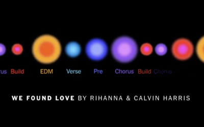
Visual deconstruction of popular songs
Nate Sloan and Charlie Harding, for NYT Opinion, look at how the structure…
-

Particles on a plane
The CDC says it’s safe to travel now if you’re vaccinated, so you…
-
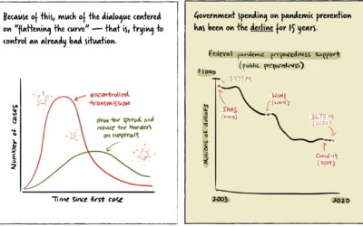
Stopping a pandemic before it starts
For Politico, Beatrice Jin provides an illustrated guide on stopping a pandemic before…
-
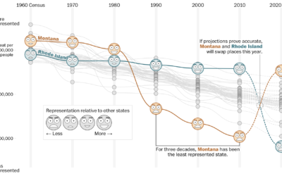
How your state might lose or gain representation with Census count
Harry Stevens, Tara Bahrampour and Ted Mellnik for The Washington Post look at…
-

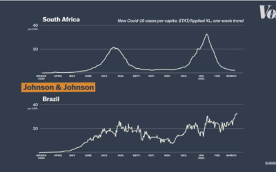
Visualizing risk of Johnson & Johnson vaccine side effect
As the Johnson & Johnson vaccine pauses in the United States, Philip Bump…
-
Vaccine efficacy rates explained
Vox explains efficacy rates and why the best vaccine is the one you…
-
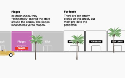
Stores that closed on famous shopping streets
Pre-pandemic, we walked around shopping areas casually browsing, but a lot of retail…
-
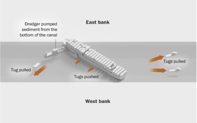
How the Ever Given got unstuck
The Washington Post illustrated how the Ever Given got stuck and was freed…
-
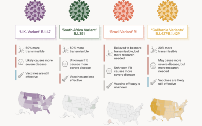
Coronavirus variant tracker
For Axios, Will Chase, with illustrations by Brendan Lynch, provides the current status…
-
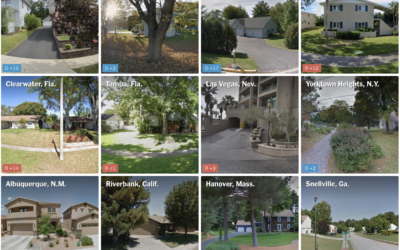
Guess who the neighborhood voted for
NYT’s The Upshot has a quiz that puts you in a neighborhood via…
-
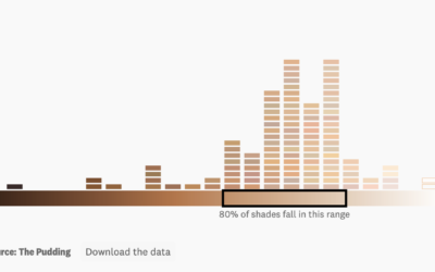
Analysis of color names used with makeup
For The Pudding, Ofunne Amaka and Amber Thomas looked at shades, words, and…
-

What if a giant banana was orbiting Earth
yeti dynamics imagined if a giant banana were orbiting Earth from the same…
-
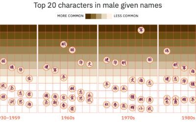
Evolution of Chinese names
For Kontinentalist, Isabella Chua took a dive into the evolution of Chinese names:…
-
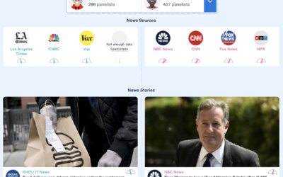
Facebook feed comparison between groups
As part of their Citizen Browser project to inspect Facebook, The Markup shows…
-
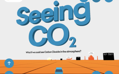
Seeing CO2 is a playable data visualization
Seeing CO2, by design studio Extraordinary Facility, is a playable data visualization that…
Recently for Members
Browse by Chart Type See All →


Browse By Topic
Get the Book
 Visualize This: The FlowingData Guide to Design, Visualization, and Statistics
 Visualize This: The FlowingData Guide to Design, Visualization, and Statistics
Available now.