The R site has a new face. It looked dated for years —…
Software
Programs and online applications to help you make use of data.
-
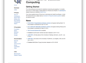
R site updated
-
rvest: R package to scrape web data
Inspired by the Python libraries RoboBrowser and BeautifulSoup, the rvest package by Hadley…
-
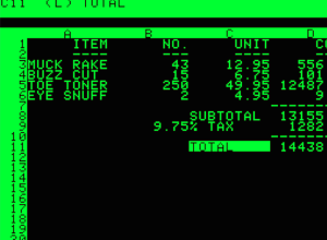
Spreadsheets for life
Planet Money goes back to a 1984 article by Steven Levy that discusses…
-

Convert geographic data to 3-D models for printing
This seems like fun. The NodeJS package shp2stl by Doug McCune lets you…
-
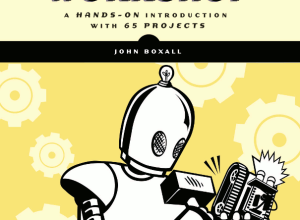
Arduino Workshop, a good book for getting started
I started working through Arduino Workshop by John Boxall over the holidays, and…
-

Rising R usage in the sciences
R continues its growth, and usage in the sciences is no exception. Nature…
-
Chart data quickly with open source Charted
Charted is a tool used internally at Medium that they recently released into…
-

Easier online choropleth maps with Landline
Despite the frequent use of choropleth maps online, they’re still kind of tricky…
-
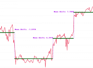
Breakout detection in R
Say you have time series data and you want to detect significant changes,…
-
Ditch Excel and format your data with csvkit
I thought I linked to csvkit a while ago, but apparently not. If…
-
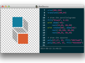
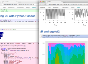
PlotDevice: Draw with Python
You’ve been able to visualize data with Python for a while, but Mac…
-
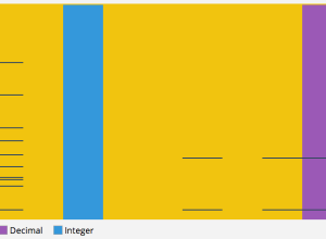
CSV Fingerprint: Spot errors in your data at a glance
You get your CSV file, snuggle under your blanket with a glass of…
-
Vector maps on the web with Mapbox GL
Online mapping just got an upgrade:
Announcing Mapbox GL JS — a fast… -

Accessible Web visuals and code with p5.js →
Visualization on the Web can be tricky for those unfamiliar with code. The…
-
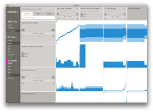
Mirador: A tool to help you find correlations in complex datasets
Mirador, a collaborative effort led by Andrés Colubri from Fathom Information Design, is…
-

R meme generator
Nobody asked for it, so you got it. The meme package for R…
-
Beaker allows data exploration in various languages
Currently in beta, Beaker lets you work and experiment with data with different…
-
Responsive data tables
Alyson Hurt for NPR Visuals describes how they make responsive data tables for…
-
Optimizing your R code
Hadley Wickham offers a detailed, practical guide to finding and removing the major…
-
Create a barebones R package from scratch
While we’re on an R kick, Hilary Parker described how to create an…
Recently for Members
Second Edition
 Visualize This: The FlowingData Guide to Design, Visualization, and Statistics (2nd Edition)
 Visualize This: The FlowingData Guide to Design, Visualization, and Statistics (2nd Edition)
New tools, refined process.
Browse by Chart Type See All →


