Using data from NOAA, Krishna Karra and Tim Wallace for The New York…
Nathan Yau
-
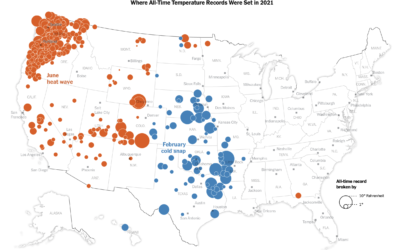
All-time temperature records broken in 2021
-
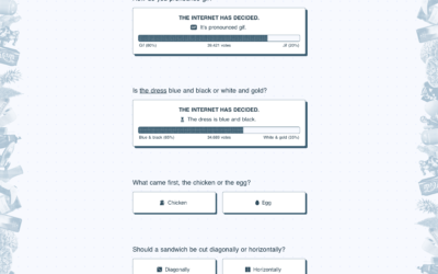
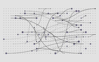
Settling all the internet debates in one go with a bunch of polling
The internet was once this fun place where people had goofy debates about…
-
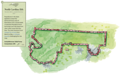
Play miniature golf, learn about congressional redistricting
Congressional redistricting and gerrymandering are important topics, because they can directly change election…
-

Scale of the bigger, more detailed universe
We’ve learned more about the universe since Charles and Ray Eames produced Powers…
-

Powers of Ten
The Powers of Ten by Charles and Ray Eames from 1977 shows the…
-
Members Only

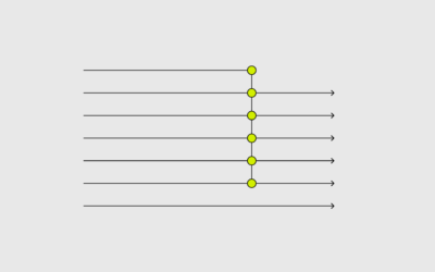
A Quick and Easy Way to Make Spiral Charts in R
Now that we’ve discovered another way to annoy chart snobs, here’s how you can make your own spirals.
-
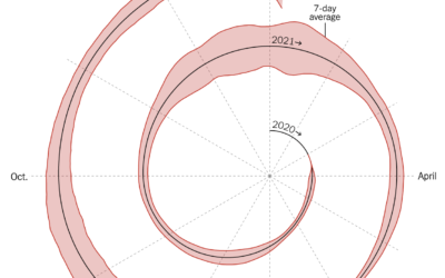
Spiral graph to show Covid-19 cases
This spiralized chart by Gus Wezerek and Sara Chodosh for NYT Opinion has…
-

Four decades of oceanic wave moments, as a surfing game
Surf is a data-based game by Andy Bergmann that lets you move across…
-
Members Only
Finding New Visualization Tools for a New Point of View – The Process 171
It’s time to bask in the joys of knowing nothing again.
-

Scale of black holes
I’m not sure there’s any way to really understand the scale of the…
-
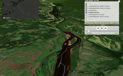
Drop rain anywhere in the world and see where it ends up
One of my favorites of the year, Sam Learner’s River Runner shows you…
-
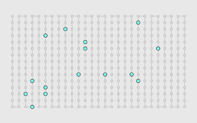
Analysis of Facebook groups before January 6
The Washington Post and ProPublica analyzed Facebook group posts that disputed election results:…
-
What the omicron numbers tell us and do not tell us
May Louise Kelly for NPR spoke briefly with biostatistics professor Natalie Dean on…
-
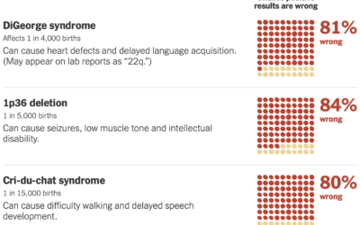
False positives with prenatal tests for rare conditions
Sarah Kliff and Aatish Bhatia for NYT’s The Upshot look at the uncertainty…
-
Best Data Visualization Projects of 2021
I looked back and picked my favorite projects for 2021. It was a long year.
-
Members Only
Visualization Tools and Resources, December 2021 Roundup
In the last roundup of 2021, here’s the good stuff for December.
-

Church of the 95% Confidence Interval
This is Hallgrímskirkja, a church in Reykjavík, Iceland. It will now also be…
-
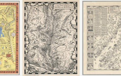
David Rumsey Map Center, cataloging historical works
The David Rumsey Map Center at Stanford houses hundreds of thousands of maps…
-
Anonymized data is rarely anonymous
Justin Sherman for Wired points out the farce that is anonymized data:
Data… -
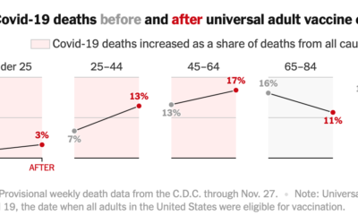
Covid-19 mortality before and after vaccine eligibility
Denise Lu and Albert Sun for The New York Times show the shifts…
Recently for Members
Second Edition
 Visualize This: The FlowingData Guide to Design, Visualization, and Statistics (2nd Edition)
 Visualize This: The FlowingData Guide to Design, Visualization, and Statistics (2nd Edition)
New tools, refined process.
Browse by Chart Type See All →


