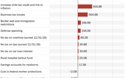
The Washington Post starts with a bar chart to show the major changes…
Nathan Yau
-
Overview of the GOP bill, a bar chart
-
Cost and savings for each item in the GOP bill
NYT’s the Upshot has a running list of the items in the bill…
-
Effects of the Republican bill on your taxes
The tax bill, that seems to be on its way to passing, will…
-
Illustrated fears about AI-generated art
Artist Christoph Niemann chimed in for the New York Times about his complicated…
-
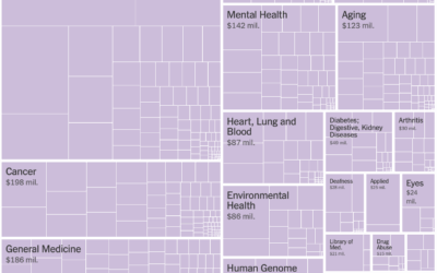
Harvard’s $2.6b of grants canceled by the government
For NYT’s the Upshot, Emily Badger, Aatish Bhatia, and Ethan Singer accounted for…
-
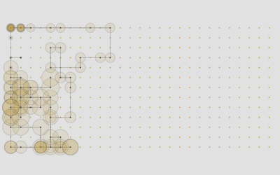
Matching potential partners based on browser history
Ideally, your romantic partner for life has similar interests, hopes, dreams, and browsing…
-
Members Only
Visualization Tools and Learning Resources, June 2025 Roundup
This is the good stuff for June: tools to use, datasets to analyze, and resources to learn from.
-
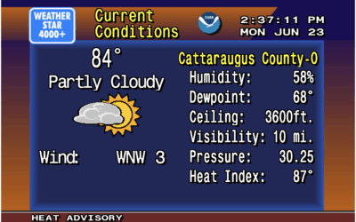
Weather displayed as vintage 1990s forecast on the Weather Channel
There was a time when you tuned in to the Weather Channel on…
-
Rubin Observatory releases first imagery of the night sky at enormous scale
The Vera C. Rubin Observatory, jointly funded by the National Science Foundation and…
-
Depth of bunker-buster bombs
To show how deep bunker-buster bombs penetrate the ground, the New York…
-
Autism definition changed, which led to rise in diagnoses
Allen Frances, a psychiatrist who chaired the group to update the Diagnostic and…
-
Satellite imagery shows avoided nuclear reactors in Iran
Jonathan Tirone, reporting for Bloomberg:
Notably absent from the latest International Atomic Energy… -
Smart glasses that track activity, emotion, and what you eat
For Tom’s Guide, Jason England reviews smart glasses by Emteq, which are equipped…
-
Feelings when strangers talk for 30 minutes
For the Pudding, Alvin Chang uses the CANDOR corpus to explore our feelings…
-
Members Only
Making Data Relatable
Communicate data so that more people care and fewer glaze over and fall into a deep mental slumber.
-
As temperatures rise, how much turbulence to expect on your flight
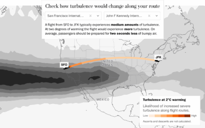
With temperatures rising, we must prepare for how everyday life could change, other…
-
Relationships outside an appropriate age range
People tend to marry or partner with those closer to their age. However, some venture outside the typical range.
-
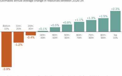
Republican bill’s effects on household income, by income group
The bill proposed by the current administration affects incomes of the poor and…
-
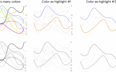
Design suggestions to make more accessible visualizations
Making charts that are accessible to those with visual difficulties might seem like…
-
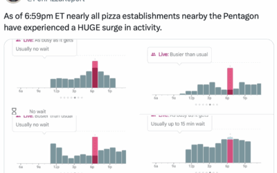
Pizza activity spikes just before reports of Israel attacking Iran
The Pentagon Pizza Report tracks pizza place activity near the Pentagon. From the…








 Visualize This: The FlowingData Guide to Design, Visualization, and Statistics (2nd Edition)


