Eli Holder shows how he split his freelance time across various projects and…
Nathan Yau
-
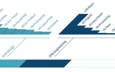
Time splits from a visualization freelancer
-

Cancer and statistics
Hannah Fry works with statistics and risk, but her perspective changed when she…
-
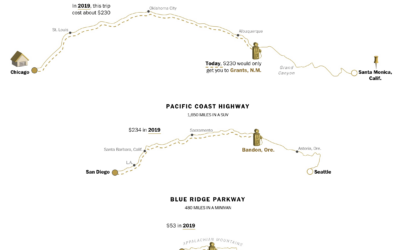
Calculating the new cost of your summer road trip
With gas prices a lot higher than usual, Júlia Ledur, Leslie Shapiro, and…
-
Members Only

Three Questions to Visualize Data Effectively
Answer the questions. Produce more focused and useful charts.
-
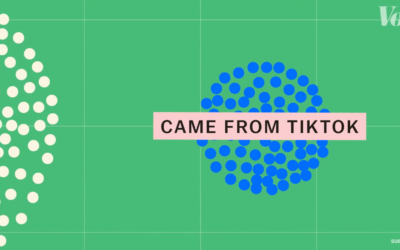
Examination of songs after virality on TikTok
Vox, in collaboration with The Pudding, looked at what happens when a song…
-
Catching students cheating with R
Matthew Crump, a psychology professor who discovered high volume cheating in his class…
-
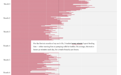
Cost of breastfeeding, seen in self-tracked data
There are baby formula shortages in the United States. A criticism from some…
-
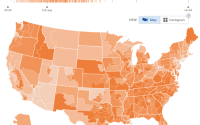
Interest levels for political issues mapped
To estimate public interest in the many political issues across the United States,…
-
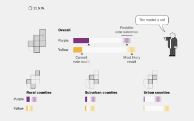
Election modeling explained
In election reporting, there’s a gap between real-time results and final results, so…
-
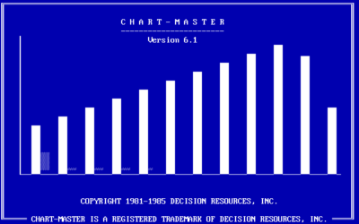
Charting software that pre-dates Excel
RJ Andrews digs up the PC archives of charting software. Scrolling through the…
-
Members Only
Visualization Tools and Learning Resources, May 2022 Roundup
Here’s the good stuff for May.
-
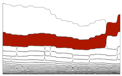
Deaths by Firearm, Compared Against Injury-Related Deaths
Among 1- to 19-year-olds, regulations decreased motor vehicle deaths, but deaths by firearms increased and became the leading mechanism in 2018.
-
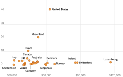
U.S. still the outlier for gun homicide rate
This chart from The New York Times, based on estimates from Our World…
-
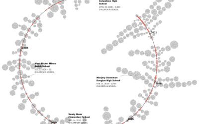
Children exposed to school shootings
The Washington Post maintains a database of school shootings (which is sad in…
-

Final texts
Alicia P.Q. Wittmeyer, for NYT Opinion, approached the one-million mark for Covid deaths…
-
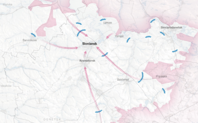
Shrinking war mapped
The war in Ukraine continues, but the scale and objects appear to have…
-

Generative sea creatures
Cindermedusae by Marcin Ignac is “a generative encyclopedia of imaginary sea creatures.” I’m…
-
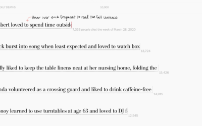
Lives cut short by Covid
Alyssa Fowers and Leslie Shapiro, for The Washington Post, used the stories of…
-
Members Only

This Time With Purpose
Without purpose, there isn’t a whole lot to grasp on.
-

Nuclear winter explained visually
Neil Halloran, known for his documentary films that lean strongly on data visualization,…
Recently for Members
Second Edition
 Visualize This: The FlowingData Guide to Design, Visualization, and Statistics (2nd Edition)
 Visualize This: The FlowingData Guide to Design, Visualization, and Statistics (2nd Edition)
New tools, refined process.
Browse by Chart Type See All →


