There are many tools, which makes it tempting to learn them all. Instead, learn one tool really well and the logic carries over to the others.
Nathan Yau
-
Members Only
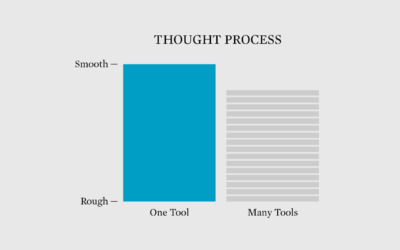
Learning to Use One Visualization Tool Really Well
-
Fonts primer
The Washington Post provides an introduction to fonts with mini-quizzes and straightforward examples.…
-
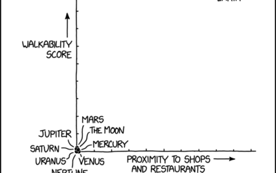
xkcd: Real estate analysis
xkcd provides the analysis we all need. I can’t believe Jupiter scored so…
-

Competitive hot dog eating requirements
Nathan’s Famous hot dog eating contest, so gross to watch but impossible to…
-
Mosaic, a framework for scalable and linked visualization
From the University of Washington Interactive Data Lab, Mosaic is a research project…
-
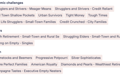
Oddly specific ad profiles
Advertising funds a big chunk of the web, but for advertisers to continue…
-
Members Only

Visualization Tools and Learning Resources, June 2023 Roundup
Here’s the good stuff for June.
-
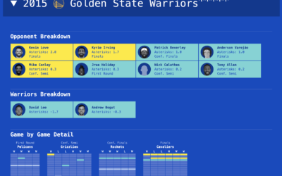
Astericking NBA champions
It seems to have grown more common for basketball fans to complain that…
-

Noise and health
The New York Times explores how noise impacts health:
Anyone who lives in… -

Password game requires more ridiculous rules as you play
Password rules seem to get more strict and weird over time. Neal Agarwal…
-
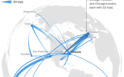
A year of flight paths, for someone with an unlimited pass
United Airlines sold a lifetime unlimited pass in 1990 for $290,000. Tom Stuker…
-
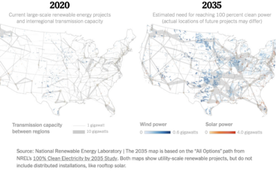
Map of electric grid required for cleaner energy
To power the United States with more clean energy, you might think it’s…
-

Crochet lake map
Andrew Hahn crocheted a map of Lake Mendota in Wisconsin. Each stitch represents…
-
Members Only
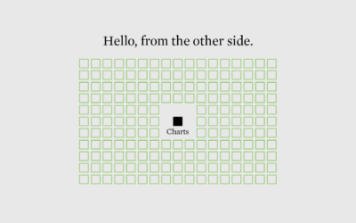
Chart Practice: Branch Out Beyond the Visual Bits
Learn more about your data and have more to visualize.
-

An interactive guide to color and contrast
Color and contrast choices often are a product of personal preferences, but you…
-
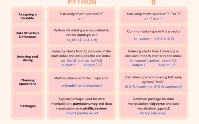
Switching from Python to R
If you’re looking to switch or just want to expand your skills, this…
-
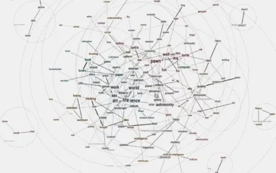
Friend simulation system, with ChatGPT
Philippe Vandenbroeck and Santiago Ortiz were curious about a system that incorporated knowledge…
-

To make electric vehicle batteries, China must be involved
For The New York Times, Agnes Chang and Keith Bradsher ask if it’s…
-
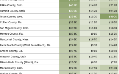
Where people are moving in the U.S.
Based on migration data recently released by the IRS, Nami Sumida for the…
-
Members Only
Chart Practice: Changing the Audience
Learn about who is looking at your work and how they interpret it.
Recently for Members
Second Edition
 Visualize This: The FlowingData Guide to Design, Visualization, and Statistics (2nd Edition)
 Visualize This: The FlowingData Guide to Design, Visualization, and Statistics (2nd Edition)
New tools, refined process.
Browse by Chart Type See All →


