For Financial Times, Sam Learner, Oliver Roeder, and Irene de la Torre Arenas…
Nathan Yau
-
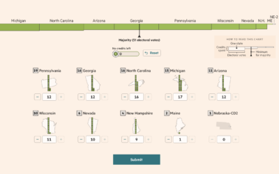
Election game to win the White House against other readers
-
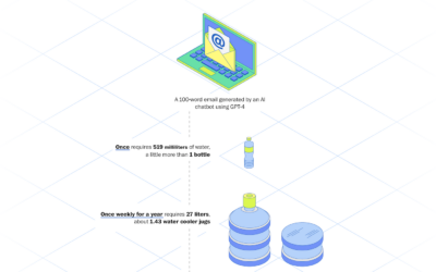
Energy used to generate an email with AI
For The Washington Post, Pranshu Verma and Shelly Tan illustrate the scale of…
-
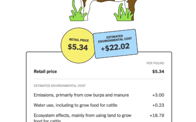
Environmental cost of food
The New York Times highlights the work of True Price Foundation, a group…
-
Members Only
How to Map with Contour Lines and GeoTIFF in R
GeoTIFF data can provide high granularity but make it hard to see patterns when data is sparse. Contour lines provide an aggregated view that makes patterns easier to see.
-
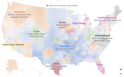
Grocery owner territories
Any day is a good day for a map of predominant commercial chains.…
-
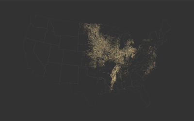
Immigration in Democrat counties
For Bloomberg, Elena Mejía and Shawn Donnan use a transitioning cartogram to show…
-
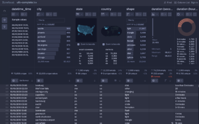
Rowboat for fast CSV exploration
Fathom Information Design, known for client visualization-centric projects, introduced Rowboat. It’s a tool…
-

Political leanings of first and last names
For The Washington Post, Andrew Van Dam and Lenny Bronner analyzed names and…
-
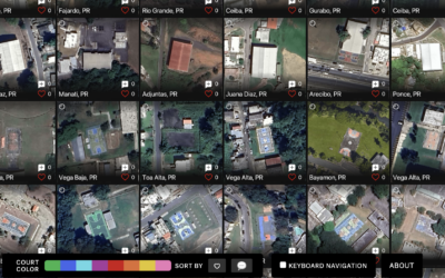
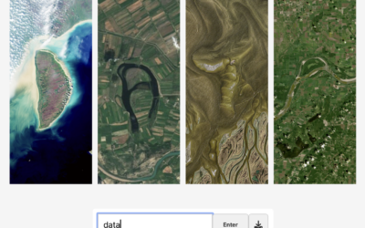
Satellite imagery of all the outdoor basketball courts
For The Pudding, Matthew Daniels extracted all the outdoor basketball courts in the…
-
Members Only

Refreshing Map Tutorials; Design Trade-Offs and Making the Wrong Choice
Visualization always involves trade-offs between audience, insights, and resources. Sometimes you make the wrong choice.
-
Retirement Ages by Country
China recently increased their retirement age to 63 for men and 55 for women. Even with the adjustment, the country is still on the lower end when compared to other countries.
-
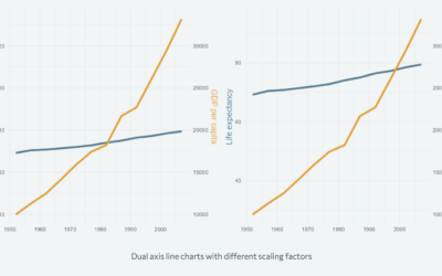
Improving axes on a chart
Nicola Rennie provides five quick tips to improve on default axis scales:
[T]he… -
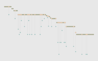
When Americans Stop Working
Normal retirement age, also known as full retirement age, is 67 years old for those born in 1960 or later. It’s common for people to stop working before this age, but they’re veering older.
-
Spell your name with satellite imagery
Here’s a fun interactive from NASA Landsat that lets you enter your name…
-
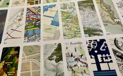
Atlas of Design, Volume 7
Every two years, since 2012, the North American Cartographic Information Society publishes Atlas…
-
Members Only

Mapping Course Updates; When the Data Speaks But Doesn’t Have Much to Say
It’s easy to look at data and assume truthiness. Numbers! Facts! Concreteness! A lot of the time that’s just not the case.
-

Fingers for scale
This is one small bit in a Reuters piece by Mariano Zafra and…
-
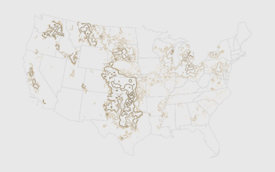
Where the Crops Grow
Since weather and land availability vary across the country, so do the crops. This is the cropland geography of the United States.
-

Making unrefined vs. refined avocado oil, illustrated
For The Washington Post, Anahad O’Connor and Aaron Steckelberg show the contrast between…
-
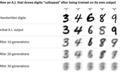
AI feedback loop to nowhere
AI models are trained on data, and better data helps make better models.…
Recently for Members
Second Edition
 Visualize This: The FlowingData Guide to Design, Visualization, and Statistics (2nd Edition)
 Visualize This: The FlowingData Guide to Design, Visualization, and Statistics (2nd Edition)
New tools, refined process.
Browse by Chart Type See All →


