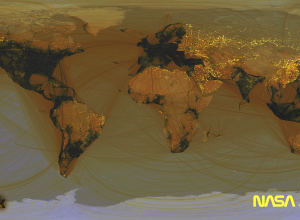
Remember the Facebook connections map from a while back? It showed digital friendships…
Nathan Yau
-
Where people don’t use Facebook
-
When data guys triumph
Cade Massey and Bob Tedeschi for The New York Times on the book,…
-
FlowingData is brought to you by…
A big thank you to the FlowingData sponsors. Without them, I would not…
-
Link
Up and Down the Ladder of Abstraction →
As part of Kill Math, Bret Victor describes the levels of interaction
-
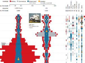
Space launches over time
With the end of NASA’s human spaceflight program, Tommy McCall and Mike Orcutt…
-
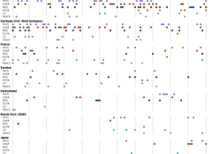
Nobel laureates by country and prize
Nobel Prizes have been awarded every year since 1901. Where are all the…
-
Link
Fatality Analysis Reporting System →
Didn’t know such extensive data on road fatalities was publicly available. Get records on individual incidents from the FTP
-
#thankyousteve
Twitter engineer Miguel Rios pays tribute to the man, the legend. Zoomed out…
-
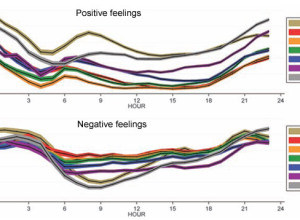
A global mood ring called Twitter
In a follow-up to their mood maps, Scott Golder and Michael Macy of…
-
Link
Scripting Inkscape with d3.js →
An integration of both tools for a smooth workflow
-
Picturing the creative process
The creative process changes by person and project, but there are obstacles and…
-
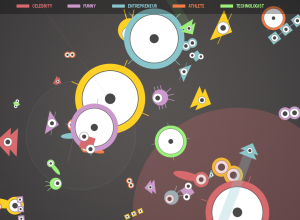
Twitter users as organisms, Tweetures
Twitter is a bustling place of tweets, retweets, and replies, and the growth…
-
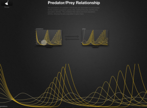
Kill Math makes math more meaningful
After a certain point in math education, like some time during high school,…
-
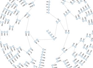
All numbers lead to one
In 1937, mathematician Lothar Collatz proposed that given the following algorithm, you will…
-
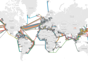
Submarine cable system connecting the world
TeleGeography maps underwater cables that connect countries and continents:
TeleGeography’s free interactive submarine… -
Link
Generating graphs of retweets and @-messages →
Quick guide using R and Gephi
-
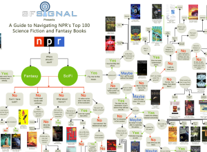
Flowchart: Which of NPR’s top 100 science fiction and fantasy books should you read?
SF Signal constructs a big arse flowchart to help you sift through NPR’s…
-
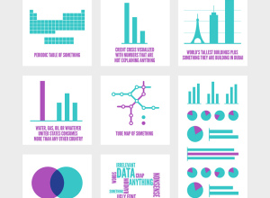
Most popular infographics generalized
Yep, still amusing. [via]…
-
The Many Words for Visualization
There are a lot of words to describe visualization and visualization-related things. It…
-
Live data wall and immersive film at THINK exhibit
The THINK exhibit from IBM just opened up at Lincoln Center in New…





 Visualize This: The FlowingData Guide to Design, Visualization, and Statistics (2nd Edition)


