By now we’ve all seen the zoomed out thumbnail view of the Mueller…
Nathan Yau
-

A more detailed view of the Mueller Report
-
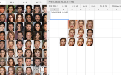
Explore generative models and latent space with a simple spreadsheet interface
Generative models can seem like a magic box where you plug in observed…
-

Redacted
The redacted version (pdf) of the Mueller report was released today. Here’s the…
-

DataCamp noindex (The Process #36)
The welcoming nature of the data community was one of the reasons I switched to Statistics. Let’s keep it that way.
-
Exploring data to form better questions
Feeding off the words of John Tukey, Roger Peng proposes a search for…
-

What happened at Notre-Dame
Notre-Dame in Paris, France was on fire. The New York Times describes what…
-
Facial recognition machine for $60
For The New York Times, Sahil Chinoy on privacy and how easy it…
-

Percentage of Households in Each Income Level
What percentage of households fall into lower-, middle-, and upper-income levels when you adjust for household size?
-
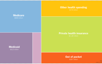
Comparing the potential cost of Medicare for everyone
For The Upshot, Josh Katz, Kevin Quealy, and Margot Sanger-Katz, consulted economists to…
-

What Qualifies as Middle-Income in Each State
The meaning of “middle-income” changes a lot depending on where you live and your household size.
-
Members Only

Shifting to Responsive Charts, Tools for Mobile (The Process #35)
In this issue I go over my somewhat delayed shift towards making charts that work in different screen sizes and the tools that work for me.
-
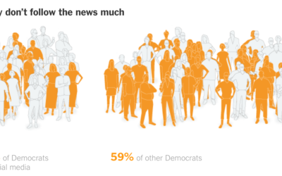
Contrasting social media Democrats to real life
As many know (I hope), what we see on social media often doesn’t…
-

All of the deaths in Game of Thrones
A few years back, The Washington Post illustrated every death in Game of…
-
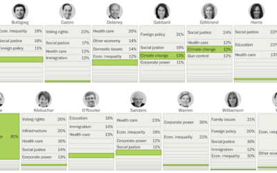
Issues Democratic hopefuls are talking about on social media
For the Washington Post, Kevin Schaul and Kevin Uhrmacher parsed the social media…
-

Bad data from a faulty sensor on the Boeing 737 Max
The New York Times illustrated what likely happened in the Ethiopian Airlines and…
-
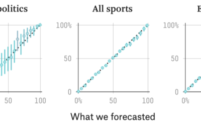
FiveThirtyEight evaluates their forecasts
FiveThirtyEight uses forecasts to attach probabilities to politics and sports, and they get…
-
Finding context for the data
Context makes data useful. Without it, it’s easy to get lost in numbers…
-
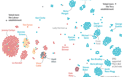
Brexit voting divisions
The Economist charted the divisions within political parties using Brexit votes as proxy.…
-

Census data downloader to reformat for humans
There is a lot of Census data. You can grab most of the…
-
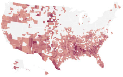
Where the IRS most likely audits
Using estimates from a study on regional bias in tax audits, ProPublica mapped…
Recently for Members
Second Edition
 Visualize This: The FlowingData Guide to Design, Visualization, and Statistics (2nd Edition)
 Visualize This: The FlowingData Guide to Design, Visualization, and Statistics (2nd Edition)
New tools, refined process.
Browse by Chart Type See All →


