The Relationship Timeline Continues to Stretch
We know that people are marrying later in life, but that’s not the only shift. The whole relationship timeline is stretching. From the first time couples meet, the timelines below show the median number of years after until relationships turned romantic, couples lived together, and eventually married.
Relationship Timelines After Meeting
Comparing the median path to marriage per decade.

Meet
Romantic
Live together
Marry
1960s
Living together and getting married often happened at the same time.
1970s
1980s
Waiting longer to get married…
1990s
2000s
One more month before turning romantic. Maybe more ways to meet now?
Now it’s common to live together for years before getting married.
2010s
0 years
1
2
3
4
5
6

Meet
Romantic
Live together
Marry
1960s
Living together and getting married often happened at the same time.
1970s
Waiting longer to get married…
1980s
1990s
2000s
One more month before turning romantic. More options?
Now it’s common to live together for years before getting married.
2010s
0
1
2
3
4
5
6
years
This is based on estimates from the most recent release of the How Couples Meet and Stay Together survey, administered by the Michael J. Rosenfeld, Reuben J. Thomas, and Sonia Hausen.
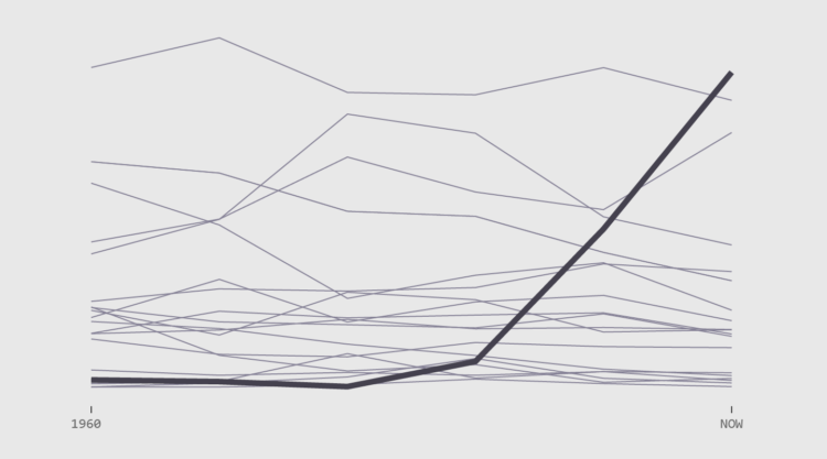
Shifts in How Couples Meet
Watch the changes over six decades. Meeting online now reigns supreme.
Notes
- The HCMST dataset continues to interest. You can download it here.
- I analyzed and charted the data in R. There’s a timeline tutorial if you’re interested.
Become a member. Support an independent site. Make great charts.
See What You GetFlowingData is made possible by supporting members. Since 2007, I, Nathan Yau, a real person, have been analyzing and visualizing data to help more people understand and appreciate it in their everyday lives.
If you liked this or want to make similar data things, please consider supporting this small corner of the internet. You get unlimited access to visualization courses, tutorials, and extra resources. Thanks. — Nathan
Chart Type Used
