Lauren Leatherby and Amy Schoenfeld Walker reporting for The New York Times:
“Every…
Nathan Yau
-
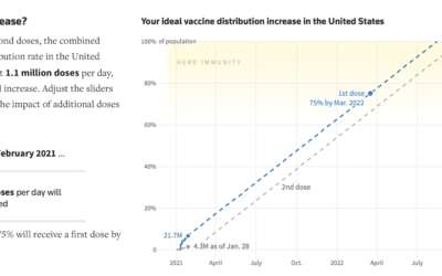
Improving vaccine distribution in all states
-
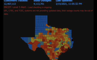
Map of power outages
PowerOutage.US keeps a running tally of outages across the United States, and it’s…
-

Data visualization crossword puzzle
This is fun. Lisa Charlotte Rost made a data visualization crossword puzzle. Print…
-
Members Only

Problem, Then Solution – Visualization Process #126
Visualization rules and best practices are generalized solutions to generalized problems. Better visualization requires a more specific view.
-
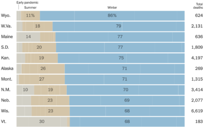
Half of coronavirus deaths were in the winter
You probably knew that coronavirus deaths have been in the several thousands per…
-

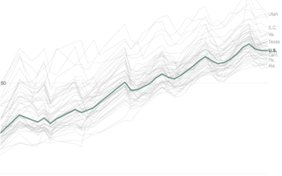
How quickly the U.S. is vaccinating vs. how long it’ll take to get back to “normal”
Vaccines provide light at the end of the tunnel, but when we finally…
-
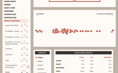
Comparing live music recordings against the studio versions
There’s something about hearing music live no matter how many times you’ve heard…
-

Tracking Capitol rioters through their mobile phone data
For NYT Opinion, Charlie Warzel and Stuart A. Thompson returned to the topic…
-

AI-generated candy hearts
Continuing her annual tradition, Janelle Shane trained various AI models to generate two-word-all-caps…
-

Pandemic Graphics Archive
The Pandemic Graphics Archive is a work-in-progress collection of floor signs and posters…
-
Members Only

Uncertain Words and Uncertain Visualization, Better Together
People’s interpretation of a chart can change if you use differents words to describe it, even if the data stays the same.
-
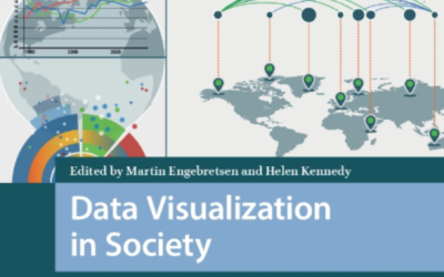
Data Visualization in Society
Data Visualization in Society, an open access book, is a collection of works…
-

Sonification of Covid-19 deaths
This is interesting:
What does 425,000 Covid deaths sound like? I was inspired…
-

Precinct-level map of 2020 election results
NYT’s The Upshot published their precinct-level map of 2020 election results. Zoom in…
-
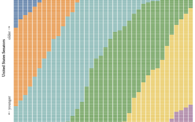
Age generations in the U.S. Senate, over time
With this straightforward unit chart, wcd.fyi shows which generation each Senate member belonged…
-

Living in Data
I’m also looking forward to Jer Thorp’s Living in Data, which comes out…
-
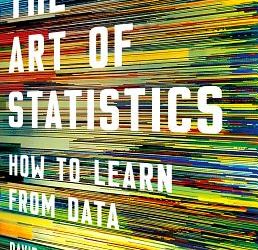
The Art of Statistics
While we’re on the topic of Statistics books for the general public, David…
-

The Data Detective
Tim Harford has a new book coming out tomorrow called The Data Detective:…
-
When the U.S. could be vaccinated
For Reuters, Feilding Cage, Chris Canipe and Prasanta Dutta made an interactive that…
-

Snowflake generator
Vivian Wu made a snowflake generator. Adjust parameters such as growth, kaleidoscoping, and…
Recently for Members
Second Edition
 Visualize This: The FlowingData Guide to Design, Visualization, and Statistics (2nd Edition)
 Visualize This: The FlowingData Guide to Design, Visualization, and Statistics (2nd Edition)
New tools, refined process.
Browse by Chart Type See All →


