Hey, it’s Nathan Yau. This is The Process, the weekly newsletter for FlowingData members. We look at the many ways to visualize data and how design choices can change a message and interpretation. I’m a little early this week. Given the topic and situation in Florida, I’m making this issue public.
-
NOAA has a viewer for their GOES (Geostationary Operational Environmental Satellite) system, which provides current imagery from space. The images update every five minutes, and you can see different bands at different times for different locations.
This is the current view for the Gulf of Mexico where you can see Hurricane Milton approaching Florida:
-
Hurricane Milton continues towards Florida, estimated to make landfall on October 9, 2024 in the evening. This means potential for storm surges, high winds, flooding, and tornadoes. Instead of trying to put this all on one map, Bloomberg put together a collection of maps to track Milton.
Each map shows potential for a threat, and as you pan one map, the rest go with it.
-
Short version: Members make FlowingData possible, and it’s a lot easier to support through membership now. There are two new plans: Deviation and the upgraded Outlier. The Outlier plan is for those who want to support the site more, and as a bonus, you get a signed copy of Visualize This (2nd ed.).
Help me keep this site running forever, and get access to courses, tutorials, and the members-only newsletter. Fun data things are in the queue.
Longer version: FlowingData is 17 years old and has been almost entirely supported by paid memberships for the past 12. An eternity in internet years. Thanks to you all.
Read More -
For The Washington Post, N. Kirkpatrick, Aaron Steckelberg, and Leslie Shapiro provide a visual guide for what to do before, during, and after a hurricane. The guide was originally published in 2023, but Hurricane Milton is headed towards Florida, expected to make landfall on Wednesday or Thursday. It just reached category 5 strength. Stay safe, Floridians.
-
Deaths by drug overdose in the United States increased sharply over the past decade, but a small shift downwards appeared over the past couple years. Just not equally everywhere. For NYT Opinion, Maia Szalavitz with graphics by Sara Chodosh and Aileen Clarke, show the changes between 2000 and 2023 and how it has varied by region.
A set of alluvial diagrams show the change in deaths per 100,000 people in the Northeast, Midwest, South, and West of the United States. The West appears to be experiencing the tail end of the rise in fentanyl.
-
In a follow-up to the 2020 project, Moritz Stefaner and Google Trends show geographic and temporal search patterns for this election year in Waves of Interest.
This site presents Google Trends data on a curated set of political topics, comprising the currently most searched political concepts in the United States, topics from Pew Research Center’s election surveys, as well as a few manual additions to account for emerging issues.
Election-related graphics tend to make me feel a bit anxious, but the smooth transitions in time and space in this set of graphics is actually kind of soothing.
-
In their ongoing series on fentanyl in the United States, Reuters illustrates the journey of fentanyl precursors hidden among billions of everyday shipments. The volume of boxes, despite various layers of security, makes it impossible to intercept all illicit materials.
There are charts blended with the illustrations that you might miss if you’re just casually browsing, such as the treemap made of boxes shown above. The style reminds me of the hidden-object illustrations in kid magazines.
-
Chenxiao Guo, a PhD candidate in geography who goes by the name Atlas, made a quick comparison between satellite images to highlight places without power due to Hurricane Helene. Blue shows the path.
-
Members Only
-
Mira Rojanasakul and Nadja Popovich, for The New York Times, mapped migration out of cities between 2020 and 2023. The dot density maps show where more people moved out than in as orange dots and the opposite in green. For many, this has meant more space and lower cost of living in exchange for moving closer to areas with higher natural disaster risk.
-
There are hundreds of occupations, and while the exact number varies by classification system, most U.S. government organizations list about 500 of them. These are the standouts.
-
Jimmy Carter, the 39th president of the United States, turned 100 years old. For The Washington Post, Hannah Dormido and Kevin Uhrmacher show how that compares the other presidents.
-
Baseball’s batting lineup has changed from what seemed to make sense to what the numbers show as optimal. Neil Paine and Michelle Pera-McGhee for The Pudding show the shifts.
No place in the lineup showcases how the game has changed more than the No. 2 slot. Remember how the second spot in the order used to be all about making contact and moving runners over? Now, the data say that your best overall hitter should hit second rather than third, as originally believed. At the No. 2 spot, they will come to the plate more often, and less frequently with two outs. This is why better overall hitters — and especially better power hitters, like Trout, Seager, and Ohtani, hit in the 2-hole more than they ever did in the past.
-
Western North Carolina got the brunt of Hurricane Helene with two feet of rain over three days and major flooding as a result. The Washington Post mapped the event.
-
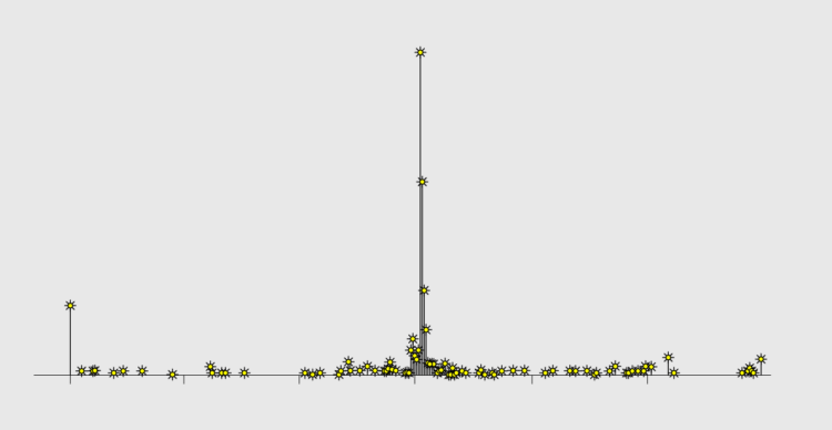
The mullet has grown popular in the Australian Football League. ABC News counted all of the long hairs.
If only I could go back in time to my eight-year-old self to tell him that the haircut his mom gave him was nothing to be embarrassed about. He was ahead of his time.
-
North Korea has been releasing thousands of trash bags into the air with balloons to land in South Korea. The bags in the air disrupt flight traffic and land in random places and on people. Reuters explains the trash, where it’s coming from, where it’s landing, and the annoyance of having bags of garbage floating over you.
I like how the story leads with floating trash balloons as you scroll. The balloons came in waves, and the number of items on the screen roughly estimates the volume of each wave.
-
As Hurricane Helene approached Florida, it grew from a tropical storm to a Category 4 hurricane. What does that mean? Amudalat Ajasa, Aaron Steckelberg, and Julie Hoban, reporting for The Washington Post, illustrate the hurricane categories with an animated model that starts peacefully and then suffers through each level.
As a Californian, I’m more familiar with earthquakes and wildfires, so this was helpful.
Helene is still moving through as of this writing, and The Post has a tracker with a projected path.
-
Members Only
-
Jed Kolko, the former Under Secretary of Commerce for Economic Affairs of the United States, discusses the challenges of estimation and recent immigration numbers from the Census Bureau:
Numerous government agencies estimate the population. Annual Census population estimates guide the allocation of federal spending and also serve as the “population controls” for essential demographic surveys. (This turns out to be a big deal. More on this, below.) These annual estimates help bridge the gap between full-count decennial censuses, and they are revised to reflect new information each year. Other agencies produce population estimates and projections for their own purposes — CBO estimates and forecasts the population as inputs into their outlook for federal spending, revenue, and deficits.
Immigration is an essential part of estimating the size and growth of the population, and the trickiest.