In a different take on showing the scale of very tiny things, Epic…
2024
-

Shrinking down to the size of an atom
-
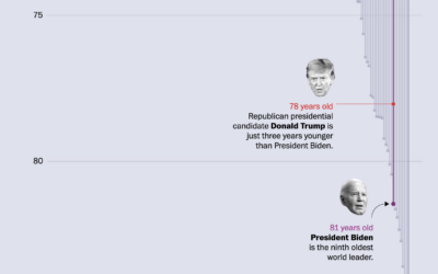
Age differences between world leaders and the populations they serve
The ages of American presidential candidates are old when compared to the ages…
-
Estimating Covid deaths
It’s impossible to know the exact number of Covid deaths worldwide, because consistent…
-
Members Only

Visualization Tools and Learning Resources, June 2024 Roundup
Here is the good stuff for the month.
-
Searching for the hardest and easiest Spelling Bee puzzels
Christopher Wolfram explains his “unnecessarily detailed analysis” of the spelling game from the…
-
Decade-Long Battle for “Yogurt” vs. “Yoghurt” on Wikipedia
After years of enthusiastic discussions, editors eventually and begrudgingly came to a conclusion.
-
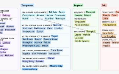
Changing climate zones of major cities
A global map of climate change can make a few degrees of rising…
-
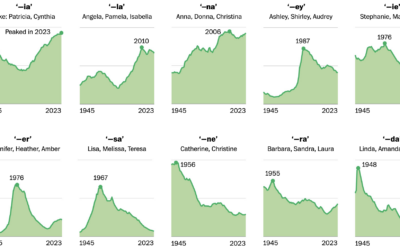
Trendy baby name sounds
For WP’s Department of Data, Daniel Wolfe analyzed baby name data with Laura…
-
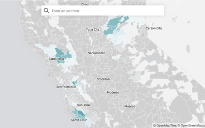
Where State Farm Insurance is dropping home policies
State Farm won’t be renewing about 30,000 policies because of high wildfire and…
-
Members Only
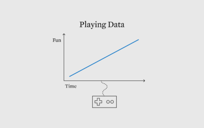
Games to Explore Data and Possibilities
Visualization and analysis is usually about minimizing uncertainty to more clearly see patterns. On the other hand, games force you to play through uncertainty.
-
Perplexity is probably stealing content
For Wired, Dhruv Mehrotra and Tim Marchman provide evidence that Perplexity, an AI-based…
-
AI-generated email from a friend
Neven Mrgan describes what it was like to get an AI-generated email from…
-
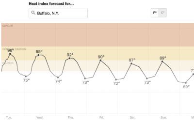
Heat tracker for the U.S.
It’s abnormally hot in a large portion of the United States, and it’s…
-
See Who is Older and Younger than You
As you get older, it might start to feel like everyone is getting younger around you. At what point are you older than the majority?
-
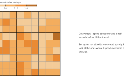
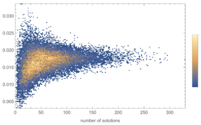
Analysis of Sudoku play patterns
Vivek Rao likes to play Sudoku, enough that he collected data on his…
-
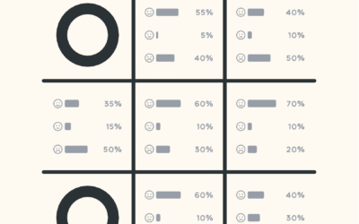
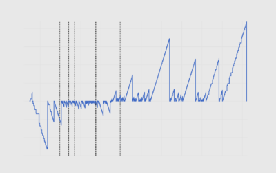
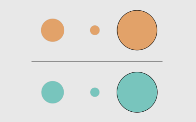
Probabilistic Tic-Tac-Toe
Thinking about life and randomness, Cameron Sun modified the classic game of Tic-Tac-Toe.…
-
Members Only
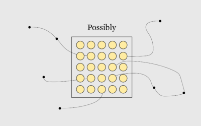
Towards Unfamiliar Data Representation
Visualization tends towards familiarity and convenience, which is useful for getting things done and reading data quickly. But the familiar is also less fun and can be stifling.
-
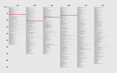
Occupation and Salary Rankings, Each Decade Since 1970
Job types changed over the years, because there were these things called computers that created occupations and shifted others. How did income change for different jobs, relative to everyone else?
-

Visualize This on storytelling with data
I talked to Cole Nussbaumer Knaflic about my early motivations, FD origins, the…
-
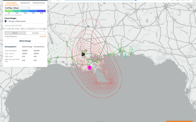
Mapping hurricane winds with avocado of uncertainty
Stamen, whose design breakdowns I always appreciate, discusses why they took a different…
Recently for Members
Second Edition
 Visualize This: The FlowingData Guide to Design, Visualization, and Statistics (2nd Edition)
 Visualize This: The FlowingData Guide to Design, Visualization, and Statistics (2nd Edition)
Browse by Chart Type See All →


