I just created a new Twitter account, and it got me to thinking…
-
17 Ways to Visualize the Twitter Universe
-
A World of Information in Data-driven Art – Not Your Grandma’s Dashboard
Wired Magazine recently did a feature on data-driven art.
The above image is… -
4 Data Visualizations That Inspired Me to Learn More
There was a time I didn’t really know what I wanted to do, but since I saw these data visualization pieces, I haven’t looked back.
-

Area Codes in Which Ludacris Claims to Have Hoes
I thought this map was amusing. As you can see, Mr. Bridges prefers…
-

Weekend Minis – Globes, Maps, and Job Opportunity
New York Talk Exchange – Illustrates the global exchange of information in real…
-
Post Something You Find Interesting to Our Facebook Group
I started a FlowingData Facebook group a couple of weeks ago, and I…
-
A World of Information – United Nations Data Just Became Accessible
For our Humanflows project, we used the United Nations Common Database for our…
-
Highlights From Journalism 3G – Symposium on Computation + Journalism
Writers and engineers came together to discuss technology’s role in journalism at the recent symposium at Georgia Tech.
-
Why Does Data Matter to Google?
Data is absolutely vital to Google’s success; without data, Google is pretty much…
-
Explore Your del.icio.us Tags and Bookmarks On 6pli
Santiago, who I met at the Visualizar workshop, forwarded me his work on…
-
How to Stop Procrastinating So that I Am Not a Bum – A Self-experiment
I waste way too much time doing completely useless stuff when I should be working. I’m ready to stop procrastinating.
-
Estimate Financial Impact of Risk and Uncertainty for a Living
I stumbled across a data table from the Social Security Administration that shows…
-
Hope Floats in Online Dating – I Want You to Want Me By Harris and Kamvar
Jonathan Harris and Sep Kamvar collaborated again in their featured piece at New…
-
Can We Improve this Graphic Showing History of Bipartisan Senate?
Some thoughts on what I think would make this graphic on the U.S. senate’s history of bipartisan politics a bit more useful.
-
Visual Website Analytics in Video Game Format
How can we use gaming to improve current data visualization techniques?
-
Talk to the New York Times Graphics Director, Steve Duenes
Everyone knows that The New York Times produces great graphics. I bet you’re…
-
IBM Visual Communications Lab and Stamen Design Are at the NYC MoMA
Congratulations to two of my most favorite visualization / design groups – IBM…
-
Welcome to FlowingData, Boing Boing Readers
Hi new FlowingData visitors. Please feel free to kick up your feet, sit back, and take a look around.
-
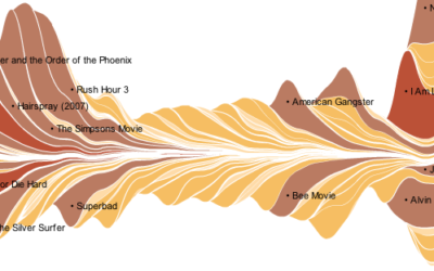
Ebb and Flow of Box Office Receipts Over Past 20 Years
The New York Times puts out another good one in this graphic for the talkies.
-

Weekend Minis – Online Video, Visualization Types, Poverty, Digital Life
For your long, relaxing weekend, enjoy some long, relaxing reading.
Recently for Members
Second Edition
 Visualize This: The FlowingData Guide to Design, Visualization, and Statistics (2nd Edition)
 Visualize This: The FlowingData Guide to Design, Visualization, and Statistics (2nd Edition)
New tools, refined process.
Browse by Chart Type See All →