Change the word ‘force’ to ‘data’ in your favorite Star Wars quotes, and you’ll suddenly understand what I mean by flowing data.
-
May the Data Be With You, Young Skywalker
-
What is Data and Why Do We Care About it So Much?
A select group of experts from several different fields were nice enough to share with me what data means to them.
-
Who’s Going to Win Super Bowl XLII?
Getting ready for the big game with chips in one hand and betting ticket in the other.
-
Weekend Minis – Government, Environment & Angry Employee
For your long-awaited Super Bowl weekend, shed some light on the government and don’t forget to backup your data.
-
Bad Statistics Leads to Poor Results and a Questionable Trial Verdict
Oxford mathematician, Peter Donnelly gives a TED talk on the common mistakes we make when interpreting Statistics.
-
NSF Science and Engineering Visualization Challenge
Achieve international glory with your scientific visualization submission.
-

Journal of Quantitative Analysis in Sports is Live
I’m quitting graduate school to become a professional sports betting fanatic.
-
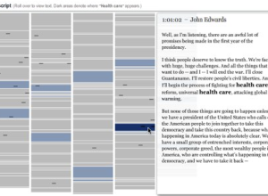
A Chat with The New York Times on Making Data More Engaging
Everybody knows about The New York Times graphics. Here are two people that their hand in a lot of it.
-
Visualization of Smiling Faces – Microsoft Live / Operation Smile
Think lots and lots of happy thoughts.
-
Weekend Minis – Maps, Motion & Resources
For relaxing and lazy weekend, have some fun with GPS and a fat list of visualization resources.
-
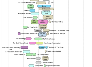
Books that Make You Dumb (Not Really)
Linking of low (and high) SAT scores and favorite books from Facebook.
-
6 Influential Datasets That Changed the Way We Think
They all revealed something we otherwise would not have seen. What data has influenced you lately?
-
Walker Tracker – A Community Site for Pedometer Fans
Tracking your foot steps with a pedometer just became social.
-
How a Trip to the Dentist Got Me Thinking About Open Data
When you’re given bad information, it’s hard not to feel cheated. Here’s what happened to me.
-

Google Decides to Host a Whole Lot of Scientific Data – Palimpsest Project
The Internet giant is set to take on terabytes of scientific data in the very near future.
-
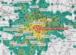
Mapping Google Access Data from (suit)men
A very pink map displaying real-time data shows us that maps can be entertaining.
-
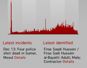
Iraq Body Count: A Human Security Project
Iraq Body Count keeps track of civilian deaths by cross checking media reports…
-
FlowingData Gets an Overhaul and a Facelift
You’ve probably already noticed (unless you’re subscribed to the feed), but FlowingData now…
-
Going Beyond Collaborative Visual Analytics with Statistics
Social data visualization is great, but what if it were coupled with quantitative analysis? Imagine the power.
-
A Primer on Information and Data Visualization
There’s a nice data visualization 101-type post over at We Make Money Not Art.
Recently for Members
Second Edition
 Visualize This: The FlowingData Guide to Design, Visualization, and Statistics (2nd Edition)
 Visualize This: The FlowingData Guide to Design, Visualization, and Statistics (2nd Edition)
New tools, refined process.
Browse by Chart Type See All →


