Get comfortable, and enjoy the computation+journalism symposium from home.
-
Live Webcast of Journalism 3G: A Symposium on Computation + Journalism
-
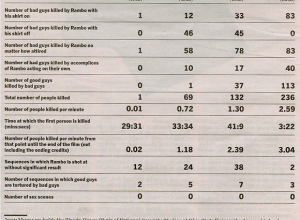
Rambo Kill Counts From Parts I, II, III, and IV
I don’t think I’ve seen a single Rambo all the way through nor…
-
What Impact Does Our Country Have on Climate Change?
BreathingEarth is an animated map that represents death rate data from September 2005…
-
Join the FlowingData Facebook Group
I just created a FlowingData Facebook group where (I hope) readers can discuss…
-
Is an Animated Transition From a Scatter Plot to a Bar Graph Effective?
Jeffrey Heer and George G. Robertson investigate the benefits of using animation in statistical graphics.
-

Putting Analysis Online With StatCrunch and Covariable [Review]
Are online statistical tools sufficient to analyze our complex datasets?
-
Grandma, Thank You For Giving Us Something to Smile About
Peace is what comes to mind when I think of my grandma.
-
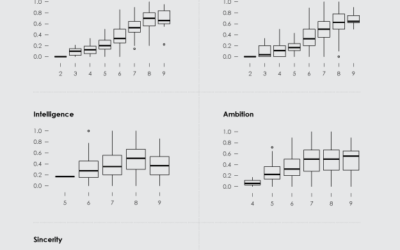
How to Read and Use a Box-and-Whisker Plot
Believe it or not, the box-and-whisker is not just a box and some whiskers.
-
Mapping Manhattan’s Skyscraper Districts Through Time
Manhattan Timeformations looks like a series of interactive schematics from a video game,…
-
Spamology From Visualizar is Available for Exploration
This spam visualization, by Irad Lee, was one of favorite projects at Visualizar.
-
Headed to Computational Journalism at Georgia Tech
Advances in News Gathering, Improving Journalism Workflow, Social Computing and Journalism, Ubiquitous Journalism.
-
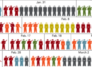
A Lesson in Recycling Chartjunk as Junk Art
In this age of abundant data, it is technically challenging to infuse graphics with as much of it as possible.
-
Understanding Data, Not Just the Realm of Scientists in Ivory Towers
This guest post is by Hadley Wickham, a Statistics PhD candidate and a…
-
Comparing Roger Clemens to Hall of Fame Pitchers
For fun, I tried graphing Clemens’ past ERAs against the ERAs for the 16 most recent hall of fame pitchers.
-
Weekend Minis – Design Paradigms, Colbert Bump, and Bullet Graphs
For your long, relaxing weekend, enjoy some visualization treats.
-
Showing Historical & Cultural Connections and Mapping Influence
This guest post is by Mike Love, and he answers my question —…
-
Increasing Data Literacy Across the General Public With Truth and Beauty
Matthew Hurst, from Microsoft Live Labs and the co-creator of BlogPulse, answers my…
-
Speed Dating Data – Attractiveness, Sincerity, Intelligence, Hobbies
What do others look for in the opposite sex? How do you measure up? Find the answers in this speed dating dataset.
-
Data Makes Reasonable Decision-making Possible
This guest post is by Andrew Gelman from Statistical Modeling, Causal Inference, and…
-

Tap Into the Wisdom of Crowds, Make Money by Predicting Future Events
There are two roles at Predictify — those who answer and those who ask — and you can do both.
Recently for Members
Second Edition
 Visualize This: The FlowingData Guide to Design, Visualization, and Statistics (2nd Edition)
 Visualize This: The FlowingData Guide to Design, Visualization, and Statistics (2nd Edition)
New tools, refined process.
Browse by Chart Type See All →