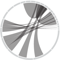
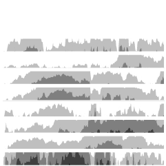
Nexus, by Ivan Kozik, lets you explore your Facebook social network and find…
-
What Interests Do Your Facebook Friends Have in Common?
-
Upgraded to WordPress 2.5 – Hopefully All Went Well
I just upgraded to WordPress 2.5. I’ve been due for an upgrade for…
-
Warning: Nerdy Waters Ahead – Baby Got Stats and Too Logit
This just might be nerdy statistics overload even for me. A group from…
-
Translating Data Into Information that Changes Us
Wondering what statistics is for? This is what.
Data are a whole lot… -
Last Chance to Win Tufte’s Visual Display of Quantitative Information
A quick reminder – there’s just three more days to put in your…
-
A Little Bit of Design Goes a Long Way With Infographics
If I’ve learned anything about designing information graphics, it’s that attention to detail…
-
Position Available for Professor of Statistics at UCLA
While we’re on the topic of what you plan to do with your…
-

What Are You Going to Do With Your PhD in Statistics?
Statistics graduate students at Columbia University are hosting a symposium on careers for…
-

Facebook Security Upgrade Rendered Useless – Private Photos Leaked
Just when you thought it was safe to upload those photos from that…
-
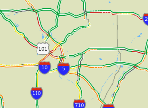
Data is Going to Change How and Where You Drive – Dash GPS Navigation
Dash, an Internet-connected GPS device, is going to change the way you drive…
-
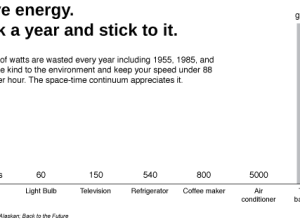
Save the Space Time Continuum – Do Not Exceed 88 Miles Per Hour
Billions of watts are wasted every year including 1955, 1985, and 2015. Be…
-
Is the New Google Visualization API Going to Limit Our Data Imagination?
Google recently released a visualization API that allows you to share embeddable visualization…
-
First Annual Applied Statistics Center Art Contest
Speaking of contests, the Applied Statistics Center at Columbia University is holding their…
-
Win a Copy of The Visual Display of Quantitative Information By Edward Tufte
FlowingData reached a long awaited milestone yesterday – 1,000+ subscribers. Thank you to…
-
21 Ways to Visualize and Explore Your Email Inbox
Can we somehow tell a meaningful story with the thousands of emails we’ve sent, received, and deleted?
-

Six Years of Piracy Data Available for Download – Shiver Me Timbers
I stumbled across this dataset covering piracy of Oscar-nominated films over the last…
-
A Self-experiment – My Mid-month Report
Two weeks ago, I vowed to stop procrastinating using two strategies:
Make a…
-
Interact With the Atlas of Electromagnetic Space
Jose Luis Vicente and Irma Vilà , in collaboration with Bestiario, have created…
-
Hello, Boing Boing Readers – Welcome to FlowingData
Hi, Boing Boing readers. Welcome to FlowingData. For the new visitors, here’s the…
-
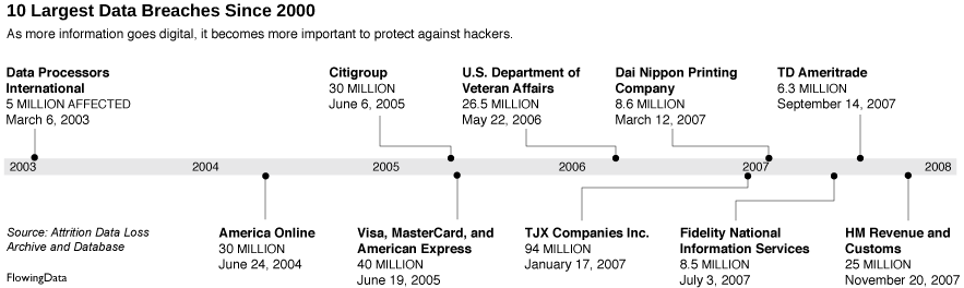
10 Largest Data Breaches Since 2000 – Millions Affected
In light of the MySpace photo breach (due to their negligence) a couple…
Recently for Members
Second Edition
 Visualize This: The FlowingData Guide to Design, Visualization, and Statistics (2nd Edition)
 Visualize This: The FlowingData Guide to Design, Visualization, and Statistics (2nd Edition)
New tools, refined process.
Browse by Chart Type See All →