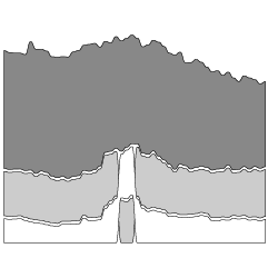
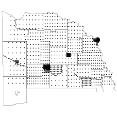
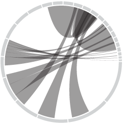
The above New York Times graphic shows where each candidate got his or…
-
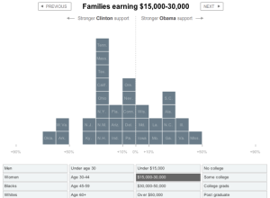
Voting Breakdown for Democratic Presidential Primaries
-

Our Non-ability to Misunderstand Statistics of Rare Events
Cory Doctorow from The Guardian writes about our inability to understand the statistics…
-
Data Visualization Gets Personal – Putting Data Into Your Hands
Want to have some fun and win an Amazon gift certificate in the…
-
Watch TED Talks in Sphere Form – TEDSphere
The Bestiario design group seems to have been busy lately. Their latest project,…
-

What Are Your Favorite Data Visualizations in Recent Memory?
It’s time for a reader discussion, open thread, etc. Today’s question is:
What… -
Find Your Dream Home (or Fantasize) With Trulia Snapshot
Trulia, the real estate search site, launched Trulia Snapshot today in collaboration with…
-
Flickr Tags and Pictures as a Universe – Tag Galaxy
Steven Wood‘s thesis project, Tag Galaxy is a beautiful piece of work to…
-
Going to the Wireless Summit in DC Tomorrow
I’m headed to Washington tomorrow for the International Summit for Community Wireless Networks.…
-
Microsoft Excel Can’t Handle Clinton and Obama’s Moola
The Internet has made it easier to donate to presidential campaigns, so much…
-
Become a FlowingData Sponsor
Do you have a product or program aimed at statisticians, computer scientists, and/or…
-
Using Mobile Phones to Understand Ourselves and Motivate Change
Mobile technology has come a long way from those foot-long phones hooked up…
-

Statistics is a Diverse Field With Different Paths of Study
It’s a focused expertise, but statistcs can be applied to a broad range of fields that produce data.
-
5 Data Visualization Dissertations Worth a Look
It’s coming to the end of the academic year, which means there are…
-
Measuring Informational Distance Between Cities
Bestiario, the group behind 6pli, recently put up their piece that maps informational…
-
U.S. Census Bureau’s 2008 Statistical Abstract – Looking at America’s Data
The U.S. Census Bureau released their 2008 Statistical Abstract, the National Data Book,…
-

The Safest Seat to Sit In On a Plane is…
Popular Mechanics did a study on where it was safest to sit on…
-
What Do You Primarily Use to Analyze and/or Visualize Data? [POLL]
In elementary school through high school, I always used Microsoft Excel for my…
-
Relaxing and Drinking On the Beach This Week
My wife and I are celebrating our one-year anniversary this week with an…
-
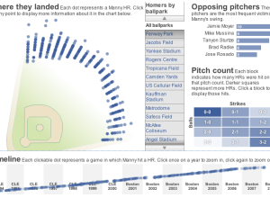
Tracking Manny Ramirez’s Hunt for 500 Homers
The Boston Globe lets readers explore home run data for the Boston Red…
-
Quickie Visualizations for Debugging
This guest post is by Rahul Bhargava, a Senior Software Engineer at nTAG…
Recently for Members
Second Edition
 Visualize This: The FlowingData Guide to Design, Visualization, and Statistics (2nd Edition)
 Visualize This: The FlowingData Guide to Design, Visualization, and Statistics (2nd Edition)
New tools, refined process.
Browse by Chart Type See All →