Apple, with an announcement that the world has been waiting for, released 3-D…
Software
Programs and online applications to help you make use of data.
-
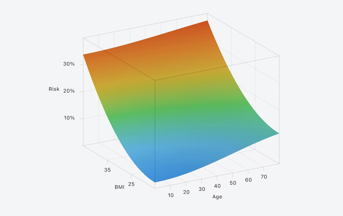
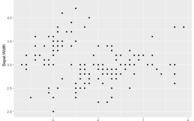
Apple introduces third dimension to Swift Charts framework
-
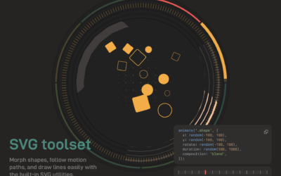
Anime.js, a JavaScript animation engine
New to me, Anime.js by Julian Garnier seems like a fun library to…
-
Access previous versions of government websites with GovWayback
You can use the Internet Archive to access historical versions, but GovWayback makes…
-
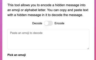
Hiding data in an emoji
Messing with how emojis are encoded, Paul Butler demonstrates how one might hide…
-
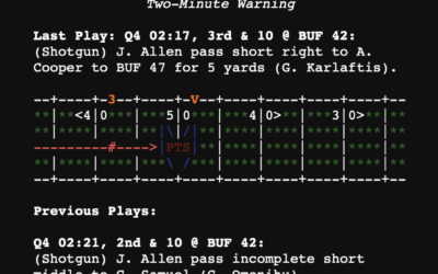
Plain text box scores
New to me, Plain Text Sports shows box scores for the major sports…
-
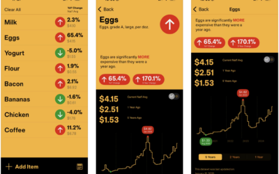
With InflataCart, your grocery list plus inflation data
If you shop at the grocery store regularly, you’ve felt prices increasing, especially…
-
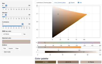
Color picker with R
As we have learned over the years, there can never be enough color-picking…
-
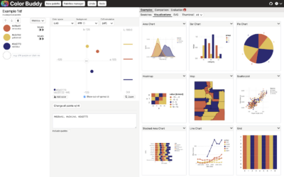
Color Buddy, a tool for building color palettes for visualization
Picking colors for visualization can be tricky, because there are infinite possibilities across…
-
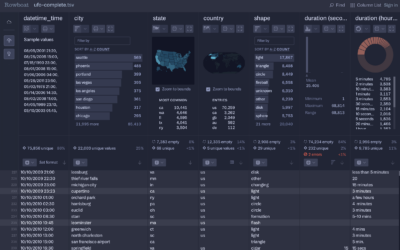
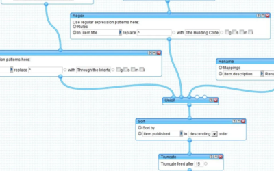
Rowboat for fast CSV exploration
Fathom Information Design, known for client visualization-centric projects, introduced Rowboat. It’s a tool…
-
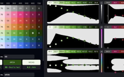
Huetone for accessible color systems
There is no shortage of color-picking tools, but it seems there can never…
-
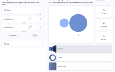
Data GIF Maker lets you make animated GIFs with data
The Data GIF Maker is a fun tool from Google that lets you…
-
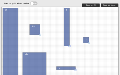
Simple tool for proportional area charts
There might be times when you want to visualize data with area, but…
-

The Nature of Code, refreshed
Daniel Shiffman, who you might know from his enthusiastic YouTube channel The Coding…
-

easystats, an R package
The easystats R package in on my to-try list.
easystats is a collection… -
BrailleR, a R package to improve access for blind users
From CRAN:
Blind users do not have access to the graphical output from… -
Catalog of AI data tools
Meant to be comprehensive more than a curated collection, the Journalist’s Toolbox AI…
-
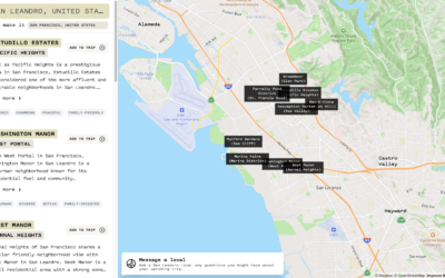
Find familiar places in new cities
If you’re traveling to a new city, it can be tricky to figure…
-
NYT Flash-based visualizations work again
In the 2000s, if you wanted to make interactive or animated visualization for…
-

Psuedo-charts with Microsoft Image Creator
With each new AI-based tool that comes out, I begrudgingly kick the tires…
-
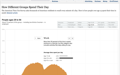
Visual history of Yahoo Pipes
For Retool, Glenn Fleishman looks back to a time when data on the…
Recently for Members
Second Edition
 Visualize This: The FlowingData Guide to Design, Visualization, and Statistics (2nd Edition)
 Visualize This: The FlowingData Guide to Design, Visualization, and Statistics (2nd Edition)
New tools, refined process.
Browse by Chart Type See All →


