As a ratio of home prices to household income, the cost of buying…
Maps
Intuitive to look at spatial patterns and great for distributing geographic data.
-
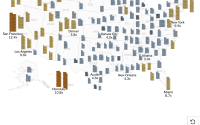
Stacking home prices against income
-
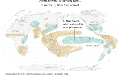
Effects of El Niño, a map
Raymond Zhong and Harry Stevens, for the New York Times, go with a…
-

Cartographers review movie maps
John Nelson and Peter Atwood review maps that appeared in movies, such as…
-
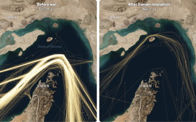
Battle for Hormuz
The Strait of Hormuz might be “completely open” for ships to pass through,…
-
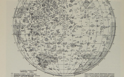
History of mapping the Moon
For most of history, maps of the Moon were based only on the…
-
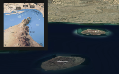
Visual guide to Iran’s coastline and islands at the Strait of Hormuz
For Al Jazeera, Mohamed A. Hussein and Mohammed Haddad provide a map of…
-
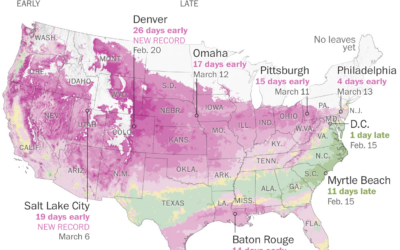
Where leaves are emerging and flowers are blooming
It’s that time of year again when we hear about how the plants…
-
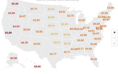
Gas prices map, by county
Gas prices are high across the U.S., more so in some places than…
-
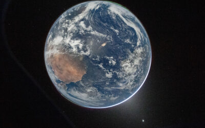
First images from Artemis II astronauts
The first downlinked images were published by NASA. The best view of Earth’s…
-
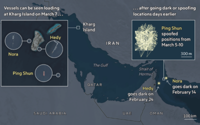
Shadow fleet transporting oil
A so-called shadow fleet of tankers transport oil illicitly around the world. They…
-
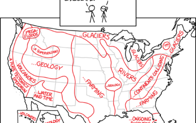
History of landscape features
From xkcd, a map sketch of why the landscape is what it is…
-
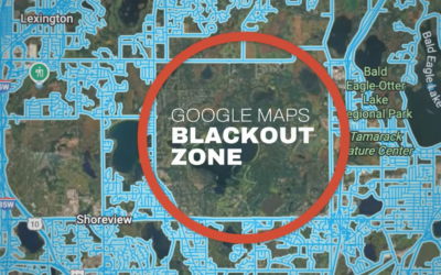
Mapping the unmapped Google Maps city
In most places, property lines stop at the street, but in North Oaks,…
-
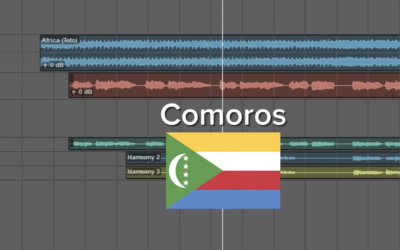
Africa by Toto with the lyrics switched out for the countries
You’re probably familiar with the song “Africa” by Toto. This version, by There…
-

Shades of a lunar eclipse
There was a total lunar eclipse on March 3, 2026. From Michala Garrison…
-
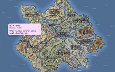
Mapping what makes us happy
In 2017, researchers asked study participants via MTurk to list three happy moments…
-
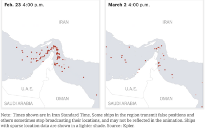
Oil supply chain slowdown
The New York Times mapped the traffic difference at the Strait of Hormuz,…
-
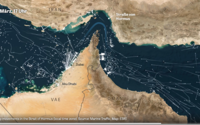
Marine traffic through the Strait of Hormus
Normally there is a steady flow of ships through the strait, but when…
-
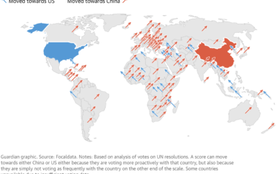
Map of countries aligning with China
Using an analysis from Focaldata, the Guardian used the angled arrow approach to…
Recently for Members
Second Edition
 Visualize This: The FlowingData Guide to Design, Visualization, and Statistics (2nd Edition)
 Visualize This: The FlowingData Guide to Design, Visualization, and Statistics (2nd Edition)
New tools, refined process.
Browse by Chart Type See All →


