Marking the third anniversary of the first Covid deaths in the United States,…
Data Art
Finding the beauty in numbers.
-

Cyanotype to represent grief
-
Conway’s Game of Life in infinite space
Conway’s Game of Life is a zero-person game where cells in a grid…
-

Procedurally generated driving game
Sometimes you need to slow down and go on a drive with no…
-
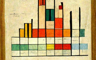
Data visualization(-ish) in the style of famous artists
DALL-E is an AI system from OpenAI that creates images from text. You…
-

Empty school buses as a representation of student lives lost
The NRA Children’s Museum from Change the Ref is a mile-long convoy of…
-

Generative sea creatures
Cindermedusae by Marcin Ignac is “a generative encyclopedia of imaginary sea creatures.” I’m…
-

Chart used as drink label
For Swee Kombucha, Bedow used a stacked chart as a food label to…
-

Global warming bike path
The @LpzfuersKlima team have completed painting a giant representation of the Warming Stripes…
-

Clock shows percentage of life lived so far
Shortlife is a clock by artist Dries Depoorter that simply shows the percentage…
-

AI-powered artwork app
Wombo Dream is a fun app that lets you enter some words to…
-

Sonified animation of London Covid-19 rates
Valentina D’Efilippo, Arpad Ray, and Duncan Geere visualized and sonified Covid-19 rates and…
-

A flag planted for every Covid-19 death
In fall 2020, Suzanne Brennan Firstenberg planted a flag for each American who…
-

Data recorded in fabric quilt
Kim Moran-Jones quilted temperature minima and maxima in the UK, along with Covid-19…
-

AI-generated movie posters
Noah Veltman fed an AI movie descriptions and made it generate images. The…
-
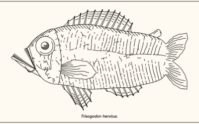
Procedurally generated fish drawings
Lingdong Huang’s project fishdraw seems straightforward on the surface. You go to the…
-
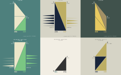
UEFA Euro 2020 matches visualized with triangle sets
Krisztina Szűcs used sets of animated triangles to show how each match played…
-
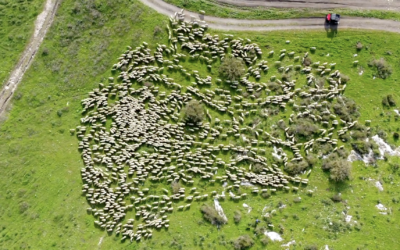
Sheep herding movements from above
Aerial photographer Lior Patel followed a herd of sheep in Yokneam. The results…
-

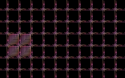
Tapestry for reflective data visualization
As a way to reflect on 2020, Catherine Madden wove tapestry to visualize…
Recently for Members
Second Edition
 Visualize This: The FlowingData Guide to Design, Visualization, and Statistics (2nd Edition)
 Visualize This: The FlowingData Guide to Design, Visualization, and Statistics (2nd Edition)
New tools, refined process.
Browse by Chart Type See All →


