Annelie Berner used blooming flowers as a visual metaphor to show climate change.…
Data Art
Finding the beauty in numbers.
-
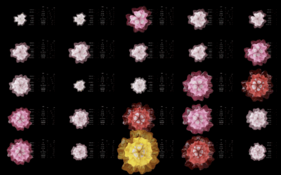
Flower blooms to visualize climate change
-

Wikipedia as a walkable, virtual museum
Imagine everything on Wikipedia in an infinite museum of galleries. That’s what Maya…
-

Data bead bracelets
Data Beads, by Eszter Katona and Mihály Minkó, is a fun initiative that…
-

See wind data on Mars through tele-present wind
With the art installation tele-present wind, David Bowen displays data collected by NASA’s Perseverance rover mission.
-
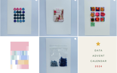
Data Advent Calendar
Jordan Cunliffe uses embroidery to explore and visualize data. This year, headed towards…
-
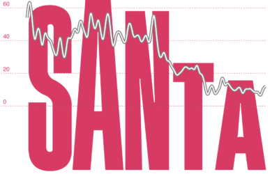
Your name shaped under a trend line
Add another graphic to the baby name genre of visualization. Karim Douïeb put…
-

Tree blanket color-coded by local temperature
Speaking of data blankets, the knitting club in the area I live has…
-
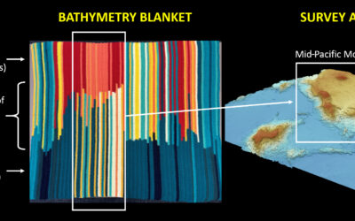
Bathymetry blanket crochet
Jesse Gwinn, from NOAA, was at sea on a mapping expedition and to…
-

Music visualizer in the style of a Pong game
You know the classic game Pong with the paddles and ball that moves…
-
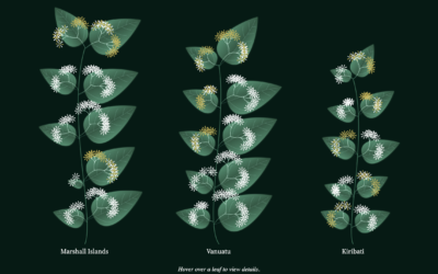
Visualizing poverty levels with a plant metaphor
To show poverty in the Pacific Region between age groups, gender, and location,…
-

Visualizing GitHub commit history in a 3-D virtual space
Ren Yuan visualized the GitHub commit history for the PyTorch library. The virtual…
-
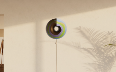
Currently, a light display that shows where your energy is from
Currently is a prototype ambient display that shows where your energy comes from.…
-

Wind flows displayed with spinning paddles
Joanie Lemercier used a grid of spinning paddles that turn with the wind.…
-
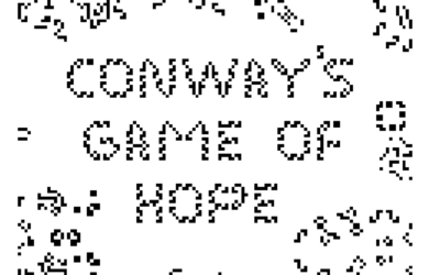
Conway’s Game of Hope
Alexander Miller wrote a “fable of emergence” that combines Conway’s Game of Life…
-

Conway’s Game of Life with a third dimension
Alec Singh added another dimension to Conway’s Game of Life for a pretty,…
-

A phone charger that only works when you recharge yourself
Recharge, an art installation by Dries Depoorter, uses a system that detects when…
-
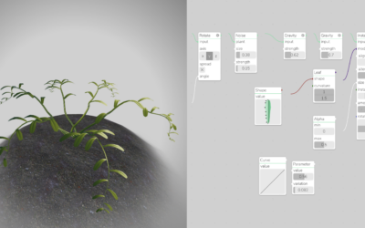
Generative plants
Generate your own plant with Max Richter’s interactive. Adjust leaf shape, density, and…
-
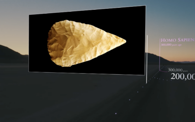
Scale model of the universe’s timeline
To better understand the scale of time and feed your existential dread, Wylie…
Recently for Members
Second Edition
 Visualize This: The FlowingData Guide to Design, Visualization, and Statistics (2nd Edition)
 Visualize This: The FlowingData Guide to Design, Visualization, and Statistics (2nd Edition)
New tools, refined process.
Browse by Chart Type See All →


