Bathymetry blanket crochet
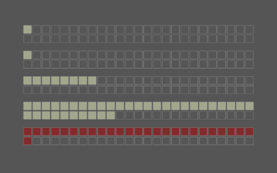
Jesse Gwinn, from NOAA, was at sea on a mapping expedition and to pass the downtime between tasks, she crocheted a bathymetry blanket:
I assigned 11 colors to different depth ranges: reds and yellows for shallower waters (~2,000-4,000 meters/1.2-2.5 miles), blues and purples for deeper areas (~4,000-6,000 meters/2.5-3.7 miles). Each vertical row contains two colors, illustrating the deepest and shallowest points recorded in a 6-hour period. The relative location of the color change is positioned to represent the average depth of the seafloor for that timeframe. […] The finished blanket contains 97 rows, representing 582 hours (a little more than 24 days) worth of bathymetry data collected using multibeam sonar.
Become a member. Support an independent site. Get extra visualization goodness.
See What You Get