Happy Thanksgiving! Eat lots and lots and lots. Rest. Then eat more.…
-
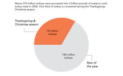
Happy Turkey Day
-
Spreadsheet Invasion
Something for you leading into the Thanksgiving weekend. Enjoy this short video (below)…
-
How to Make Bubble Charts
Ever since Hans Rosling presented a motion chart to tell his story of the wealth and health of nations, there has been an affinity for proportional bubbles on an x-y axis. This tutorial is for the static version of the motion chart: the bubble chart.
-
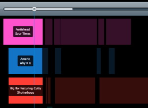
Girl Talk mashup breakdown visualized
In case you missed it, Girl Talk recently released his fifth album All…
-
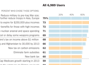
How Twitter users balanced the budget
In a follow-up to their puzzle to balance the budget, The New York…
-
Evolution of the two-party vote during past century
Political science PhD candidate David Sparks has look at the evolution of the…
-
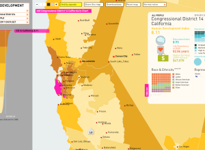
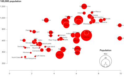
Mapping human development in America
In work with the American Human Development Project, Rosten Woo and Zachary Watson…
-
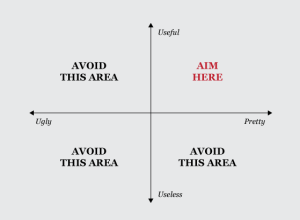
Target for charting excellence
The scales for what qualifies as pretty and useful change depending on the…
-
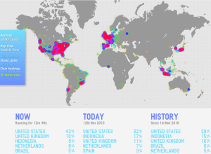
A world of tweets
We’ve seen this sort of thing before, with tweets mapped and such, but…
-
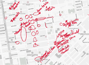
Defining neighborhoods with map scribbles
TenderMaps brings an informal approach to highlighting the parts of neighborhoods:
We wanted… -
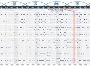
What generation do you belong to?
In this interactive, USA Today guesses your age, based on what influenced you…
-
R is the need-to-know stat software
This Forbes post on the greatness that is R is being passed around…
-
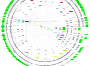
Why network visualization is useful
AT&T Labs’ Infoviz research group describes network graphs and their many uses:
There… -
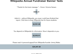
Visualize This: Winning Wikipedia fundraiser banners
Wikipedia’s annual fundraiser is in progress. If you haven’t noticed already, when you…
-
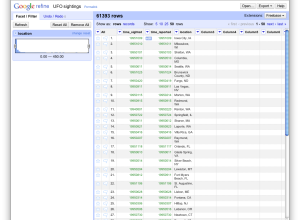
Format and clean your data with Google Refine
When we first learn how to deal with data in school, it’s nicely…
-

The very first NYT election map
Matthew Ericson, deputy graphics director of The New York Times, dug through the…
-
Learn the rules of data graphics so you can bend them
If you take away anything from The Visual Display of Quantitative Information, make…
-
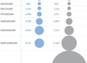
You fix the budget puzzle
Not pleased with how the government is handling the budget and deficit? Fine.…
-
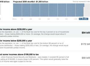
Comparison of Republican and Democratic tax plans
Lori Montgomery of the The Washington Post reports on the difference between the…
-

Algorithmic architecture with balls
Geometric Death Frequency-141 by Federico Diaz is an algorithm-based sculpture at MASS MoCA,…
Recently for Members
Second Edition
 Visualize This: The FlowingData Guide to Design, Visualization, and Statistics (2nd Edition)
 Visualize This: The FlowingData Guide to Design, Visualization, and Statistics (2nd Edition)
New tools, refined process.
Browse by Chart Type See All →


