Coronavirus testing in the United States has been a slow process to say…
coronavirus
-
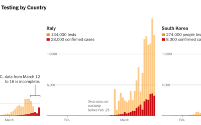
Lagging coronavirus testing in the US
-
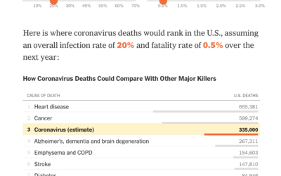
Possible coronavirus deaths compared against other causes
Based on estimates from public health researcher James Lawler, The Upshot shows the…
-
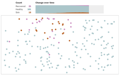
Simulations for virus spread with social distancing
Social distancing is the game plan these days. Try to stay at home…
-
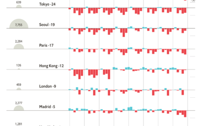
Change in foot traffic in outbreak cities
From The Economist, this chart shows the (mostly) decrease in foot traffic in…
-
Coronavirus, a Visual Rundown – The Process 080
We’re seeing a lot of visual to help explain what’s going on. Here’s the main stuff: what it is, who is affected, the spread, and what we can do.
-
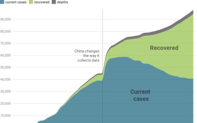
A view of the coronavirus outbreak through data
There’s a lot of figures and numbers floating around about the coronavirus disease.…
-

Coronavirus life cycle
For The New York Times, Jonathan Corum and Carl Zimmer describe how the…
-
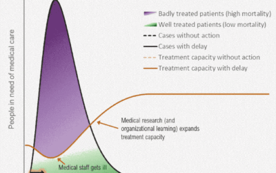
Flatten the coronavirus curve
The coronavirus can possibly infect a lot more people than there are those…
-
Responsible coronavirus charts
Speaking of responsible visualization, Datawrapper provides 17 charts and maps you can use…
-
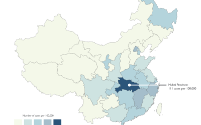
Responsible mapping
We’re seeing a lot of maps now about coronavirus. There are a lot…
-

Machine learning to help you not touch your face
The CDC recommends that you do not touch your face to minimize the…
-
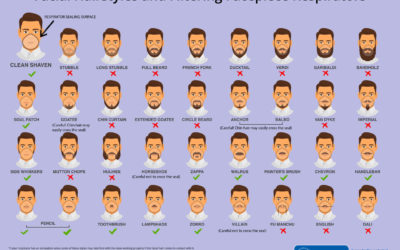
Face mask respirator and its usefulness with different beard styles
The Centers for Disease Control and Prevention made this graphic to show what…
-
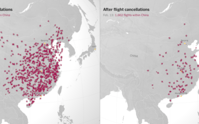
Canceled flights due to coronavirus
With an animated side-by-side map, The New York Times shows canceled flights in…
-
Members Only
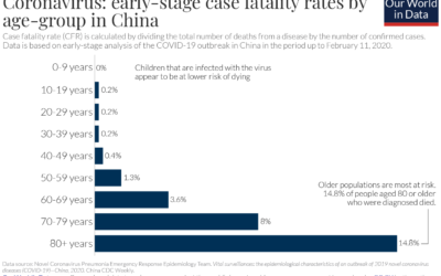
Misleading or Not? A Chart Showing Coronavirus Fatality Rate (The Process #75)
Welcome to another episode of Misleading or Not? where we look at a chart and decide if it’s misleading or not.
Recently for Members
Second Edition
 Visualize This: The FlowingData Guide to Design, Visualization, and Statistics (2nd Edition)
 Visualize This: The FlowingData Guide to Design, Visualization, and Statistics (2nd Edition)
New tools, refined process.
Browse by Chart Type See All →


