One way to estimate the impact of the coronavirus is to compare it…
coronavirus
-
Comparing the coronavirus to past deadly events
-
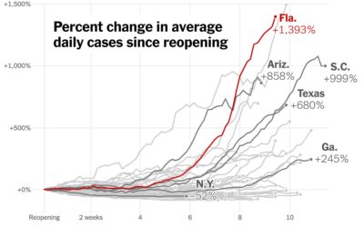
Increase in cases since states reopened
Using the now all too familiar baseline chart, where all of the time…
-
Race and the virus
The New York Times obtained data on race and those affected by the…
-
Data on loans issued through the Paycheck Protection Program
The Paycheck Protection Program was established to provide aid to small businesses. It’s…
-
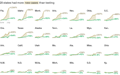
Cases vs. testing
There have been assertions that increased case counts are all from increased testing.…
-
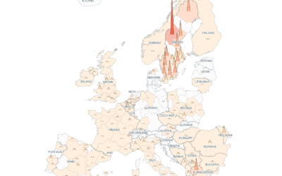
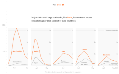
Coronavirus counts across Europe
Going with the shaded triangle peaks to show case counts and deaths, The…
-
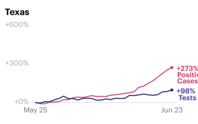
Increased case counts not just from increased testing
Some attribute increased Covid-19 case counts to increased testing. While that is certainly…
-
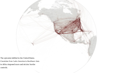
When the world shut down, seen through global flights
Lauren Tierney and William Neff for The Washington Post used a rotating globe…
-
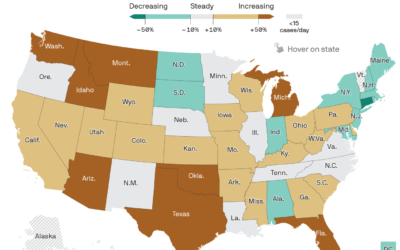
Map of Covid-19 surge
Axios provides a straightforward state map showing the percentage change in the 7-day…
-
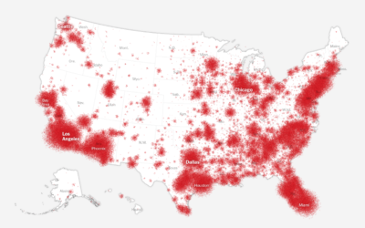
How the coronavirus won in the United States
Using a wide array of sources, The New York Times shows how the…
-
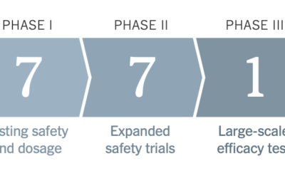
Vaccine tracker
As we know, it typically takes years to develop a vaccine that is…
-
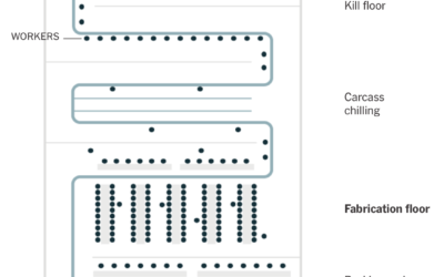
Challenges of reopening the meatpacking plant
To reopen safely, meatpacking plants have to take precautions to provide space and…
-
Health conditions and income
A large proportion of those who died from Covid-19 had pre-existing medical conditions.…
-
Failed CDC data pipeline
The New York Times reports on how the CDC struggled and failed on…
-

A comic on spotting misinformation
There’s a lot of misinformation passing through the internets right now. A lot.…
-

Impact on Households in the United States
The Census Bureau has been running the Household Pulse Survey since April 23, 2020 to get some gauge for how the pandemic is changing things at home. Here’s how things look so far.
-
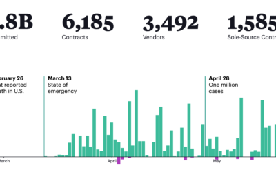
What the federal government has been buying and where from
The Federal Procurement Data System tracks federal contracts of $10,000 or more. For…
-
54 ways coronavirus changed the world
The coronavirus has changed everything. Larry Buchanan, for The New York Times, goes…
-
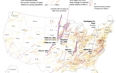
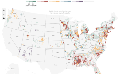
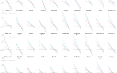
Map shows increasing confirmed cases in rural areas
This map by Tim Meko for The Washington Post uses time series lines…
-
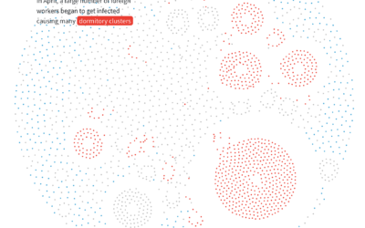
Anatomy of an outbreak
For Reuters, Manas Sharma and Simon Scarr animated a coronavirus outbreak in Singapore…
Recently for Members
Second Edition
 Visualize This: The FlowingData Guide to Design, Visualization, and Statistics (2nd Edition)
 Visualize This: The FlowingData Guide to Design, Visualization, and Statistics (2nd Edition)
New tools, refined process.
Browse by Chart Type See All →


