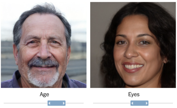
The timeline for a new infection isn’t the same for everyone. Some never show any symptoms. Some recover quickly. Some take months to recover. So, for The New York Times, Katherine J. Wu and Jonathan Corum describe the timeline of a coronavirus infection with a set of illustrative charts instead of using exact numbers.
-
Just looking back at the past eight or nine months of coronavirus posts for no particular reason. Some that stood out:
- When It Comes to Covid-19, Most of Us Have Risk Exactly Backward
- How washing your hands for 20 seconds does the trick
- This 3-D Simulation Shows Why Social Distancing Is So Important
- Math behind wearing masks
- Face mask respirator and its usefulness with different beard styles
-
You’ve seen the line charts showing case rates over time. The focus is on trends and whether things are getting better or worse. This piece by Jan Willem Tulp focuses on the current rates with tickers and a sonification of new cases.
Ding, ding, ding. There’s a new ding for each new case as you look at the page, based on a weekly average for each country tracked by Our World in Data.
-
Members Only
-
NPR estimated how many people have experienced unhealthy air this year, largely in part to the wildfires on the west coast:
An NPR analysis of U.S. Environmental Protection Agency air quality data found that nearly 50 million people in California, Oregon and Washington live in counties that experienced at least one day of “unhealthy” or worse air quality during wildfire season so far this year. That’s 1 in 7 Americans, an increase of more than 9 million people compared with 2018, the worst previous year.
Oh.
-
RJ Andrews, in collaboration with the David Rumsey Map Center, curated a collection of historical data visualization:
Data visualization leapt from its Enlightenment origins and into the minds of the general public in the 1760s. It cast more powerful spells throughout the following century. By 1900, modern science, technology, and social movements had all benefited from this new quantitative art. Its inventions include the timeline, bar chart, and thematic map. Together, these innovations changed how we understand the world and our place within it. Data visualization helped a new imagination emerge, wired to navigate a reality much bigger than any single person’s lived experience.
Bookmarking this for a closer look later.
-
How to Make a Heatmap in Excel
Heatmaps quickly translate data tables into a visual form, making them a great tool to explore a new dataset.
-
With wildfires burning in the western United States, smoke fills the air. This is an animation of the air quality during the past couple of months.
-
The New York Times got a hold of the President’s tax records for the past two decades. They charted the reported gains and losses.
It starts with an overview stacked area chart and then scrolls through the details and peculiarities. Very peculiar.
-
Stefanie Posavec and Miriam Quick have a new book out called I am a book. I am a portal to the universe.
I’m different to any other book around today. I am not a book of infographics. I’m an informative, interactive experience, in which the data can be touched, felt and understood, with every measurement represented on a 1:1 scale. How long is an anteater’s tongue? How tiny is the DNA in your cells? How fast is gold mined? How loud is the sun? And how many stars have been born and exploded in the time you’ve taken to read this sentence?
Using all the elements that make a book, well, a book in a completely original way, I blend playful design and data storytelling to introduce scientific concepts to a broad, all-ages readership.
Instead of using traditional visual encodings, Posavec and Quick use the actual pages of the book — the physical weight, dimensions, and texture — to represent data. You’re invited to drop the book to test gravity, snap the cover shut to hear a measure in decibels, and to run your finger across the pages as a proxy for time and distance.
A fun one for the kids and the adults. I’m sure it’ll make its way over to the US, but it looks like you can get the UK edition in a roundabout way via Amazon. Or, if you’re in Europe, you can go direct to the source.
-
With recorded U.S. Covid-19 deaths passing the 200k mark, somehow the number still feels distant for many. The Washington Post, in collaboration with Lupa and the Google News Initiative, brings the tally to your neighborhood to help you relate more closely.
The story starts at your location. Based on population counts and density, you zoom out to see an approximation of how far a death radius would expand from where you are. You’re also taken to a county that would be wiped out.
Obviously we’re looking at hypotheticals here, but the interactive provides a granular sense of scale. The point is that 200,000 people dead is… a lot.
The Post’s version is based on Lupa’s original, which they made with Brazil numbers and location. Alberto Cairo provides background on the project here.
Small note for those who make these location-based interactives. Some people (me) who don’t want to share location or are outside the range of your dataset, it’s useful to provide links to well-known locations, so that they can still see the data.
-
Mail-in ballots can be rejected if they’re not filled out or mailed correctly. A small percentage of them always are. This year, when we’re talking millions of mail-in ballots, even a small percentage means a lot of tossed ballots. For NYT’s The Upshot, Larry Buchanan and Alicia Parlapiano show how some states modified the design of their ballots to reduce the rejections.
-
Members Only
-
Google released a search trends dataset earlier this month. Using this dataset, Adam Pearce made an explorer to compare search volume over time:
The COVID-19 Search Trends symptoms dataset shows aggregated, anonymized trends in Google searches for more than 400 health symptoms, signs, and conditions, such as cough, fever and difficulty breathing. The dataset provides a time series for each region showing the relative volume of searches for each symptom.
Even if you’re not keen on analyzing Covid-19 data, this is likely a good time series source to at least bookmark for later.
-
The Marshall Project contrasted ad spending on Facebook by Trump’s campaign against Joe Biden’s:
Our analysis found that of the $82 million Trump’s reelection campaign has spent on Facebook ads this year, $6.6 million paid for ads about crime and policing—a top focus of his Facebook campaign. Almost all of it came since George Floyd was killed by police in Minneapolis in May. More than one-third of those ad buys were aimed at key battleground states and many sought to persuade specific undecided voters, and married women in particular. The Biden campaign? It didn’t spend a cent on criminal justice ads on Facebook until late August, choosing instead to focus on the COVID-19 pandemic and economic recovery. Yet Biden had, during the Democratic primaries, articulated a more progressive criminal justice platform than any of his party’s recent nominees.
-
For NYT Opinion, Gus Wezerek and Andrew Whitby on what might happen if the count ends on September 30:
Times Opinion predicted how many people would remain uncounted on Sept. 30, based on each state’s current response rate. Our analysis shows that those undercounts will cheat some states — mostly Republican — out of federal funding and one state out of a congressional seat.
-
When this all started, Covid-19 was impacting large cities at a much higher rate than everywhere else. This straightforward chart from NPR shows how the share of deaths in small and medium cities has made its way up to over half of all weekly Covid-19 deaths.
-
Companies are tracking what you do online. You know this. But it can be a challenge to know the extent, because the methods are hidden on purpose. So The Markup built Blacklight:
To investigate the pervasiveness of online tracking, The Markup spent 18 months building a one-of-a-kind free public tool that can be used to inspect websites for potential privacy violations in real time. Blacklight reveals the trackers loading on any site—including methods created to thwart privacy-protection tools or watch your every scroll and click.
We scanned more than 80,000 of the world’s most popular websites with Blacklight and found more than 5,000 were “fingerprinting” users, identifying them even if they block third-party cookies.
We also found more than 12,000 websites loaded scripts that watch and record all user interactions on a page—including scrolls and mouse movements. It’s called “session recording” and we found a higher prevalence of it than researchers had documented before.
Try it out here. Just enter a URL, and you’ll see a real-time count of the ad trackers, third-party cookies, cookie evaders, and keystroke recorders on any given site.
This is why I got rid of Google Analytics, social media widgets, and ad-serving snippets on FD years ago.
-
Adam Pearce and Ellen Jiang for Google’s PAIR, explain how granular data can lead to easy identification of individuals and how randomization can help:
Aggregate statistics about private information are valuable, but can be risky to collect. We want researchers to be able to study things like the connection between demographics and health outcomes without revealing our entire medical history to our neighbors. The coin flipping technique in this article, called randomized response, makes it possible to safely study private information.
-
For NYT Opinion, Stuart A. Thompson and Yaryna Serkez mapped the most predominant “climate threat” in each county:
This picture of climate threats uses data from Four Twenty Seven, a company that assesses climate risk for financial markets. The index measures future risks based on climate models and historical data. We selected the highest risk for each county to build our map and combined it with separate data from Four Twenty Seven on wildfire risks.
Got me thinking about Tim Meko’s maps of natural disasters.