RJ Andrews, in collaboration with the David Rumsey Map Center, curated a collection of historical data visualization:
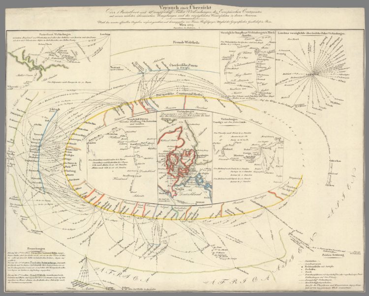
Data visualization leapt from its Enlightenment origins and into the minds of the general public in the 1760s. It cast more powerful spells throughout the following century. By 1900, modern science, technology, and social movements had all benefited from this new quantitative art. Its inventions include the timeline, bar chart, and thematic map. Together, these innovations changed how we understand the world and our place within it. Data visualization helped a new imagination emerge, wired to navigate a reality much bigger than any single person’s lived experience.
Bookmarking this for a closer look later.
 Visualize This: The FlowingData Guide to Design, Visualization, and Statistics (2nd Edition)