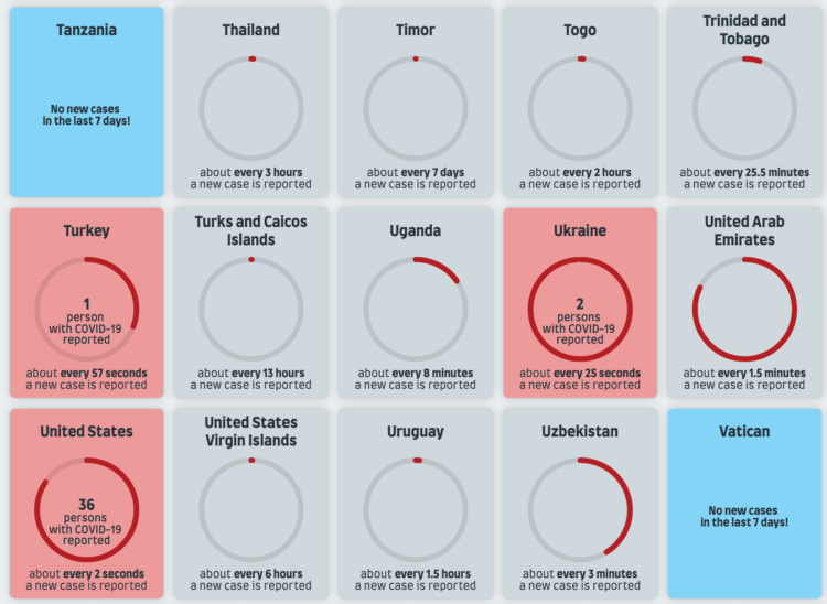
You’ve seen the line charts showing case rates over time. The focus is on trends and whether things are getting better or worse. This piece by Jan Willem Tulp focuses on the current rates with tickers and a sonification of new cases.
Ding, ding, ding. There’s a new ding for each new case as you look at the page, based on a weekly average for each country tracked by Our World in Data.
 Visualize This: The FlowingData Guide to Design, Visualization, and Statistics (2nd Edition)