The CDC now recommends that you wear a cloth face mask if you leave the house. For The Washington Post, Bonnie Berkowitz and Aaron Steckelberg answer some questions you might have about making your own, including the chart above. You need material that provides both filtration and breathability.
-
Your schedule changed. The time spent in front of or using a screen probably shifted. Using data from SimilarWeb and Apptopia, Ella Koeze and Nathaniel Popper for The New York Times look at how these changes are reflected in average daily traffic for major websites and apps.
More video games, more social apps, and more virus news.
-
For The New York Times, Lazaro Gamio and Karen Yourish use an animated map to show known total coronavirus deaths over time. The height of each triangle represents the count for a Core-Based Statistical Area. Let it play out, and New York almost spikes out of view.
See also the county-based circular version for total confirmed cases.
-
Will Chase, who specialized in visualization for epidemiological studies in grad school, outlined why he won’t make charts showing Covid-19 data:
So why haven’t I joined the throng of folks making charts, maps, dashboards, trackers, and models of COVID19? Two reasons: (1) I dislike reporting breaking news, and (2) I believe this is a case of “the more you know, the more you realize you don’t know” (a.k.a. the Dunning-Kruger effect, see chart below). So, I decided to watch and wait. Over the past couple of months I’ve carefully observed reporting of the outbreak through scientific, governmental, and public (journalism and individual) channels. Here’s what I’ve seen, and why I’m hoping you will join me in abstaining from analyzing or visualizing COVID19 data.
There’s so much uncertainty attached to the data around number of deaths and cases that it’s hard to understand what it actually means. This takes a high level of context in other areas on the ground. On top of that, people are making real life decisions based on the data and charts they’re seeing.
So while I think a lot of the charts out there are well-meaning — people under stay-at-home trying to help the best way they know how — it’s best to avoid certain datasets. As Chase describes, there are other areas of the pandemic to point your charting skills towards.
See also: responsible coronavirus charts and responsible mapping.
-
From researchers at Bauhaus-University Weimar, this video shows how various methods of covering a cough change the spread of air from your mouth.
-
For Reuters, Chris Canipe looks at social distancing from the perspective of household income:
Anonymized smartphone data in the United States shows some interesting trends. People in larger cities and urban corridors were more likely to change their travel habits, especially in early March. By the end of the month, most U.S. residents were traveling dramatically less than they did in February, but social and demographic differences were strong predictors of how much that changed.
The above shows median change in distance traveled against median household income by county. Note the downwards trend showing counties with lower median incomes with less change in travel.
For many, it’s not possible to work from home or it isn’t safe to stay at home. Don’t be too quick to judge.
An aside: There are bigger things to concentrate on right now, but after this is all done, I feel like we need to think more about who has access to our location via cellphone. Clearly the data has its uses, but that’s not always going to be the case.
-
Members Only
-
Based on cellphone data from Cuebiq, The New York Times looked at how different parts of the country reduced their travel between the end of February and the end of March. Some counties really stayed at home. Some not so much:
In areas where public officials have resisted or delayed stay-at-home orders, people changed their habits far less. Though travel distances in those places have fallen drastically, last week they were still typically more than three times those in areas that had imposed lockdown orders, the analysis shows.
The streets are quiet here in northern California, so this is pretty shocking for me. If you can, stay at home, folks. It’s inconvenient, but it’s a small sacrifice for something much bigger.
-
As you would expect, not many people are flying these days. The Washington Post mapped the halts around the world:
On Tuesday, the TSA screened just over 146,000 passengers at U.S. airports, a 94 percent plunge from 2.4 million on the same day last year. By the end of March, the TSA screened just over 35 million passengers at U.S. airports during the month, a 50 percent decrease from more than 70 million at the end of March last year.
At this point, I would gladly wait a couple of hours in a security line for just a taste of normalcy.
-
Fatalities from Covid-19 range from the hundreds of thousands to the millions. Nobody knows for sure. These predictions are based on statistical models, which are based on data, which aren’t consistent and reliable yet. FiveThirtyEight, whose bread and butter is models and forecasts, breaks down the challenges of making a model and why they haven’t provided any.
-
On the surface, the decennial census seems straightforward. Count everyone in the country and you’re done. But the way we’ve done that has changed over the decades. The Pudding and Alec Barrett of TWO-N looked at the changes through the lens of questions asked:
We looked at every question on every census from 1790 to 2020. The questions—over 600 in total—tell us a lot about the country’s priorities, norms, and biases in each decade. They depict an evolving country: a modernizing economy, a diversifying population, an imperfect but expanding set of civil and human rights, and a growing list of armed conflicts in its memory. What themes and trends will you notice?
-
3Blue1Brown goes into more of the math of SIR models — which drive many of the simulations you’ve seen so far — that assume people are susceptible, infectious, or recovered.
-
Maybe you’re starting to run low. Here’s how much you’ll need when you go to restock.
-
Comprehensive national data on Covid-19 has been hard to come by through government agencies. The New York Times released their own dataset and will be updating regularly:
The tracking effort grew from a handful of Times correspondents to a large team of journalists that includes experts in data and graphics, staff news assistants and freelance reporters, as well as journalism students from Northwestern University, the University of Missouri and the University of Nebraska-Lincoln. The reporting continues nearly all day and night, seven days a week, across U.S. time zones, to record as many details as possible about every case in real time. The Times is committed to collecting as much data as possible in connection with the outbreak and is collaborating with the University of California, Berkeley, on an effort in that state.
You can download the state- and county-level aggregates on GitHub.
-
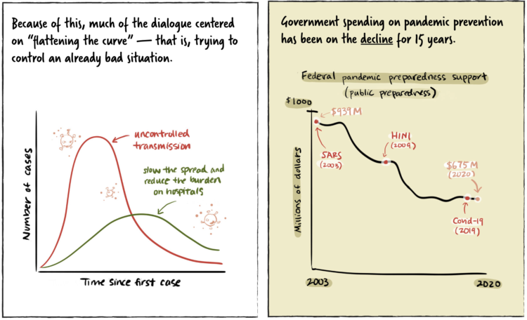
A comic by Marcos Balfagón attaches action to the curve.
-
Members Only
-
The Department of Labor released the numbers for last week’s unemployment filings. 3.28 million for the country. For The New York Times, Quocktrung Bui and Justin Wolfers show the numbers relative to the past and a breakdown by state:
This downturn is different because it’s a direct result of relatively synchronized government directives that forced millions of stores, schools and government offices to close. It’s as if an economic umpire had blown the whistle to signal the end of playing time, forcing competitors from the economic playing field to recuperate. The result is an unusual downturn in which the first round of job losses will be intensely concentrated into just a few weeks.
You can find the recent data here.
-
The numbers are fuzzy. You take them at face value, and you end up with fuzzy interpretations. Starting at the end of this month, Johns Hopkins is providing a two-week epidemiology course on understanding these numbers better:
This free Teach-Out is for anyone who has been curious about how we identify and measure outbreaks like the COVID-19 epidemic and wants to understand the epidemiology of these infections.
The COVID-19 epidemic has made many people want to understand the science behind pressing questions like: “How many people have been infected?” “How do we measure who is infected?” “How infectious is the virus?” “What can we do?” Epidemiology has the tools to tell us how to collect and analyze the right data to answer these questions.
Yes.
-
Wade Fagen-Ulmschneider made a set of interactive charts to track confirmed coronavirus cases. Switch between regions and scales. See the data normalized for population or not. See trends for active cases, confirmed cases, deaths, and recoveries.
Usually this much chartage and menu options would seem overwhelming. But by now, many of us have probably seen enough trackers that we’re ready to shift away from consumption into exploratory mode.
The data behind this tracker, like many others, is from the Johns Hopkins University Center for Systems Science and Engineering (JHU CSSE). They’ve been updating their repository daily on GitHub.
-
I read and read and read and read. But almost everything I read about is out of my control, so I’m turning more energy towards things that I can control. I’m keeping my distance. Supporting local. Writing. Poking at data. Making charts.
It’s going to get better, and we will get through this.