For Wired, Craig Mod writes about how he uses code as a way to find order during less coherent times:
Break the problem into pieces. Put them into a to-do app (I use and love Things). This is how a creative universe is made. Each day, I’d brush aside the general collapse of society that seemed to be happening outside of the frame of my life, and dive into search work, picking off a to-do. Covid was large; my to-do list was reasonable.
The real joy of this project wasn’t just in getting the search working but the refinement, the polish, the edge bits. Getting lost for hours in a world of my own construction. Even though I couldn’t control the looming pandemic, I could control this tiny cluster of bits.
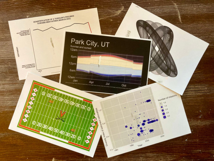
A couple of years ago, I spoke about how FlowingData is a personal journal in disguise. I find myself turning to data and charts, because those things feel familiar and can be a source of comfort.
So while reading Mod’s essay, it was easy to substitute in data and nod my head in agreement.


 Visualize This: The FlowingData Guide to Design, Visualization, and Statistics (2nd Edition)


