xkcd poked fun at the sometimes questionable color choices of researchers.
xkcd poked fun at the sometimes questionable color choices of researchers.
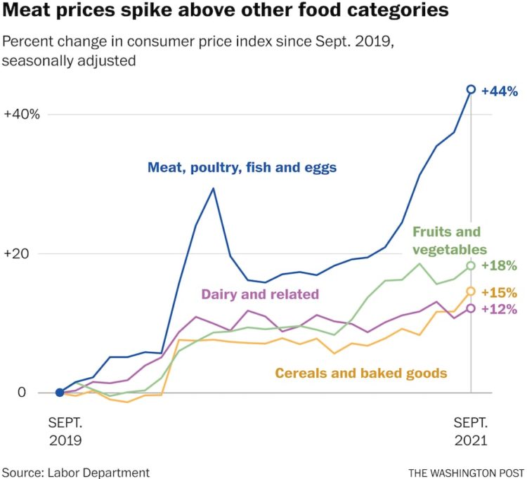
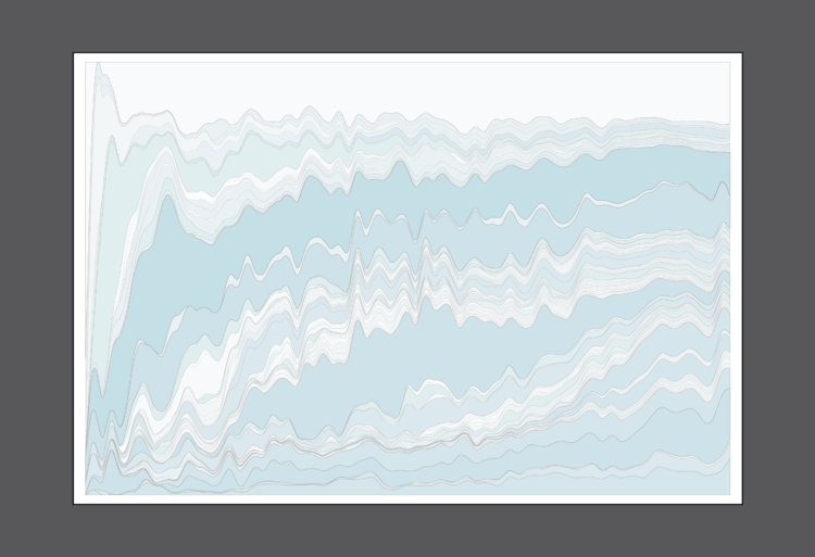
Using Consumer Price Index, Alyssa Fowers and Rachel Siegel for The Washington Post show how the prices of everyday things rose since 2019. A set of baseline charts show lines moving up much more than one would hope, due to coronavirus and supply chain issues.

All the tools are a product of visualization’s many uses, which isn’t so terrible. But not all the tools are champions.
Valentina D’Efilippo, Arpad Ray, and Duncan Geere visualized and sonified Covid-19 rates and vaccinations in London Under the Microscope. Best viewed with headphones on. Geere on the sound:
Here’s how it works. There are two melodic saw wave drones separated by an octave – the higher represents cases, and the lower represents deaths. The chords that make them up each reflect the balance of different variants over time. As the data spikes, so does the filter cutoff.
The bassline reflects movement data. When people are moving around the city a lot, you hear the bassline move faster. During lockdown, when people were confined to their homes, it slows to a single beat for each bar.
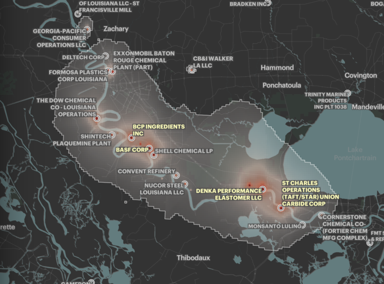
Based on five years of data from EPA models, ProPublica mapped areas in the United States where cancer risk is higher due to air pollution:
In all, ProPublica identified more than a thousand hot spots of cancer-causing air. They are not equally distributed across the country. A quarter of the 20 hot spots with the highest levels of excess risk are in Texas, and almost all of them are in Southern states known for having weaker environmental regulations. Census tracts where the majority of residents are people of color experience about 40% more cancer-causing industrial air pollution on average than tracts where the residents are mostly white. In predominantly Black census tracts, the estimated cancer risk from toxic air pollution is more than double that of majority-white tracts.
Interact with the full map here.
If you’ve taken classes that cover image processing, you’ve likely come across the Lenna image. It’s a headshot of Lena Forsén taken from Playboy Magazine in 1972. For The Pudding, Jennifer Ding, with Jan Diehm and Michelle McGhee, looked at use of the image in research over the years — despite copyright claims and Forsén’s wish for researchers to move on to a different image.
Ding used a straightforward bar chart to show the pattern over time, but the annotation provides a layer of context that tells you what those peaks and valleys mean.
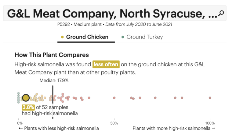
The USDA recommends that you cook your chicken to at least 165°F to kill salmonella bacteria (time is also a factor), which appears to be more common than I would hope. ProPublica has a Chicken Checker so that you can find out. Look up the poultry product number on your pack of chicken, and you can see what percentage of USDA samples from the respective processing plant had salmonella.
A beeswarm chart shows how the plant’s rate compares to other plants that process the same type of poultry.
All I can think about now is that trend on social media from a while back where people cooked their chicken to rare. Mmm, salmonella.
The IEEE VIS 2021 conference is running virtually this week, and there’s a lot of work that’s caught my eye but I haven’t had the chance to look through it all yet. One of those things is the alt.VIS workshop that lead into the conference. The papers included such topics as Towards a Theory of Bullshit Visualization, Visualization for Villainy, and Manifesto for Putting Chartjunk in the Trash 2021!.
I’m giving this a hard bookmark to read later.
Here’s the good stuff for October.
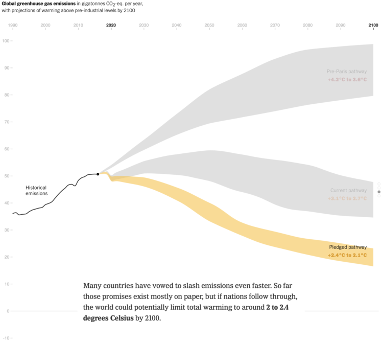
There has been progress since the Paris climate agreement in 2014, but there’s still more to do. Brad Plumer and Nadja Popovich for The New York Times look at the possible paths we could take.
You could use a package, but then you couldn’t customize every single element, and where’s the fun in that?
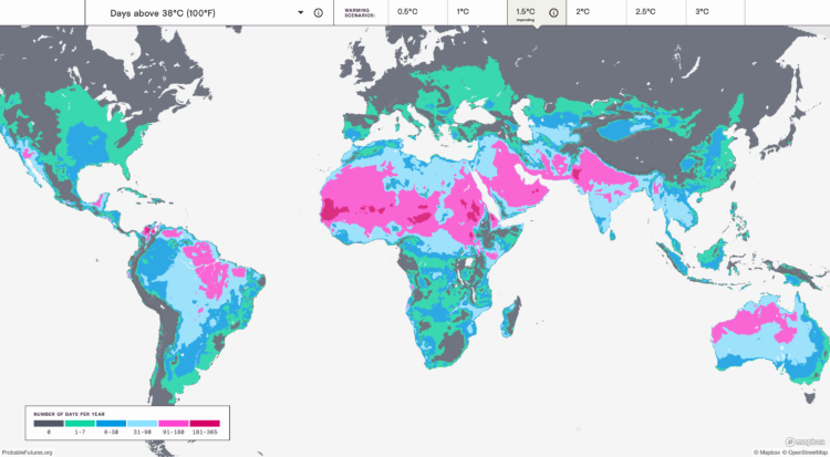
Earth is getting warmer, and the previously abstract concept seems to grow more concrete every day. Probable Futures mapped increasing heat, decreasing cold, and shifting humidity under different warming scenarios.
You have the global view shown above, and then when you zoom in enough, you can click on grid cells for the model estimates. Dots on the map point to a handful of short stories on how warming has changed daily life, which I feel like could use more attention.
Next to the zoom navigation buttons is a camera button, which lets you download the view that you’re looking at. This feature is probably new to me but has been around a for a while. I like it.
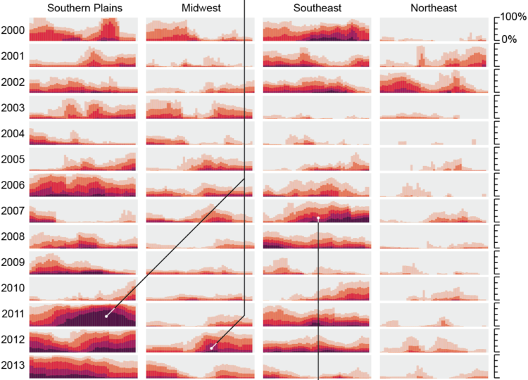
For Scientific American, Cédric Scherer and Georgios Karamanis charted drought extent by region using a grid of stacked bar charts. Each cell represents a year for a corresponding region, and color represents drought intensity.
Compare this view to more map-centric ones. This version focuses more on time than it does geography. One isn’t better than the other. Just different.
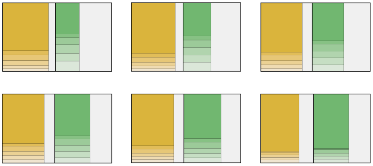
Here’s how the distribution of genres has changed since 1945 up to present.
Mona Chalabi has a new podcast Am I Normal? and it’s very good:
We all want to know if we’re normal—do I have enough friends? Should it take me this long to get over my ex? Should I move or stay where I am? Endlessly curious data journalist Mona Chalabi NEEDS to know, and she’s ready to dive into the numbers to get some answers. But studies and spreadsheets don’t tell the whole story, so she’s consulting experts, strangers, and even her mum to fill in the gaps. The answers might surprise you, and make you ask: does normal even exist?
There are two episodes so far: the first on how long it takes to get over a breakup and the second on how many friends people have. A takeaway from both is that defining “normal” is a fuzzy matter and the data only gets you part of the way there.
Margot Sanger-Katz and Alicia Parlapiano for NYT’s The Upshot broke down a Democrat spending proposal. I like the lead-in treemap that shows the proposed components and the box that it needs to squeeze into:
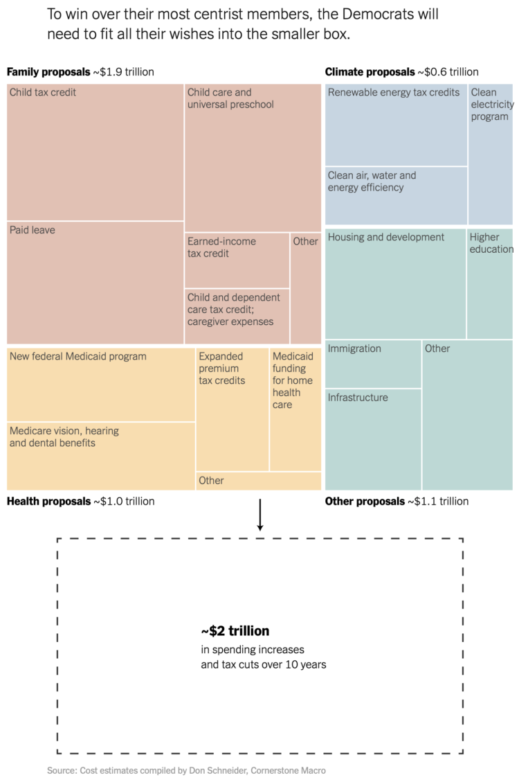
I’ve seen treemaps that transition into different sizes, but I don’t think I’ve seen a box drawn on the outside of the treemap for comparison. It feels natural.
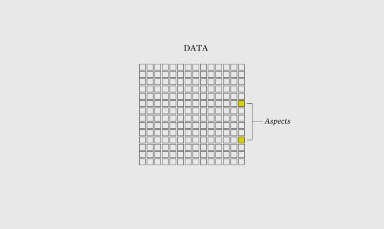
When you visualize aspects of the data instead of just the data itself, what you show grows more obvious.
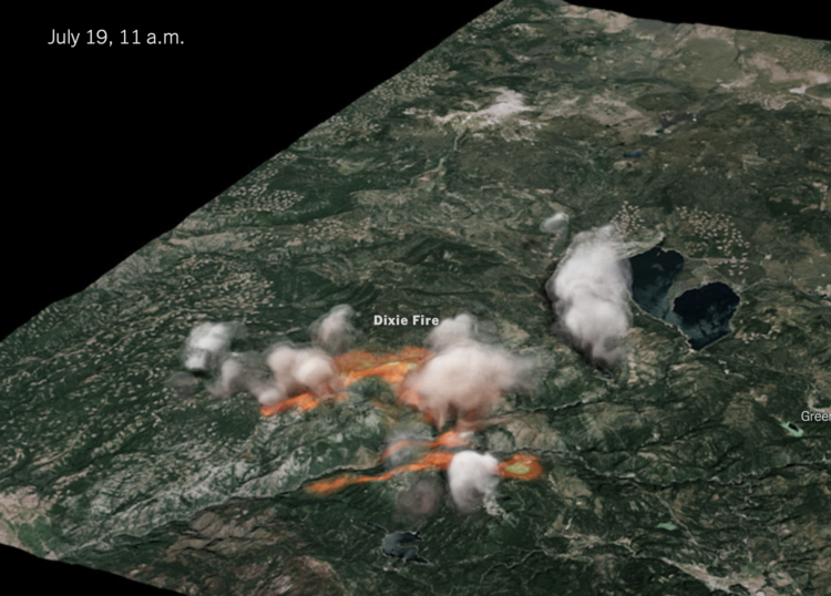
The New York Times used radar data to create a 3-D model of the Dixie fire smoke clouds:
The raw data was collected every 10 minutes in radial sweeps around the radar stations, each at a higher altitude. The Times combined and reformatted the data using Py-ART, a collection of algorithms and utilities used regularly in radar analysis. We then filtered it to reduce noise.
We applied color and texture to the 3-D volume to approximate a smoke- and cloud-like look. And we interpolated the sequence in time to create a smoother video animation.
The data comes from the NOAA Next Generation Radar (seems to be down right now), and the rendering was inspired by Neil Lareau’s more barebones chart.
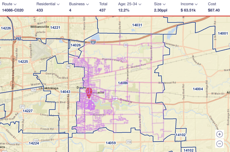
I’m not sure how long this has been around, but the USPS has a tool where you can see the mail route in any geographic area. Just search for an address and you can see where they go. It’s meant for businesses interested in direct mail, so it also shows average income, number of houses, and how much it’d cost to send mail on that route.
I had no idea it was that easy to focus on a geographic area, but it makes sense now that I think about the type of ads I get in the mailbox.
 Visualize This: The FlowingData Guide to Design, Visualization, and Statistics (2nd Edition)
New tools, refined process.


