
Matt Dray is developing a package in R that runs a text-based game. Part of that game requires procedural dungeons that are different each time you play.
Matt Dray is developing a package in R that runs a text-based game. Part of that game requires procedural dungeons that are different each time you play.
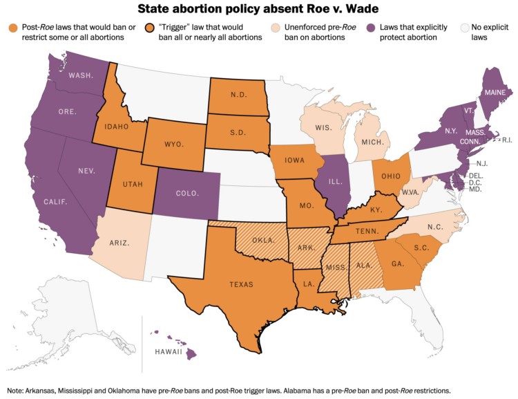
If Roe v. Wade were overturned, abortion policies would change in many states. From last year, Daniela Santamariña and Amber Phillips, for The Washington Post, mapped what would happen.
I’ll probably never tire of these sort of videos. It starts at human scale and then zooms in closer and closer until it gets to quarks.

Tucker Carlson hosts a nightly show viewed by millions. The New York Times analyzed the changing structure of the show and Carlson’s recurring speaking points, over a span of 1,150 episodes. NYT shows the results with a mix of audio and video clips and wideout views like the one above, which mark episodes that use specific types of rhetoric.
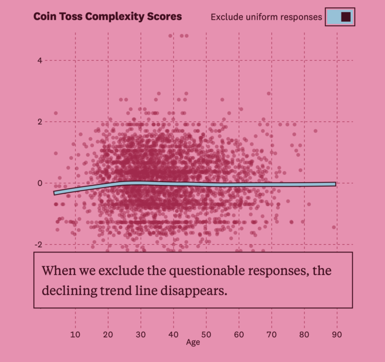
In 2017, a study posited that human behavior complexity peaks at age 25 and then declines, especially after age 60. The researchers estimated complexity through people’s ability to make up random patterns. Russell Goldenberg and Arjun Kakkar, for The Pudding, let you put the theory to the test and discuss why the original researcher’s findings were questionable.
Nuclear energy has bad memories linked to it, which tends to draw fear from the general public. Harry Stevens, for The Washington Post, explains why some feel the fear is unwarranted:
This explanation vastly oversimplifies a great deal of sophisticated engineering. However, the basic concept of a steam-powered electricity plant had been worked out by the late 1800s. “The only thing the 20th century gave us was a new way to make steam by heating it with nuclear fission,” said James Mahaffey, a retired nuclear engineer who has written several books on nuclear energy.
The piece includes cartoon circles with eyes to describe a fission chain reaction. Classic Stevens. Stevens should include cartoon eyes in every piece he makes for his own bit of branding.
Here’s the good stuff for April.
There’s a subreddit where people share a story and ask if they’re the asshole. WTTDOTM and Alex Petros trained AI models based on the responses so that you can enter your own story and see what the AI outputs as responses:
AYTA responses are auto-generated and based on different datasets. The red model has only been trained on YTA responses and will always say you are at fault. The green model has only been trained on NTA responses and will always absolve you. And the white model was trained on the pre-filtered data. Have fun!
Unfortunately you only get three responses from your input, one from each model. It would’ve been fun if the AI tried to make a final call.
Lorenzo Franceschi reporting for Motherboard on a leaked Facebook document:
“We do not have an adequate level of control and explainability over how our systems use data, and thus we can’t confidently make controlled policy changes or external commitments such as ‘we will not use X data for Y purpose.’ And yet, this is exactly what regulators expect us to do, increasing our risk of mistakes and misrepresentation,” the document read. (Motherboard retyped the document from scratch to protect a source.)
In other words, even Facebook’s own engineers admit that they are struggling to make sense and keep track of where user data goes once it’s inside Facebook’s systems, according to the document. This problem inside Facebook is known as “data lineage.”
Hm.
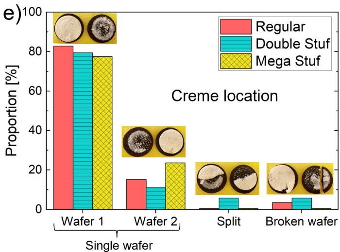
Crystal Owens, Max Fan, John Hart, and Gareth McKinley from Massachusetts Institute of Technology published their research on how the cream in an Oreo behaves when you split the sandwich, in Physics of Fluids:
Using a laboratory rheometer, we measure failure mechanics of the eponymous Oreo’s “creme” and probe the influence of rotation rate, amount of creme, and flavor on the stress–strain curve and postmortem creme distribution. The results typically show adhesive failure, in which nearly all (95%) creme remains on one wafer after failure, and we ascribe this to the production process, as we confirm that the creme-heavy side is uniformly oriented within most of the boxes of Oreos. However, cookies in boxes stored under potentially adverse conditions (higher temperature and humidity) show cohesive failure resulting in the creme dividing between wafer halves after failure. Failure mechanics further classify the creme texture as “mushy.” Finally, we introduce and validate the design of an open-source, three-dimensionally printed Oreometer powered by rubber bands and coins for encouraging higher precision home studies to contribute new discoveries to this incipient field of study.
This is very important. [via kottke]
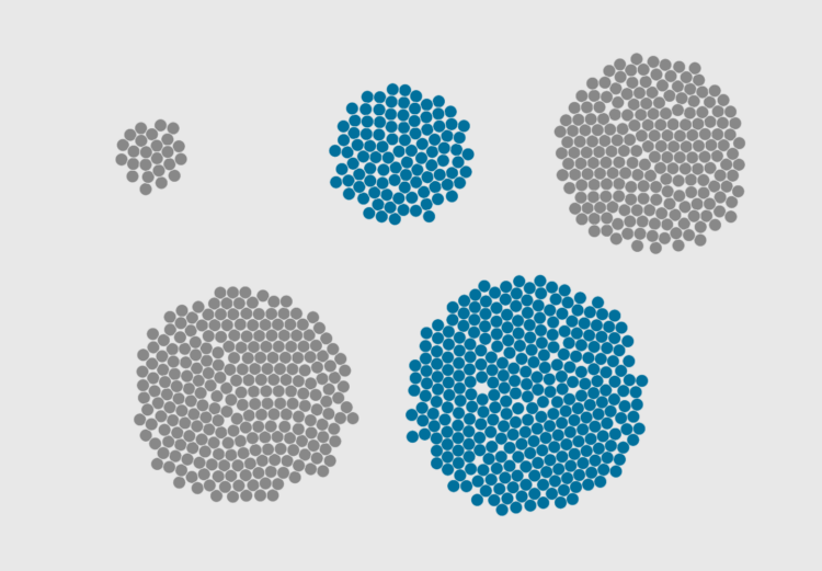
Represent individual counts with grouped units to make data feel less abstract.
Sam Biddle and Jack Poulson for The Intercept reporting on Anomaly Six, a company that knows a lot about a lot of people through phone data:
To fully impress upon its audience the immense power of this software, Anomaly Six did what few in the world can claim to do: spied on American spies. “I like making fun of our own people,” Clark began. Pulling up a Google Maps-like satellite view, the sales rep showed the NSA’s headquarters in Fort Meade, Maryland, and the CIA’s headquarters in Langley, Virginia. With virtual boundary boxes drawn around both, a technique known as geofencing, A6’s software revealed an incredible intelligence bounty: 183 dots representing phones that had visited both agencies potentially belonging to American intelligence personnel, with hundreds of lines streaking outward revealing their movements, ready to track throughout the world. “So, if I’m a foreign intel officer, that’s 183 start points for me now,” Clark noted.
Sentiment analysis can be fun to apply to varying types of text, but the usefulness of the results, as Rachael Tatman argues, is often low:
[T]he places where it makes sense for a data scientist or NLP practitioner working in industry to use sentiment analysis are vanishingly rare. First, because it doesn’t work very well and second, because even when it does work it’s usually measuring the wrong thing.
Although it’s not a lost cause. Tatman also points out areas where sentiment analysis could provide value.
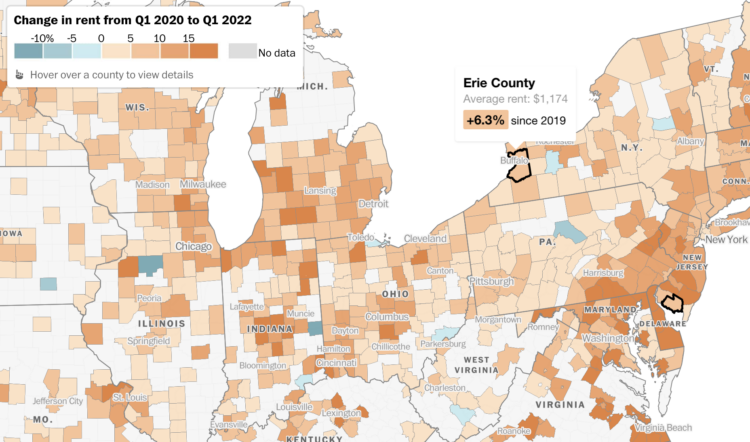
Rent increased pretty much everywhere in the United States over the past year. Abha Bhattarai, Chris Alcantara and Andrew Van Dam for The Washington Post use a map to show you by how much:
Nationally, rents rose a record 11.3 percent last year, according to real estate research firm CoStar Group. That fast pace of growth remained elevated in the first months of 2022, as many parts of the country continued to notch double-digit jumps in rent prices.
In high school, we spend most of our days with friends and immediate family. Then we get older and get jobs, get married, and grow our own families to spend more time with co-workers, spouses, and kids. Here’s how things change, based on a decade of data from the American Time Use Survey, from age 15 to 80.
When you choose visual encodings before considering the data, you usually end up with results that aren’t so great.
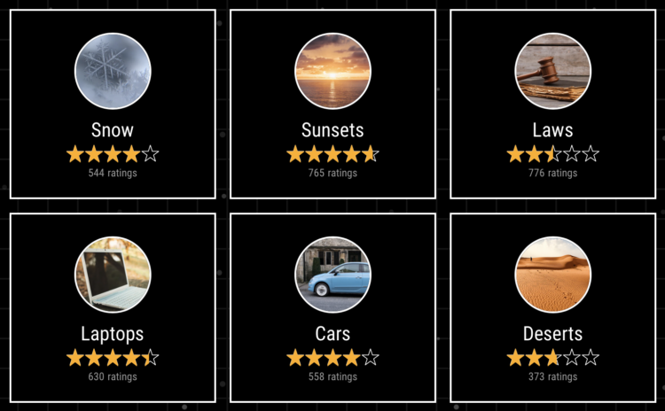
Given our love for making our opinions heard for products on the internets, Earth Reviews from Neal Agarwal extends the possibilities. Review acne, frogs, snow, gum, doors, and many other important things that require important reviews. Make your voice heard.
Zack Capozzi, for USA Lacrosse Magazine, explains how he calculates win probabilities pre-game and during games. On interpretation, which could easily apply to other sports and all forecasts:
But interpretation here matters quite a bit. And this is frustrating for some people, but that 61 percent should be interpreted as: “if these teams played 100 times, we would expect Marquette to win 61 of those games.” It definitely does not mean that the model is 61 percent confident that Marquette will win.
This is a bit odd, but this also means that if the Win Probability model gives Team A a 90% chance to beat Team B, there is nothing wrong with the model if Team B ends up winning the game. The issue would arise if, out of 100 90-percent win probability games, the favorite wasn’t winning around 90 of those games. When the model says 90 percent, you want it to mean 90 percent.
I wonder how many people incorrectly interpret the probability as “61 percent confident”. I bet a lot.
I do know that ever since the Golden State Warriors lost to the Cleveland Cavaliers in the 2016 NBA Finals — while holding a 90-something percent win projection by FiveThirtyEight — I stopped paying attention to win probability. But learning more about the calculation made it more interesting.
Atomic Agents is a JavaScript library by Graham McNeill that can help simulate the interactions between people, places, and things in a two-dimensional space. Saving for later. Looks fun.

In 2021, a large portion of North America was stuck in a heat dome with record temperatures and wildfires. Gordon Logie for Sparkgeo mapped the before-and-after of major wildfires during the year in British Columbia, with a combination of satellite imagery, photos, and scrolling. Logie then shows major floods, which are not necessarily caused by the fires, but are highly correlated.
The transitions for the before-and-after show the wildfire damage clearly. Instead of using the slider format, which kind of uncovers an after image, you can see the already boundaried regions change right away.
 Visualize This: The FlowingData Guide to Design, Visualization, and Statistics (2nd Edition)
New tools, refined process.


