There’s a data visualization book bundle on Humble Bundle this month. Get twenty-two books for eighteen dollars — with a portion of the proceeds going to Girls Who Code. Seems like a pretty good deal.
There’s a data visualization book bundle on Humble Bundle this month. Get twenty-two books for eighteen dollars — with a portion of the proceeds going to Girls Who Code. Seems like a pretty good deal.
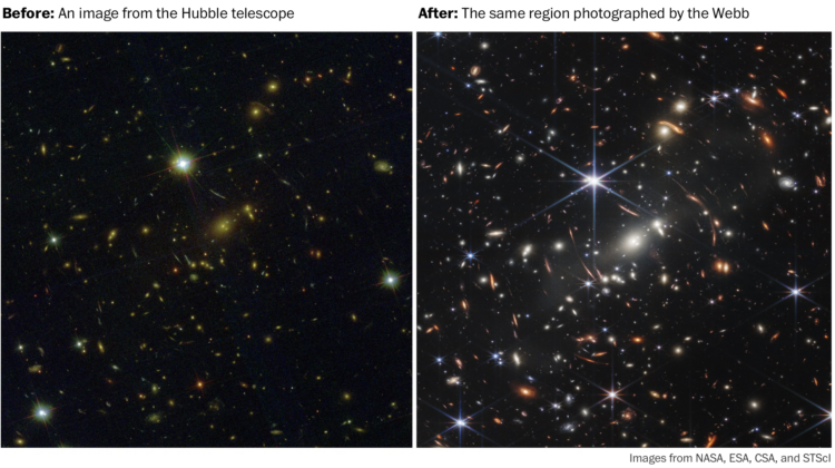
The first public picture from the James Webb telescope is kind of cool and all, but you can’t fully appreciate it unless you know what those glowing blobs represent and how they came to be. For Washington Post Opinion, Sergio Peçanha provides context for why NASA’s recent accomplishment is so awesome:
Everything about the Webb telescope is mind-boggling. Ponder this: Humans sent a telescope the size of a tennis court into space and parked it four times farther away than the moon.
There it orbits the sun along with us, just so we can get some pictures.
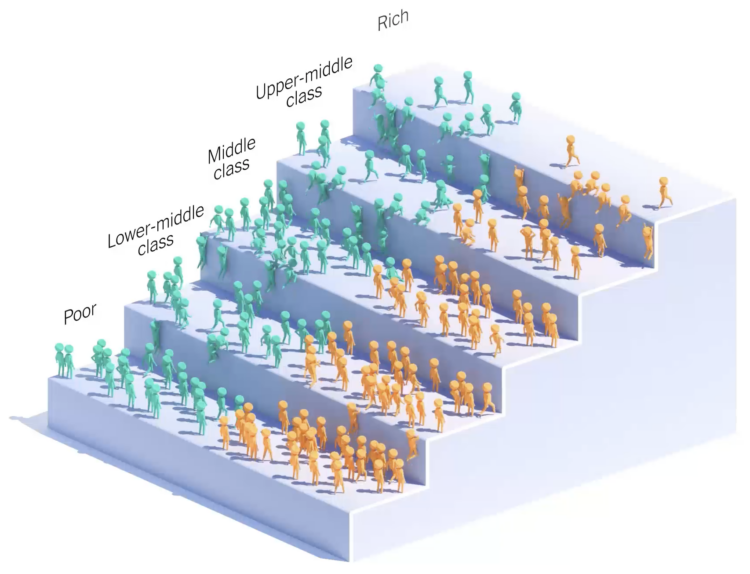
You’ve probably seen the moving bubbles that show how something changes over time. NYT Opinion lowered the abstraction level and showed little people climb the steps of income. The graphic is based on research by Ran Abramitzky and Leah Boustan:
Using the data set, Mr. Abramitzky and Ms. Boustan were able to compare the income trajectories of immigrants’ children with those of people whose parents were born in the United States. The economists found that on average, the children of immigrants were exceptionally good at moving up the economic ladder.
Abramitzky and Boustan just published a book on the topic.

NASA released an image from the Webb First Deep Field telescope, which shows a whole lot of galaxies:
Thousands of galaxies – including the faintest objects ever observed in the infrared – have appeared in Webb’s view for the first time. This slice of the vast universe covers a patch of sky approximately the size of a grain of sand held at arm’s length by someone on the ground.
We are tiny specks.
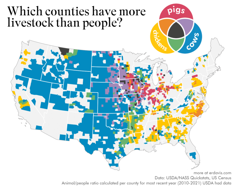
The United States Department of Agriculture provides annual inventory data on livestock, crops, and various products. The tool is very ad hoc government-looking, but it seems to work well enough.
Erin Davis made some fun maps that use the data at the county level to compare livestock populations to people populations. Davis compared animals individually, but the multivariate one that compares cows, chickens, and pigs is my favorite.
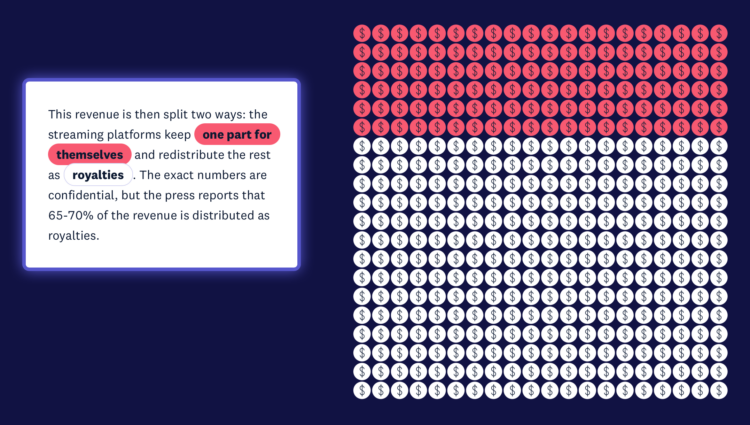
From the listener perspective, we pay our monthly or annual fees and just turn on our music streams. The path those fees take from our wallet to musicians is less straightforward. For The Pudding, Elio Quinton does a good job of visually explaining where the money goes (and some of the better ways you can support artists).
Use visual metaphors to shorten the distance between data and what it represents.
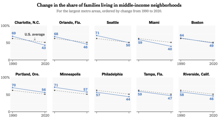
Income distribution continues to stretch on the high end and squish on the low end. For The New York Times, Sophie Kasakove and Robert Gebeloff look closer at what’s happening in the middle:
Nationally, only half of American families living in metropolitan areas can say that their neighborhood income level is within 25 percent of the regional median. A generation ago, 62 percent of families lived in these middle-income neighborhoods.
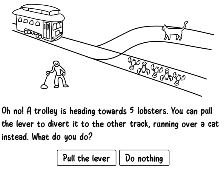
You’ve probably heard of the trolley problem, a thought experiment that imagines a trolley approaching a fork in the tracks. There are five people stuck on one path and one person stuck on the other. If the trolly continues on its current path, five people will die, but if you consciously switch the tracks, you could save them and only one person dies. Do you switch or let the trolley continue?
Neal Agarwal, who continues to gift the internet with fun projects, reframes the trolley problem with increasingly more absurd choices. You also get to see how others answered, so you can compare your own choices against the moral compass of the internet.
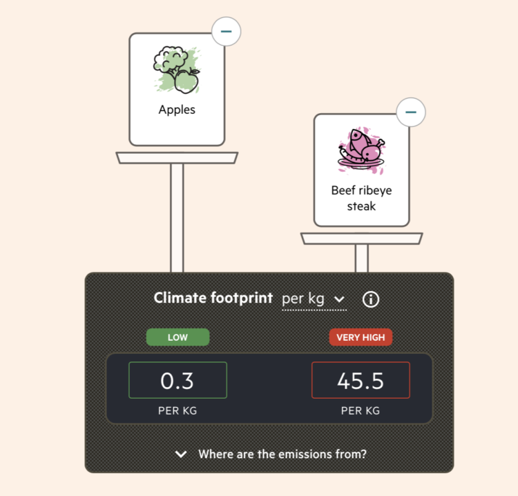
By purchasing certain foods, we make decisions about the carbon footprint from the production of those foods. Most of us don’t have a good idea of how much difference our choices can make though. Financial Times reports on policymakers working to make the footprint more obvious through food labeling.
Based on estimates from CarbonCloud, a scale on the FT piece weighs the carbon footprint per kilogram of various foods. The scale metaphor threw me off at first, because the item with a lower carbon footprint appeared visually higher. Of course with a scale, something heavier pushes down more, but my brain was thinking in terms of x-y-coordinates. Maybe that’s just me staring at too many charts.
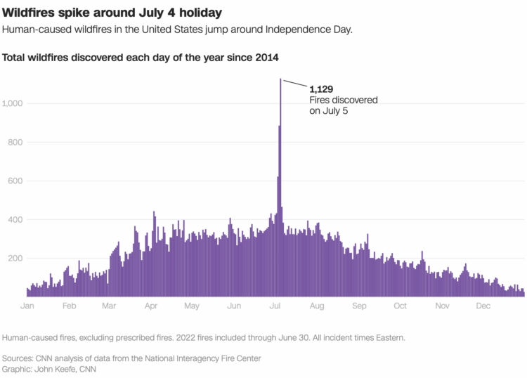
It’s Independence Day here in the United States, which means there will be fireworks in a lot of places. This chart from John Keefe for CNN shows why plans have changed in many areas.
That’s a big spike on July 4 and 5. (See also: Why people visit the emergency room.)
As an aside, that’s a Datawrapper chart. The tell is in view source, but the spacing and interaction usually tips me off. I’ve been noticing them on more news outlets lately, which speaks highly for Datawrapper’s ease-of-use and readability.
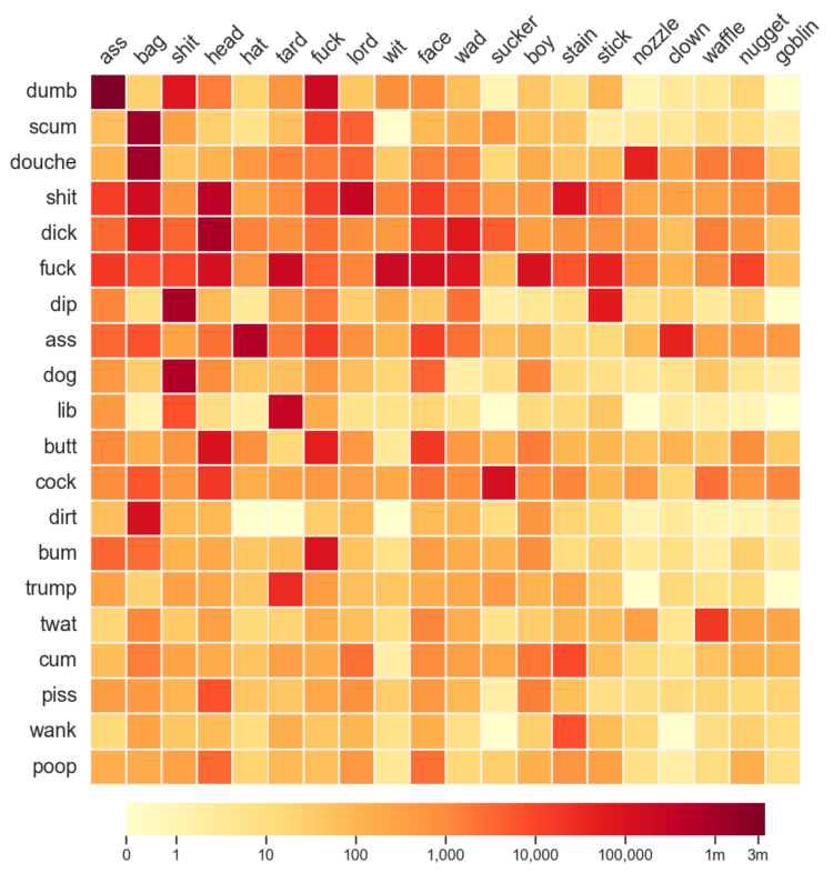
As you know, Reddit is typically a sophisticated place of kind and pleasant conversation. So Colin Morris analyzed the usage of compound pejoratives in Reddit comments:
The full “matrix” of combinations is surprisingly dense. Of the ~4,800 possible compounds, more than half occurred in at least one comment. The most frequent compound, dumbass, appears in 3.6 million comments, but there’s also a long tail of many rare terms, including 444 hapax legomena (terms which appear only once in the dataset), such as pukebird, fartrag, sleazenozzle, and bastardbucket.
Stay classy.
Here’s the good stuff for June.
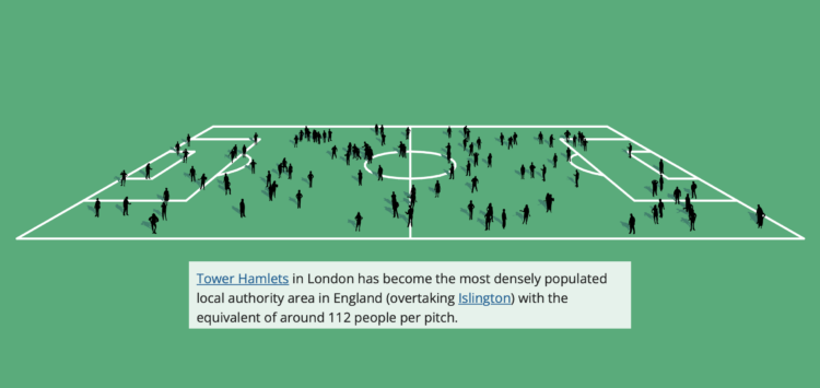
The Office for National Statistics for the UK published an interactive to show how population has changed:
The population of England and Wales has increased by more than 3.5 million in the 10 years leading up to Census 2021. Using the first results from this census, we look at which places have seen the biggest increases and decreases, which areas had the largest growth in different age groups, and how your chosen local authority area compares with others.
You choose a region and go from there. The best part though is the football (a.k.a. soccer) field used to visualize population density, which communicates the numbers on a relatable scale.
This past weekend marked 15 years since I first posted on FlowingData. What started as a placeholder for class projects, became a hobby, which eventually turned into a career choice.
With each year that passes, running an independent site, on data visualization of all things, seems less common. Many of my favorite data and visualization sites from years past are dead links now or are frozen in time.
It’s for a good reason though: There are a lot of opportunities these days for people who know how to visualize data. The field is more established than it was 15 years ago.
So, sometimes it feels weird out here in my little corner of the internet. But I’m glad that I’ve been able to do this for this long and still get to do it, all while enjoying the process. I get to see things develop and be a part of the growth, in my own quiet, introverted way.
Thank you for reading. Thank you to past and present members who support FlowingData. Not a member? Check out the perks for keeping this fully member-supported site flowing.
Alright, back to the data. Some fun things are headed down the pipeline.
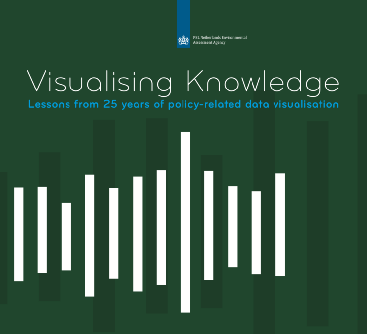
Visualising Knowledge is an open book from PBL Netherlands Environmental Assessment Agency, based on 25 years of making charts:
PBL data visualisation is about visualising research results, using graphs, maps, diagrams and infographics. Over the years, the variety in types of visualisation formats has greatly increased. In addition, visualisations have to be presented in an increasing number of different media: from figures in reports to interactive visualisations that are easy to read on smartphones and tablets.
The book ‘Visualising knowledge’ provides insight into how visualisations at PBL are created in a process of close collaboration between visualisation experts, researchers and communication experts, always keeping in mind both the medium and the target audience.
The original version is in Dutch, and they just published an English version. Download either version here.
 An Introduction to Statistical Learning, by Gareth James, Daniela Witten, Trevor Hastie, and Rob Tibshirani:
As the scale and scope of data collection continue to increase across virtually all fields, statistical learning has become a critical toolkit for anyone who wishes to understand data. An Introduction to Statistical Learning provides a broad and less technical treatment of key topics in statistical learning. Each chapter includes an R lab. This book is appropriate for anyone who wishes to use contemporary tools for data analysis.
The PDF version of the book is free to download. There’s also a free online course companion.
Felix Krause tracks many metrics of his life, both manually and passively, and put the data in one database. He put up a subset of the data on an updating site that shows where he is, what he’s eaten, how he’s feeling, the time he spent on the computer, and plenty more. After three years, he concluded it was not worth the time:
Overall, having spent a significant amount of time building this project, scaling it up to the size it’s at now, as well as analysing the data, the main conclusion is that it is not worth building your own solution, and investing this much time. When I first started building this project 3 years ago, I expected to learn way more surprising and interesting facts. There were some, and it’s super interesting to look through those graphs, however retrospectively, it did not justify the hundreds of hours I invested in this project.
It’s interesting to see people independently come to this conclusion over the years. With the quantified self stuff, people often expect that culling data about your activities and behaviors will result in rich, unexpected insights. But unless you’re actively trying to answer a question or working towards a milestone, usually you won’t get much out of the collection process.
It’s a similar sentiment around “let the data speak” with visualization. You have to actively look at and translate the data.
But personal data collection as a form of reflection or journaling? That’s a different story.
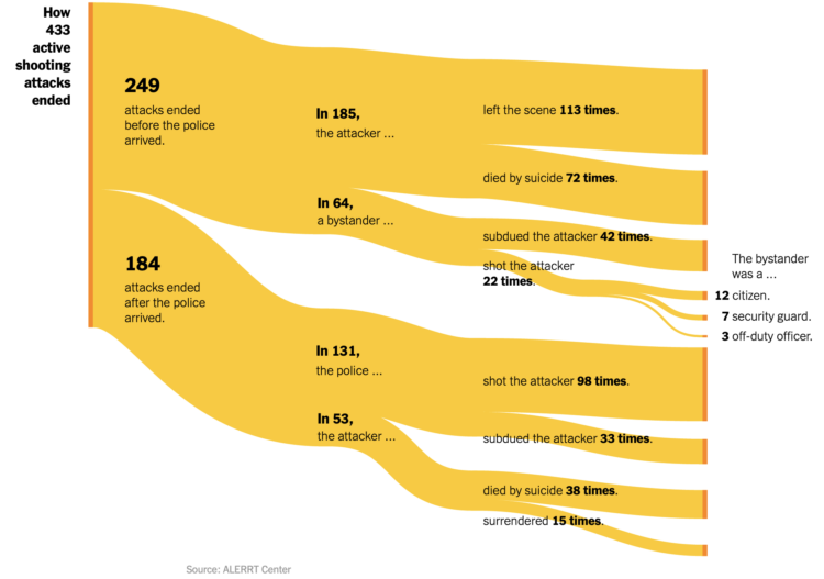
For The New York Times, Larry Buchanan and Lauren Leatherby used Sankey diagrams to show the endings from active shootings in the United States:
Most attacks captured in the data were already over before law enforcement arrived. People at the scene did intervene, sometimes shooting the attackers, but typically physically subduing them. But in about half of all cases, the attackers commited suicide or simply stopped shooting and fled.
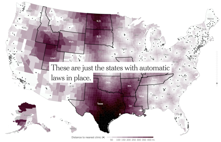
With Roe vs. Wade in place, there were areas in the United States where a woman had to travel farther than others to get to the nearest clinic. With Roe vs. Wade overturned, the geography will change as states enforce bans. For NYT’s The Upshot, Quoctrung Bui, Claire Cain Miller and Margot Sanger-Katz mapped what will likely happen.
 Visualize This: The FlowingData Guide to Design, Visualization, and Statistics (2nd Edition)
New tools, refined process.


