Introduction to Probability for Data Science is a free-to-download book by Purdue statistics professor Stanley H. Chan:
We need a book that balances the theory and practice. We need a book that provides insights and not just theorems and proofs. We need a book that motivates the students, telling them why probability is so essential to their work. We need a book that highlights the impacts of the subject. From over than half a decade of teaching the course, I have distilled what I believe to be the core of probabilistic methods. I put the book in the context of data science, to emphasize the inseparability between data (computing) and probability (theory) in our time.


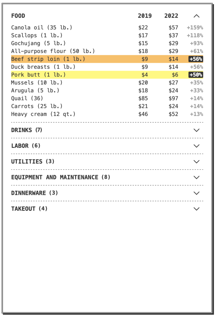 If you’ve eaten at a restaurant lately, you might have noticed a substantially higher bill than you’re used to. You’d be right to assume that it’s because of things like inflation and pandemic-induced prices, but you might not realize how much the cost of ingredients, labor, and a new takeout business model has gone up for restaurants. Priya Krishna and Umi Syam, for The New York Times,


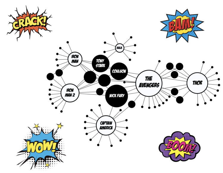
 Visualize This: The FlowingData Guide to Design, Visualization, and Statistics (2nd Edition)


