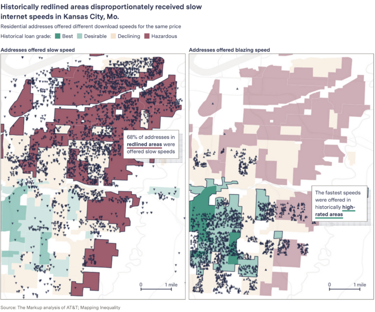
Using data from NOAA, Krishna Karra and Tim Wallace for The New York Times mapped all-time temperature records set in 2021. Red indicates an all-time high, and blue indicates an all-time low. Circle size represents the degree difference from the previous record.
-
The internet was once this fun place where people had goofy debates about how to pronounce “gif” (with a hard g), the color of a dress (blue and black), and whether or not a hot dog is a sandwich (no). That place is no more, leaving unsettled debates just floating around out there.
Luckily, Neal Agarwal compiled the hot debates in one place to settle the scores once and for all.
-
Congressional redistricting and gerrymandering are important topics, because they can directly change election results. However, gerrymandering is called gerrymandering, so it’s too easy to get lost in the details. Well, fret no more. Dylan Moriarty and Joe Fox for The Washington Post made a miniature golf game to teach what’s currently at stake.
It’s a ten-hole course where each putting green is in the shape of a district. The shapes grow more complex as you progress, and the game keeps score for you, so that you can compare your score to par or how other readers performed. It has sound, pretty watercolors, and it’s fun to play.
In the process, the Post tricks you into learning. Win-win.
-
[arve url=”https://www.youtube.com/watch?v=2iAytbmXYXE” /]
We’ve learned more about the universe since Charles and Ray Eames produced Powers of Ten in 1977, so the BBC made an homage to the film, updating with what we know now. Spoiler alert: the universe is still big.
-
[arve url=”https://www.youtube.com/watch?v=0fKBhvDjuy0″ /]
The Powers of Ten by Charles and Ray Eames from 1977 shows the size of the universe by starting at human scale and then zooming out further and further. Then it comes back down to Earth and zooms in closer and closer.
I’ve linked to this iconic film a few times but just wanted to put up an actual post here for reference. You should definitely check it out if you haven’t seen it before.
-
A Quick and Easy Way to Make Spiral Charts in R
Now that we’ve discovered another way to annoy chart snobs, here’s how you can make your own spirals.
-
This spiralized chart by Gus Wezerek and Sara Chodosh for NYT Opinion has sparked discussions on what it means to communicate data. A lot of people don’t like it. I’m gathering my thoughts, but I think it’s fine for two main reasons: (1) it’s a lead-in to an opinion piece and (2) it’s not trying to replace the straight-up linear views that we’ve grown uncomfortably familiar with over two-plus years.
-
Surf is a data-based game by Andy Bergmann that lets you move across a thirty-seven-year time series from NOAA. The data forms the waves, and you’re a dog on a surf board jumping over sharks.
It’s kind of like a stripped down version of Alto’s Adventure but with data. Fun.
-
Members Only
-
[arve url=”https://www.youtube.com/watch?v=0FH9cgRhQ-k” /]
I’m not sure there’s any way to really understand the scale of the largest black holes in the universe, but Kurzgesagt gives it a good try.
-
One of my favorites of the year, Sam Learner’s River Runner shows you a terrain map that lets you place a drop of rain anywhere in the contiguous United States. You’re then taken on a river tour that shows where the drop ends up. Learner just expanded the project to let you drop water anywhere in the world.
-
The Washington Post and ProPublica analyzed Facebook group posts that disputed election results:
To determine the extent of posts attacking Biden’s victory, The Post and ProPublica obtained a unique dataset of 100,000 groups and their posts, along with metadata and images, compiled by CounterAction, a firm that studies online disinformation. The Post and ProPublica used machine learning to narrow that list to 27,000 public groups that showed clear markers of focusing on U.S. politics. Out of the more than 18 million posts in those groups between Election Day and Jan. 6, the analysis searched for words and phrases to identify attacks on the election’s integrity.
The more than 650,000 posts attacking the election — and the 10,000-a-day average — is almost certainly an undercount. The ProPublica-Washington Post analysis examined posts in only a portion of all public groups, and did not include comments, posts in private groups or posts on individuals’ profiles. Only Facebook has access to all the data to calculate the true total — and it hasn’t done so publicly.
Read more about the methodology behind the analysis.
-
May Louise Kelly for NPR spoke briefly with biostatistics professor Natalie Dean on the omicron surge and what we can take away from the data:
Yeah, I mean, the public health impact is made up a lot of different things, and we’re most acutely interested in severe disease and death. But, of course, infections have impacts and we think about the disruption – you know, all the people who are going to need to miss work, including health care professionals and, you know, frontline workers. So the numbers have meaning, but it is a different public health impact when someone is mildly ill or doesn’t even have symptoms than when someone is severely ill.
The numbers are up but they don’t mean the same thing from when the numbers were up last time.
-
Sarah Kliff and Aatish Bhatia for NYT’s The Upshot look at the uncertainty of prenatal tests for rare conditions. For some tests, the results are more often wrong than they are right, which causes issues when expecting parents don’t know that.
Along with square pie charts, the piece goes into more detail with unit charts to explain what the percentages mean from a counts point of view. So if a reader doesn’t quite know what a false positive is before reading, they will have a better idea after.
-
Phew, just made it. These are my favorite data visualization projects from 2021.
Like last year, there were many Covid-related charts on the internets this year. While they are important to gauge the state of things, I found myself veering away from them to focus on other areas. I craved distraction, practical information for the times, and anything outside the bubble.
-
Members Only
-
This is Hallgrímskirkja, a church in Reykjavík, Iceland. It will now also be known as the Church of the 95% Confidence Interval.
The Church of the 95% Confidence Interval #rstats pic.twitter.com/m0gvvu2Dav
— Julien Cloarec (@CloarecJulien) December 5, 2021
-
The David Rumsey Map Center at Stanford houses hundreds of thousands of maps dating back to the 1500s. Andres Picon for San Francisco Chronicle wrote about the collection:
At the heart of that endeavor is the digitization of Rumsey’s vast physical collection, a project he began in the late 1990s when he launched davidrumsey.com, a constantly growing aggregation of about 112,000 digitized historical maps from his personal inventory. Rumsey, 77, is in the process of donating his entire map collection — more than 200,000 physical maps plus the digital ones — to Stanford so that they can be cataloged for the enjoyment of generations to come.
“It’s not only a database; it allows people to get lost inside it, no pun intended,” he said. “If you make it really usable and accessible the way ours is, it just becomes something different.”
For preservation, I wish we saw more of this and less blockchain. Hundreds of years from now, how much visualization work is still viewable?
You can view a large portion of the Rumsey collection here. You can also browse the data visualization tag to see some of the earliest made charts.
-
Justin Sherman for Wired points out the farce that is anonymized data:
Data on hundreds of millions of Americans’ races, genders, ethnicities, religions, sexual orientations, political beliefs, internet searches, drug prescriptions, and GPS location histories (to name a few) are for sale on the open market, and there are far too many advertisers, insurance firms, predatory loan companies, US law enforcement agencies, scammers, and abusive domestic and foreign individuals (to name a few) willing to pay for it. There is virtually no regulation of the data brokerage circus.
-
Denise Lu and Albert Sun for The New York Times show the shifts in Covid-19 deaths among different demographic groups:
The change in death rates among groups is starker by race and ethnicity, and the death rate has risen particularly sharply for middle-aged white people. Covid-19 now accounts for a much larger share of all deaths for that group than it did before vaccines were widely available.
In a series of slope charts, each multiple shows a group, and the background color indicates an increase (red) or a decrease (gray) in deaths among that group.