• Membership
  • Newsletter
  • Projects
  • Learning
  • About
  • Member Login
  • How to Make Bubble Clusters in R

    Represent individual counts with grouped units to make data feel less abstract.

  • Tracking the CIA to demo phone tracking

    April 26, 2022

    Topic

    Data Sharing  /  Intercept, privacy

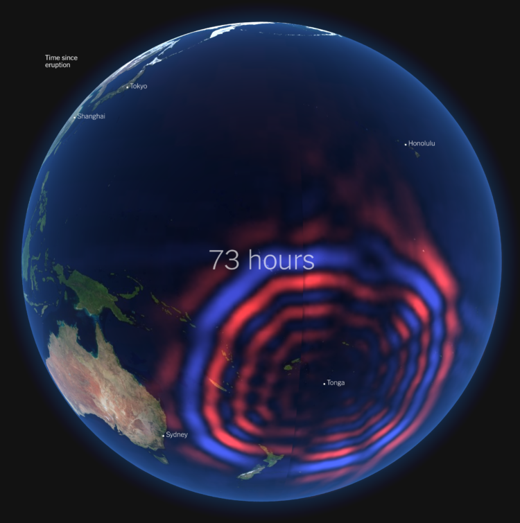
    Sam Biddle and Jack Poulson for The Intercept reporting on Anomaly Six, a company that knows a lot about a lot of people through phone data:

    To fully impress upon its audience the immense power of this software, Anomaly Six did what few in the world can claim to do: spied on American spies. “I like making fun of our own people,” Clark began. Pulling up a Google Maps-like satellite view, the sales rep showed the NSA’s headquarters in Fort Meade, Maryland, and the CIA’s headquarters in Langley, Virginia. With virtual boundary boxes drawn around both, a technique known as geofencing, A6’s software revealed an incredible intelligence bounty: 183 dots representing phones that had visited both agencies potentially belonging to American intelligence personnel, with hundreds of lines streaking outward revealing their movements, ready to track throughout the world. “So, if I’m a foreign intel officer, that’s 183 start points for me now,” Clark noted.

  • Applying sentiment analysis usefully

    April 26, 2022

    Topic

    Statistics  /  Rachael Tatman, sentiment

    Sentiment analysis can be fun to apply to varying types of text, but the usefulness of the results, as Rachael Tatman argues, is often low:

    [T]he places where it makes sense for a data scientist or NLP practitioner working in industry to use sentiment analysis are vanishingly rare. First, because it doesn’t work very well and second, because even when it does work it’s usually measuring the wrong thing.

    Although it’s not a lost cause. Tatman also points out areas where sentiment analysis could provide value.

  • How much rent increased where you live

    April 25, 2022

    Topic

    Maps  /  rent, Washington Post

    Rent increased pretty much everywhere in the United States over the past year. Abha Bhattarai, Chris Alcantara and Andrew Van Dam for The Washington Post use a map to show you by how much:

    Nationally, rents rose a record 11.3 percent last year, according to real estate research firm CoStar Group. That fast pace of growth remained elevated in the first months of 2022, as many parts of the country continued to notch double-digit jumps in rent prices.

  • Data Underload  /  people, time use

    Who We Spend Time with as We Get Older

    In high school, we spend most of our days with friends and immediate family. Then we get older and get jobs, get married, and grow our own families to spend more time with co-workers, spouses, and kids. Here’s how things change, based on a decade of data from the American Time Use Survey, from age 15 to 80.

    Read More
  • Members Only

    Stuck in a Form

    April 21, 2022

    Topic

    The Process  /  form

    When you choose visual encodings before considering the data, you usually end up with results that aren’t so great.

  • Earth Reviews

    April 21, 2022

    Topic

    Infographics  /  Earth, humor, Neal Agarwal, reviews

    Given our love for making our opinions heard for products on the internets, Earth Reviews from Neal Agarwal extends the possibilities. Review acne, frogs, snow, gum, doors, and many other important things that require important reviews. Make your voice heard.

  • Calculating win probabilities

    April 20, 2022

    Topic

    Statistics  /  probability, sports, Zack Capozzi

    Zack Capozzi, for USA Lacrosse Magazine, explains how he calculates win probabilities pre-game and during games. On interpretation, which could easily apply to other sports and all forecasts:

    But interpretation here matters quite a bit. And this is frustrating for some people, but that 61 percent should be interpreted as: “if these teams played 100 times, we would expect Marquette to win 61 of those games.” It definitely does not mean that the model is 61 percent confident that Marquette will win.

    This is a bit odd, but this also means that if the Win Probability model gives Team A a 90% chance to beat Team B, there is nothing wrong with the model if Team B ends up winning the game. The issue would arise if, out of 100 90-percent win probability games, the favorite wasn’t winning around 90 of those games. When the model says 90 percent, you want it to mean 90 percent.

    I wonder how many people incorrectly interpret the probability as “61 percent confident”. I bet a lot.

    I do know that ever since the Golden State Warriors lost to the Cleveland Cavaliers in the 2016 NBA Finals — while holding a 90-something percent win projection by FiveThirtyEight — I stopped paying attention to win probability. But learning more about the calculation made it more interesting.

  • Agent-based modeling in JavaScript

    April 20, 2022

    Topic

    Software  /  agent, Graham McNeill, JavaScript, modeling

    Atomic Agents is a JavaScript library by Graham McNeill that can help simulate the interactions between people, places, and things in a two-dimensional space. Saving for later. Looks fun.

  • Wildfires and floods, a geographic before and after

    April 19, 2022

    Topic

    Maps  /  Gordon Logie, satellite imagery, wildfire

    In 2021, a large portion of North America was stuck in a heat dome with record temperatures and wildfires. Gordon Logie for Sparkgeo mapped the before-and-after of major wildfires during the year in British Columbia, with a combination of satellite imagery, photos, and scrolling. Logie then shows major floods, which are not necessarily caused by the fires, but are highly correlated.

    The transitions for the before-and-after show the wildfire damage clearly. Instead of using the slider format, which kind of uncovers an after image, you can see the already boundaried regions change right away.

  • Scraping public data ruled legal

    April 19, 2022

    Topic

    Data Sources  /  public, scraping

    For TechCrunch, Zack Whittaker reporting:

    In its second ruling on Monday, the Ninth Circuit reaffirmed its original decision and found that scraping data that is publicly accessible on the internet is not a violation of the Computer Fraud and Abuse Act, or CFAA, which governs what constitutes computer hacking under U.S. law.

    The Ninth Circuit’s decision is a major win for archivists, academics, researchers and journalists who use tools to mass collect, or scrape, information that is publicly accessible on the internet. Without a ruling in place, long-running projects to archive websites no longer online and using publicly accessible data for academic and research studies have been left in legal limbo.

  • Redrafting the NBA, based on past player performance

    April 18, 2022

    Topic

    Statistical Visualization  /  basketball, draft, Pudding

    With the NBA playoffs underway, it can be fun to watch the best players and wonder what it’d be like if they were drafted earlier by a different team. For The Pudding, Russell Goldenberg did this for every player and team since the 1989 draft. Goldenberg made a similar thing five years ago, but this time there’s a team component.

    Another five years from now, in Redraft 3.0, I fully expect “better” picks to also consider the team makeup at the time of drafting. For example, check if it makes sense to draft another power forward when you already have a star power forward and need a shooting guard.

  • Tax services want your data

    April 18, 2022

    Topic

    Data Sharing  /  privacy, taxes, Washington Post

    Taxes are due today in the U.S. (yay). Geoffrey A. Fowler for The Washington Post on the part when tax services like TurboTax and H&R Block ask for your data:

    What he discovered is a little-discussed evolution of the tax-prep software industry from mere processors of returns to profiteers of personal data. It’s the Facebook-ization of personal finance.

    America’s most-popular online tax-prep service, Intuit’s TurboTax, also asks you to grant it additional access to the data in your return to “enrich your financial profile, communicate with you about Intuit’s services, and provide insights to you and others.”

    […]

    The good news is because of Internal Revenue Service rules, this is one data request you can actually say “no” to while continuing to do your taxes online. And if you already clicked “agree” and now have changed your mind, there are some steps you can take, too.

  • Ross Ihaka, co-creator of R, reflects on the language

    April 15, 2022

    Topic

    Software  /  NZ Herald, R, Ross Ihaka

    NZ Herald talked to Ross Ihaka, one of the creators of R:

    Today, R is depended upon around the world by analysts, data scientists and big-name companies like Facebook, Google, Amazon and the New York Times, and it’s garnered Ihaka something of a rockstar status in the field of data science and statistics.

    He’s received numerous accolades over the years recognising his work, such as the Royal Society of New Zealand’s prestigious Pickering Medal, and the Statistical Computing and Graphics Award from the American Statistical Association.

    Asked how many people use R on a daily basis, Ihaka’s guess is in the millions but he’s not quite sure how many million.

    One of the reasons R is called R is because Ihaka and co-creator Robert Gentleman both had first names that started with the letter.

  • Tonga shockwave around the world

    April 15, 2022

    Topic

    Maps  /  eruption, New York Times, shockwave, Tonga

    Earlier this year, an underwater volcano erupted in the island nation of Tonga. For The New York Times, Aatish Bhatia and Henry Fountain describe the effects of the eruption, which lasted for days and rippled around the world. The introductory animated globe shows the pressure wave and gives a good sense of the eruption’s massive scale.

  • Members Only

    Manually

    April 14, 2022

    Topic

    The Process  /  editing

    Manually editing charts is worthwhile, despite the possibility of manually making mistakes.

  • Comparing rich people incomes and the taxes they pay

    April 14, 2022

    Topic

    Statistical Visualization  /  income, ProPublica, scale, wealth

    Based on leaked IRS data for the 400 wealthiest Americans, ProPublica provides a comparison of their incomes and the lower taxes they paid between 2013 and 2018. This might be best piece so far from ProPublica’s IRS series in terms of understanding the big picture from their dataset. Also, that “smaller than a pixel” note for the average American is doing some heavy lifting.

  • Data Underload  /  age, social media

    Social Media Usage by Age

    Social media apps are on a lot of phones these days, but some tend towards a younger audience and others an older. Some are common across the population. Here’s the breakdown by age for American adults in 2021, based on data from the Pew Research Center.

    Read More
  • When people eat dinner in Europe

    April 12, 2022

    Topic

    Maps  /  dinner, Europe

    This map by @loverofgeography shows the usual dinner times for countries in Europe. There’s no source listed, so I’m not sure if this is based on actual data or just anecdotal, but I think the latter. From my meager experience, this seems right? I might have to check out European time use data.

  • Jeff Bezos wealth to scale

    April 11, 2022

    Topic

    Infographics  /  illustration, Jeff Bezos, Mona Chalabi, scale, wealth

    Jeff Bezos’ wealth is difficult to understand conceptually, because the scale is just so much more than what any of us are used to. So for NYT Magazine, Mona Chalabi took a more abstract approach, focusing less on monetary values and more on how many multiples more Bezos has compared to the median household.

    See also The Washington Post’s comparison from a couple of years ago, scaling things down to spending equivalencies. I think Chalabi’s comparison works better. It’s abstract compared with abstract.

  • Page 62 of 391
  • <
  • 1
  • ...
  • 59
  • 60
  • 61
  • 62
  • 63
  • 64
  • ...
  • 391
  • >

Analyze, visualize, and communicate data usefully, beyond the defaults.

Become a member →

Recently for Members

May 8, 2025
When the data is not what it seems

May 1, 2025
Finding the Right Charts

April 24, 2025
Visualization Tools, Datasets, and Resources – April 2025 Roundup

April 17, 2025
Breaking Out of Chart Software Defaults

April 15, 2025
Line Chart with Decorative Neon Accents

Browse by Chart Type See All →

Cartogram Parallel Coordinates Slope Chart Strip Plot Horizon Graph Dot Map Bar Chart Race Histogram Frequency Trails Surface Plot

Browse By Topic

  • Visualization

    Seeing data

  • Maps

    Seeing geographic data

  • Infographics

    Explaining data

  • Networks

    Connecting data

  • Statistics

    Analyzing data

  • Software

    Working with data

  • Sources

    Getting data

  • Design

    Making data readable

Get the Book

Visualize This: The FlowingData Guide to Design, Visualization, and Statistics

Available now.

Order: Amazon / Bookshop

Made by FlowingData

  • The Process

  • Data Underload

  • Chart Everything

  • Guides

  • Books

  • Shop

  • About
  • Contact
  • Newsletter
  • LinkedIn
  • Instagram
  • Bluesky
  • RSS
Copyright © 2007-Present FlowingData. All rights reserved.