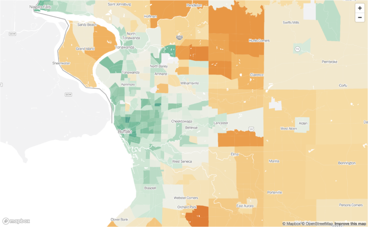
Bringing it down the Census tract level, Nadja Popovich, Mira Rojanasakul and Brad Plumer, for The New York Times, mapped emission estimates so you can see the impact of your neighborhood:
A map of emissions linked to the way people consume goods and services offers a different way to view what’s driving global warming. Usually, greenhouse gases are measured at the source: power plants burning natural gas or coal, cows belching methane or cars and trucks burning gasoline. But a consumption-based analysis assigns those emissions to the households that are ultimately responsible for them: the people who use electricity, drive cars, eat food and buy goods.
The estimates are based on research from the University of California, Berkeley.
We often think of big cities as dirtier and more pollution-heavy. By absolute counts, because there are more people, this is a correct statement, but from a per household point of view, the contrast is flipped.
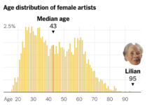 Tom Brady, the quarterback for the Tampa Bay Buccaneers, is 45 years old, which makes him the oldest player in the National Football League. Francesca Paris, for NYT’s The Upshot, places Brady’s age under the perspective of other occupations. For example, Lilian Thomas Burwell, who is an artist at 95 years old, is well in the upper percentile for those in her field (and the general population).


 Visualize This: The FlowingData Guide to Design, Visualization, and Statistics (2nd Edition)


